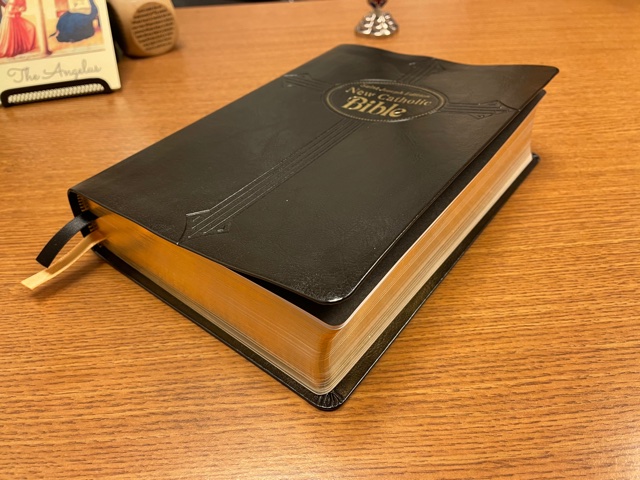
I just received my New Catholic Bible large print edition with a black Dura-Lux cover. I’ll share my first impressions without going into details about the translation, as that’s already been thoroughly covered in Marc’s blog.
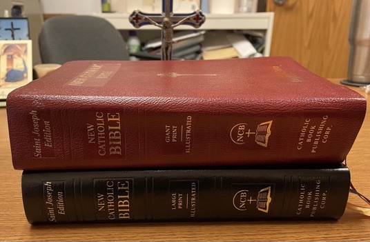
I purchased the giant print edition back when it first came out, excited by the prospect of a full edition of the NCB since I had enjoyed the New Testament and Psalm translations for some years. Though I still favor the RSV-CE and ESV-CE formal translations, the NCB does a decent job balancing readability and literalness. I purchased this one primarily for the notes, which I prefer to the NABRE’s.
The giant print edition is bulky, and the font is annoyingly large, even for my middle-aged eyes. I don’t like that the notes are at the end of each book. Endnotes are a pet peeve of mine; I find it distracting to keep going back and forth.
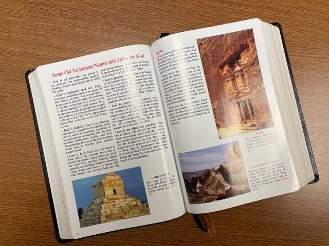
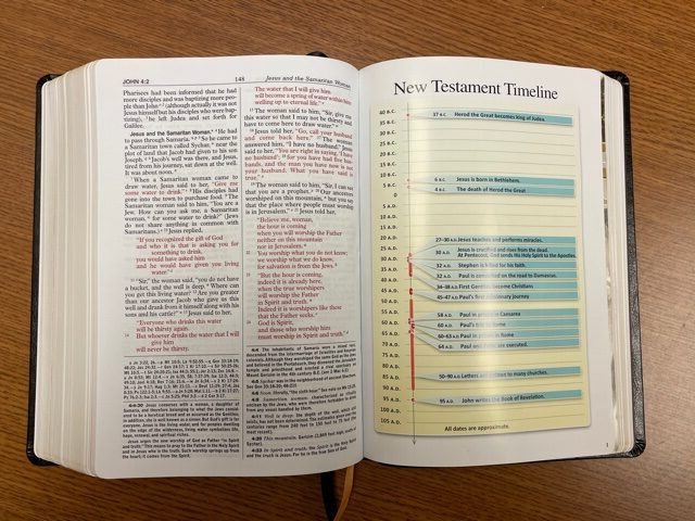
Despite my appreciation for the NCB, I only occasionally picked it up for reference. Then, in December I saw the new large print edition mentioned on Marc’s blog and ordered it. I’m quite pleased with it. Like the giant print edition, it has colorful supplemental aids (such as a chronology of the last week of Jesus’ life). These will be helpful for reading the Bible with my kiddos. And it’s great to have the notes readily accessible at the bottom of each page.
The font typically used in Catholic Book Corporation’s bibles is not elegant by any measure, but it’s easy on my eyes. It’s bold and clean. I prefer bibles not to have red lettering for the words of the Lord (I find it distracting); this one has that feature, but I can deal with it. The bible itself is still somewhat large, but no more so than the New Oxford Annotated Bible editions. Thankfully it’s not a brick, as the giant print edition is.
I would encourage CBC to make a big deal of the fact that their bibles are still made with sewn signature binding. With rare exception, I refuse to buy a bible that has glued binding— it’s usually a make or break deal for me— so I’m grateful that CBC continues their tradition of quality bible bindings. I think they would be wise to exploit that feature. I didn’t see it listed on the website. If they added a good genuine— or better yet premium— leather cover, they’d be amazing.
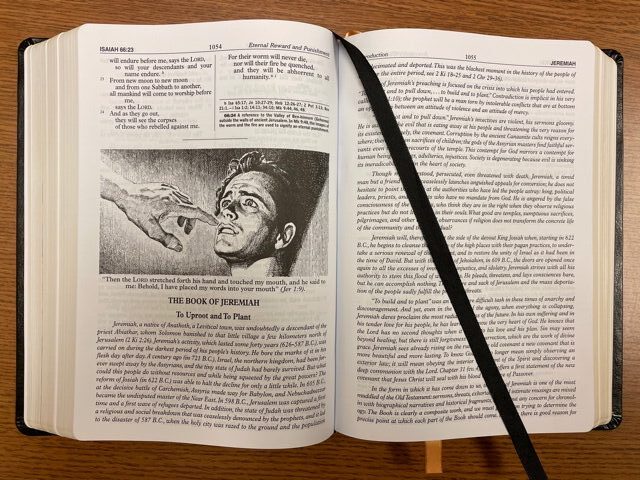
In addition to my “day job” in catechetical ministry, I’m an illustrator, and one of my favorite things about this bible is the wonderful black and white pen and ink illustrations that accompany several of the biblical book introductions. They add a lot to this edition. Unfortunately, I couldn’t find information on the illustrator, but the drawings make this bible unique and are a welcome contrast to some of the dated, cheesy color illustrations that continue to embellish CBC bibles (including in supplemental pages of this edition).
The Dura-Lux cover is nice, but this bible would be a good candidate for rebinding in premium leather by Leonard’s. It would certainly be worth it, given this bible’s overall quality. It’s a keeper. I’ll be using it a lot.
Interesting . I just received this Bible in the mail today and unfortunately it is going right back to Catholic Book Publishing. As I got to scanning the Gospels I noticed that the red lettering, especially in Matthew starting about ch. 21 was faded so bad that it was hard to read. The consistency of the darkness of the red lettering was all over the place from page to page. There were still a couple of typos that the giant print edition had also, e.g. Ben Sira 41:4 “of the God” instead of “of God”. And Acts 18:25 where it says “baptism of God” instead of “baptism of John”. It does appear they corrected Ps.97:4 where the giant print has “lightnwings” instead of “lightnings”. It is a pity since I really like the format of this Bible. I just can’t abide the faded lettering in especially red lettering, which I don’t prefer anyway.
David, with mine, too, the darkness of the red lettering varies, but on mine, it’s still readable on all the pages. The typos are indeed frustrating, given that this isn’t the first edition and these should have been corrected before this edition was printed. I hope you have a positive experience with your return and CBP’s customer service.
Thanks Leighton. I hope you enjoy it. It definitely is a great format and a really good translation in my opinion.
Leighton,
Thanks for taking the time and effort for your fine review. A comment about CBP: First, CBP provides a valuable Catholic publishing resource. For example, they are the only publisher in the US, to my knowledge, that continues to publish the Liturgy of the Hours in book form. However, in the case of” Christian Prayer” they appear to never have corrected typos that have continued since 1976! Perhaps the printing technology used in 1976 cannot be easily fixed, and a totally new production is required. However, there is no excuse for not correcting the “Common Texts” cards included with the book. Thus, I am not confident that corrections in the NCB will be forthcoming (Even though the technology should make it easier.)
Jim,
I’m not holding my breath on the corrections, either. You make good points on the LOH printings. They’ve had a few years to take care of that. And David pointed out typos I didn’t even know were there. I was only aware of the Psalm 97 and Acts 18 typos, and saw they fixed the Psalm but left the Acts! How does that happen? I think they’ve been around over 100 years.
Ah, well…
Unfortunately, these kinds of problems are not uncommon with new Bible translations. This is why most major new translations roll out new corrected editions several times before the text becomes standardized.
For example, the New American Standard was first published in 1971 and then corrected editions were published in 1972, 1973, and 1974 before becoming standardized in 1977.
The ESV was published in 2001, with updates in 2004, 2007, 2010, and 2016, and it still isn’t clear if the text has become standardized yet.
The NIV was published in 1978, and annual updates were published until the text became standardized in 1984.
The Christian Standard Bible was published in 2004, revised in 2009, given a radical revision in 2017, and then another minor update in 2020.
New translations usually don’t reach a decent form until the 3rd or 4th attempt to fix the problems.
This is a case where I think e-books are better, many publishers when they correct typos and whatnot shortly after publication will send out a free ‘update’ to the e-book.
Just how large is the print?
Biblical Catholic, I don’t know the font size, but I’d guess a 10 point font for the main text. It’s definitely smaller than the font used for my Oxford University Press NABRE large print bible, listed as 12.
If you have access to the Catholic Book Publishing Corp. NABRE large print, it’s the same font, I believe.
At any rate, it’s much smaller than the giant print of the NCB, which I regret purchasing because the font is way too large. Maybe when I’m older I’ll appreciate it more.
For my eyes, this large print has the perfect size font.
Maybe that isn’t so bad, my eyesight is awful and I have difficulty reading books in normal type, maybe I could read it at that size. What I wish is that they would offer it in other format, such as a Kindle edition or audiobook edition. There is an audiobook edition of the New Testament, I hope they make an audiobook of the entire thing.
I normally wear reading glasses for Bible reading, but find this font size very easy on the eyes. Much more so than, say, my recently purchased Augustine Institute ESV-CE. And even with the larger font (11, according to Lenny) this Bible’s not too big for me to take to work in my back pack, unlike the giant print edition.
Biblical Catholic and those interested: the Catholic Book Giant is 14 pt type and the Large is 11
As an update to my original comment about the red lettering being very uneven. I sent the Bible back to Catholic Book Publishing Company and Emilie got in touch with me quickly and sent me another copy. The red lettering in this copy is much better! CBP Co. customer service was very efficient and quite responsive to my email that I sent them. Now this copy will receive a lot of use, as I really like the format, notes, and the translation itself. Well done CBP Co.! Also Emilie informed me that the typos would be corrected in the next printing. I think this edition has a bright future in the Catholic Biblical world.
David,
I’m glad they took good care of you. I hope to see the NCB gain some ground. It’s a very nice bible.
The phony leather cover aside, my only real gripe is the red lettering, as I don’t see the purpose of putting Christ’s words in red at all. But that’s not bad, to have only one thing about it that I don’t like. Even the cover is nice for what it is.
I’m really enjoying the translation and the notes.
Leighton, I agree 100% on red lettering. I am really not a fan of it just because it usually seems uneven a lot of times and also is not really necessary. But like you I am enjoying the translation and the fact that it seems to pay homage to traditional Catholic theology, I.e. “Full of Grace”, “ the Virgin”, “Church” capitalized, “ traditions” etc. I also like the pastoral tone of the notes as well. All in all a well done translation. I also appreciated their prompt response to my issues with the other copy that I had received.
I don’t like red letter editions because they falsely suggest that the words of Christ have more authority than the rest of the Bible, and because it requires an editorial decision as to which words are the words of Christ. which isn’t always clear, particularly on the fourth gospel.
Biblical Catholic, those two reasons are precisely why I don’t like the red lettering, too. There’s no elevation of the words of Christ over the rest of Scripture, as it’s all inspired. As for the editorial problem, a great example is John 3:16. Some bibles include it as Jesus’ words, some don’t, since they didn’t use quote marks in the original Greek.
I also find the red lettering harder on the eyes.
This edition looks like the right size for me. I appreciate the NCB, but like Leighton I find myself taking my “GIANT PRINT!!!” edition off the shelf. If I want to give my arms a workout I’ll do it at the Y.
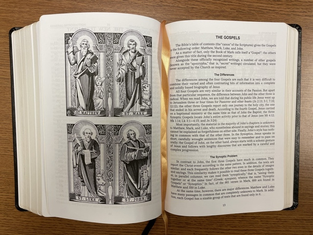
The strengths of the style of the NCB translation and notes are that they are simple, clear, unassuming, and contemporary. The dated, kitschy supplemental illustrations, presentation pages, and other fluff doesn’t jive with that aesthetic. If I were CBP, I’d lose all of that, and create a simple edition of the NCB with nothing but the translation, notes, and the nice contemporary illustrations that Leighton highlights. Those do fit in with the general NCB aesthetic of unassuming simplicity. Maybe throw in a few maps, but that’s it. I’d love a plain edition like that.
Oh, and ditch the red letter Jesus. I mean, red letter Jesus, seriously??? Who does that anymore?
I have the giant print edition and found over 10 typos in 1Kings alone. I got fed up. Can’t look at it anymore. I imagine none of these have been fixed in the new large print editions.
1 Kings 1:6 should read “He was *also* very handsome” or “He *too* was very handsome” referring to Absalom
1 Kings 1:34 remove comma from “Long live, King Solomon”
1 Kings 3:14 remove comma from “just as your father, walked”
1 Kings 7:26 “handsbreath” should be “handsbreadth”
1 Kings 7:50 “censors” should be “censers”
1 Kings 8:24 remove first comma from “servant, David, my father.”
1 Kings 11:4 remove comma from “the LORD, his God”
1 Kings 13:8-9 quotation marks need fixing
1 Kings 14:31 “Abijah” should be “Abijam”
1 Kings 16:7 missing comma at the end
1 Kings 18:12 “When I *will* have left you” or “When I leave you”
2 Kings 1:3 “no god in Israel” should be “no God in Israel” for consistency
Sharif, that’s very unfortunate. I checked, and you are correct. They were not corrected in the new edition. That sort of thing grates on me to no end. Better to delay production and take your time with the editing process. I’m sure I’ll stumble upon all kinds of errors like that as I read.
It seems to be the unfortunate norm for certain Catholic publishers. The Ordinariate prayer book was recently released, evidently without proofreading the manuscript first – apparently around three hundred errors have been found in books from the first printing. Hopefully these are all corrected quickly, nothing ruins a good book like lazy editing:
http://prayer.covert.org/DWDOerrata/?fbclid=IwAR1-3YlqP66PnKCkd7YvkNcz8AW7qw64kFivPDuWD9tLREm4ZaoxWVSxgWk
it’s the norm with new Bible translations to be ridden with errors. This is why most new translations tend to produce several quickie ‘updates’ for the first few years after initial publication.
What a sad state of affairs indeed. But I suppose it’s vastly more cost-effective to make the early adopters your free proofreaders rather than doing the job right the first time, and perishingly few publishers aren’t in this business for the money.
This exact edition is my #1 favorite Bible right now. Nothing beats its bold print and opaque paper. I love the font and the size too. The paper is so easy to flip through due to its texture and thickness. The words of Christ in red was easy to get used to. The thick, glossy, color inserts throughout the text used to bother me, until I discovered the alternative. I carefully cut them out of another NCB edition I have, and it made the Bible so floppy and actually more difficult to flip through the pages. I also saw that they switched to the words of Christ in black for their black hardcover Study Edition – Large Type, so I decided to get one. It is printed in India now instead of China, and unfortunately the paper is thinner and the print is less bold. It is much harder to flip through the pages. I feel like they are going to crinkle and crease every time I open it up. So after experimenting, I have whole new appreciation for what CBP was able to accomplish with their NCB Large Type black dura-lux. Well done!
https://www.amazon.com/Joseph-Catholic-Bible-Large-Type/dp/1947070800/ref=sr_1_1?crid=3LMIZ7C8L63NS&dib=eyJ2IjoiMSJ9.-geAzHIkCcVKMfOGFPGpQw.uNDMjxxzVCH3XxTEuJ4fO_3gBarirtGm9QeApxJWjT0&dib_tag=se&keywords=ISBN%3A+9781947070806&qid=1760024404&sprefix=isbn+9781947070806%2Caps%2C571&sr=8-1