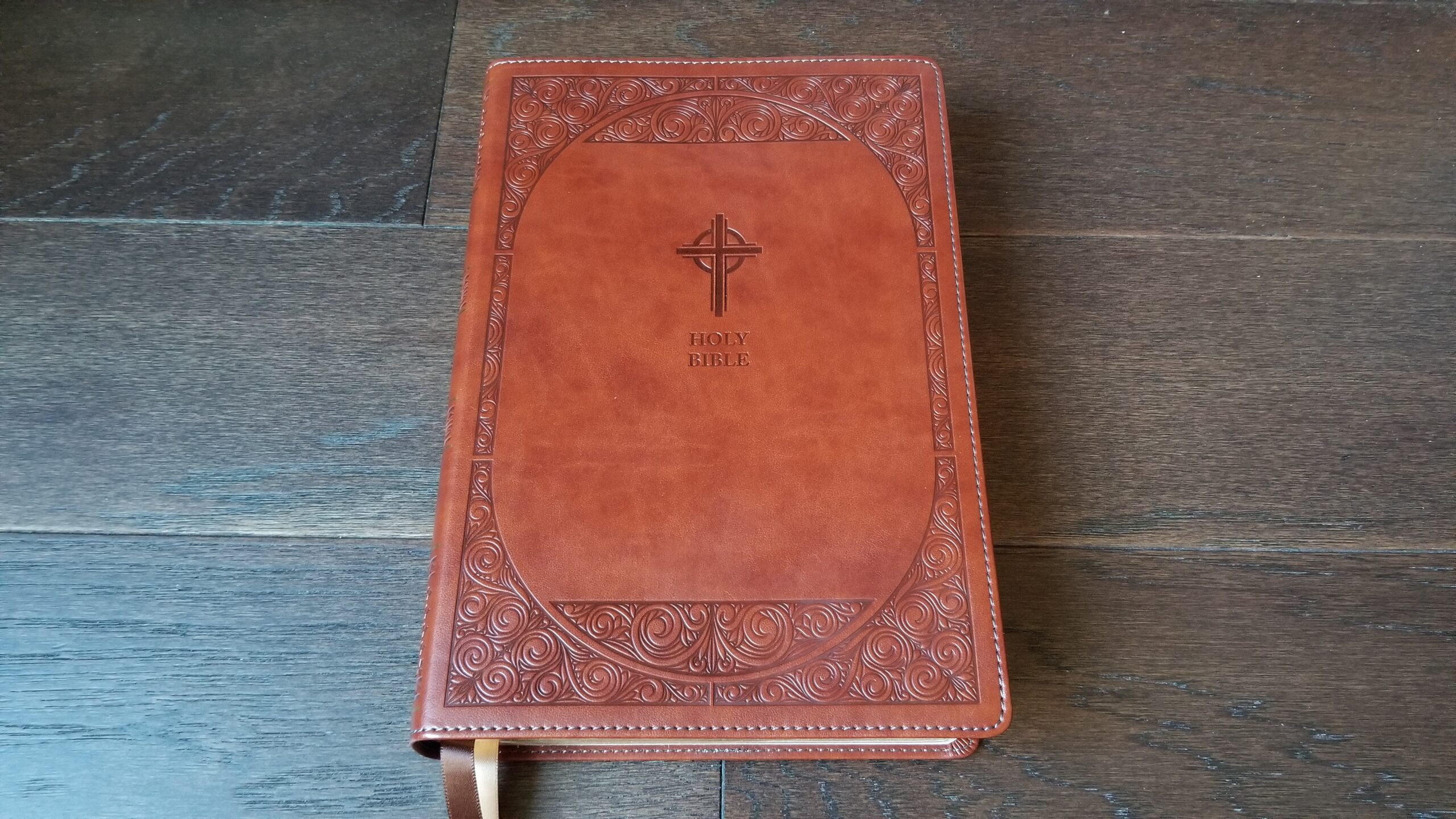
Catholic Bible Press has now released their large print New American Bible Revised Edition (NABRE). It is available in both black and brown leathersoft (imitation leather). I previewed the expected features back in April in this post, and I’ve now received my long-awaited pre-order for the brown version.
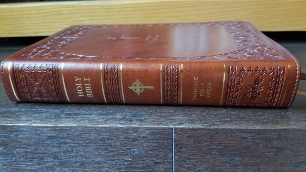
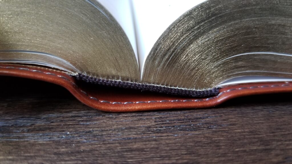
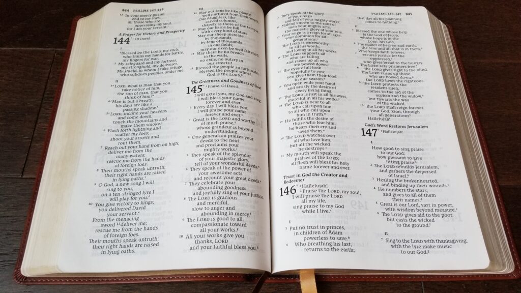
This Bible lives up to the quality that I appreciated in the NRSV-CE Personal Edition, which Catholic Bible Press released earlier this year. The leathersoft cover features embossed patterns and artwork. It is soft and flexible with stitched edges and gold printing on the spine. The paper is bright white and reasonably opaque, and the binding is sewn. There are also two 1/2-inch, double-sided ribbons.
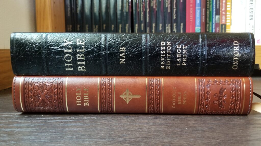
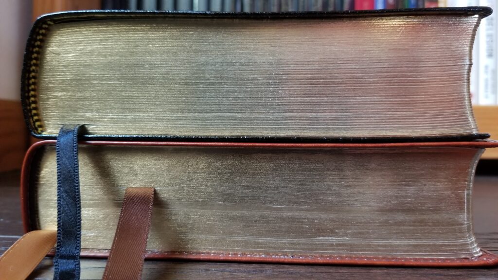
As I mentioned in the preview post, this Bible is similar in size to the Oxford large print NABRE, which has been available for several years. Now that I can compare the two side-by-side, I’m surprised at how similar they are. In real-life (which doesn’t always match the product listings!), both bibles are exactly the same length: 9 9/16 inches. The Oxford is a little narrower, measuring 6 3/8 inches wide, compared to 6 11/16 inches for the new edition from Catholic Bible Press. Finally, the Oxford is very slightly thicker, measuring 1 11/16 inches compared to 1 9/16 inches for Catholic Bible Press.
Both bibles have good quality gold gilding on the page edges. The gilding on the Oxford edition feels smoother, but both are good quality — not the spray-on gilding that publishers use on bargain imitation leather editions.
The new offering from Catholic Bible Press (CBP) also uses the same basic layout for the text as the Oxford: all the NABRE footnotes and cross-references are printed at the end of each book. In the Oxford edition, footnotes are denoted by * in the text, while the CBP uses a cross or dagger symbol. In both editions, cross references are denoted by a small lower-case letter.
The CBP edition does a much better job formatting the notes and cross-references compared to the Oxford, though. Both notes and cross-references are organized by chapter, with large bold chapter numbers and smaller verse numbers next to each note. The cross references for each chapter are arranged along the outer margin next to the notes, with one cross-reference per line. If there is not enough room, the remaining cross-references are placed below the notes for the chapter in multiple columns. This is far more readable than the cross-reference system in the Oxford, where all the references for an entire book are dumped in an impenetrable wall of text on a separate page after the notes.
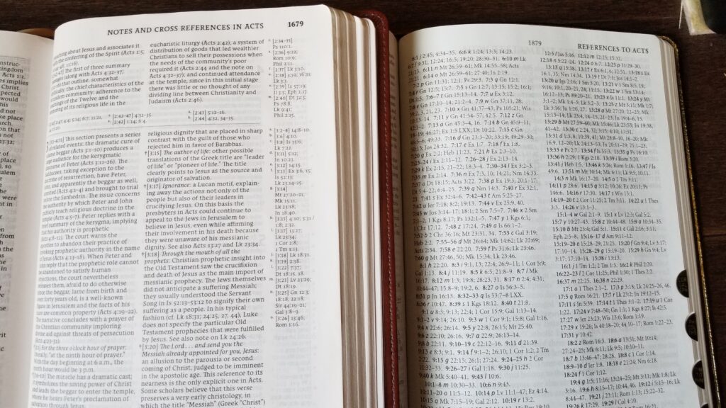
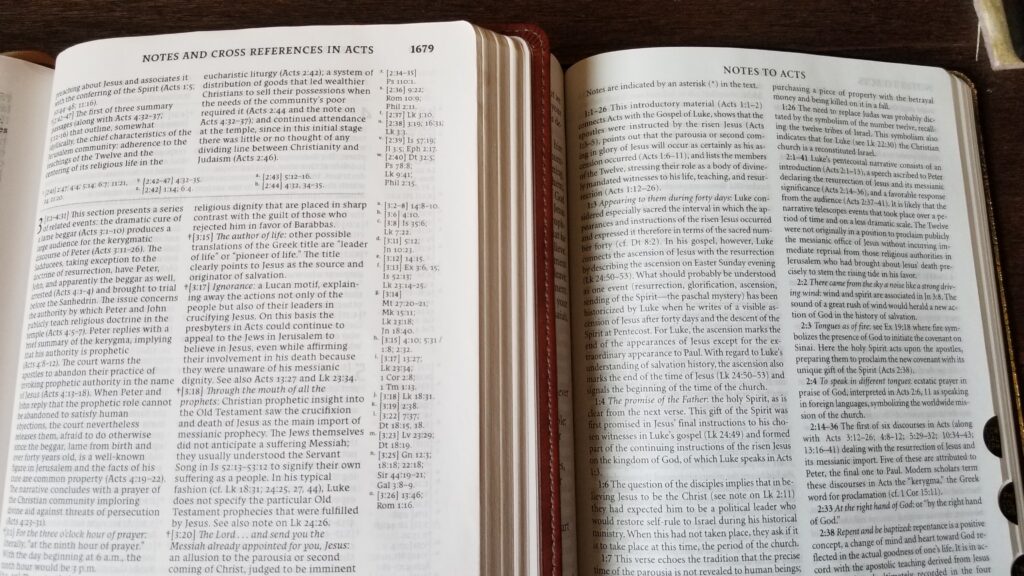
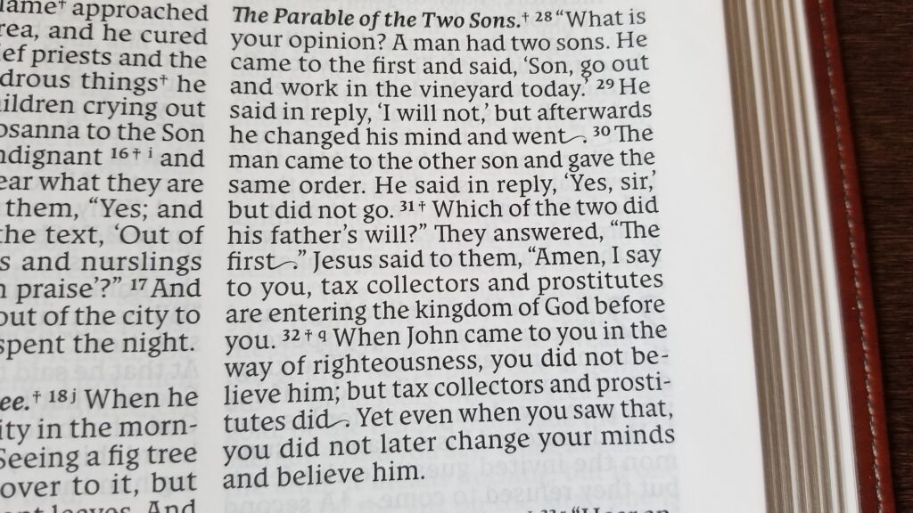
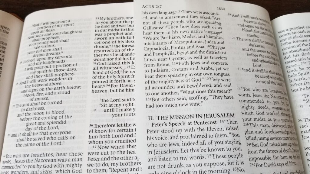
For the biblical text, CBP developed a custom font called “Catholic Comfort Print.” It is a bold typeface which looks similar to the font in the NRSV-CE Personal Edition from CBP which I reviewed in March. The most distinctive feature of this font is the elongated tails on some letters when they appear at the end of a sentence. Here is a close-up sample with a few of these flourishes:
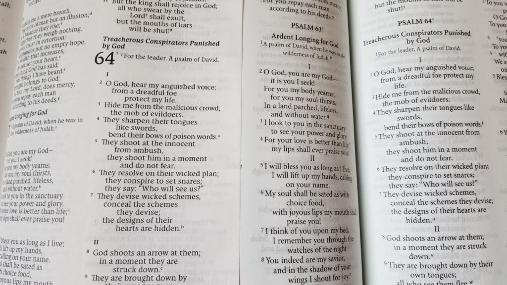
According to the advertising materials, the size of this font is 11 pts. Oxford lists a font size of 12 for their large print NABRE. Comparing the two side-by-side, the lower-case letters are identical in height between the two editions, but the Oxford font has larger upper-case letters and longer tails on letters such as p, d, t, h, etc. The Oxford font is also not as bold. The most noticeable difference is that Oxford printed their Bible with more generous line spacing, while the CBP edition looks very dense:
Overall, I find both editions roughly equal for ease of reading. The generous line spacing in the Oxford looks nicer from an aesthetic perspective, but I haven’t had any problem with the denser arrangement in the CBP edition. In fact, it’s enjoyable to read, and the bold text is exceptionally clear. The CBP edition is also line-matched, while the Oxford is not. Both editions have a similar amount of ghosting, but the line-matching, bold print, and bright white paper in the CBP edition make the ghosting less noticeable or bothersome. In some types of lighting, the Oxford has more ghosting than I’d ideally like, but overall, it is very readable.
The same observations about the fonts apply to the footnotes. Both editions use a smaller font size for the notes, but once again, the lower case letters are approximately the same height, while the Oxford features more line spacing and taller upper-case letters.
Overall, this is a nicely-done new NABRE from Catholic Bible Press. I’m surprised that it is so similar to the Oxford edition. I didn’t expect endnotes for each book, rather than footnotes at the bottom of each page. I continue to have mixed feelings about that layout. On one hand, it is nice to be able to read the text without the constant distraction of referring to notes at the bottom of the page. When the notes are at the back of the book, it is easier to resist checking a note whenever I see the footnote symbol in the text. On the other hand, it is more difficult to quickly find a random chapter-and-verse when there are so many note pages interspersed between the biblical books. I’m sure this would become second-nature to anyone who uses this Bible regularly, but it is a little disorienting as someone who is used to seeing the book chapter and verse printed at the top of every single page in a Bible.
Looking at the bigger picture, this is a well-constructed Bible with line-matching, a sewn binding, good paper, an excellent imitation leather cover, and two high-quality ribbon markers. It is an excellent alternative to the Oxford at a similar price (the Oxford is currently available on Amazon for $42.49, and the CBP is available on ChristianBook for $39.99).
I got mine a few days ago and overall I really like it!
The only disappointment for me was I prefer having the notes as footnotes. But I imagine that would have made it more difficult to do the line-matching, and might have made the page look uglier with ghosting in the footnotes area. It’s okay though, I’ve gotten used to it now, and I do have to say the format makes it a smooth reading experience.
Other than that, I like the font, and appreciate the line-matching. I also noticed the paper is slightly more opaque and yellowish than my CPB NRSVCE (large print), so it seems to me to have less ghosting than that Bible.
I just want to say, my dream for a NABRE would be the single-column OSV Catholic Journaling Bible, but with normal sized font, no journaling margins, sewn binding, and maybe make it somewhat lighter paper or lighter cover. (http://catholicbibletalk.com/2018/07/nabre-catholic-journaling-bible-from-our-sunday-visitor/) Seems like it would be easy to do, but somehow it hasn’t happened.
But the CPB NABRE will do quite well until then. This will be my go-to NABRE for some time.
The Bible looks very premium, especially the outer cover. It looks even better than their NRSV. The size looks very compact for a NABRE. If only they could make a premium RSVCE/2CE like this, it would be great.
There is a premium lay flat large print RSVCE, I have it, I love it:
https://www.catholiccompany.com/ignatius-bible-large-print-leather-cover-i120427/
This looks like a very fine first effort . Would love to see this as a thinline.
Hello! Does this bible feature the Sunday Readings and Weekday Lectionary as appendices?
No, unfortunately it does not. The only extra material aside from the normal NABRE text, notes, introductions, and cross-references is a set of color maps in the back of the Bible.
Does this NABRE by Thomas Nelson include the color maps? Thank you.
Yes. It includes 8 color maps in the back of the book.
Lovely looking Bible. I want to be sure of the dimensions – I need 6 inches by 8 inches. I like the large font.
Looking forward to hearing from you.
This bible is approximately 6.5 X 9.5 inches. The exact measurements to the 1/16th of an inch are in the third paragraph of the review. It’s significantly larger than 6 X 8 inches.
Is there any reason for the flourishes after some words? I’ve looked all over and can’t find a reason.
I heard in a review from Nickels Worth Bible Reviews that it has something to do with allowing the paragraphs to be justified perfectly with no gaps. Not sure if that’s the real reason but best I’ve heard yet.
Is the Oxford edition smyth sewn as well? I see reviews which say that it is, but on CBD and other sites it says that it is glued binding. Also when I contacted CBD and asked them about thus they said it is glued. I will decide which to purchase after I find out whether the Oxford edition is sewn or glued. Thanks! God bless
The genuine leather edition of the Oxford Large Print NABRE has a sewn binding. I just took it off the shelf to make sure, and it is definitely sewn. I purchased my copy several years ago, so there’s always a chance that they have changed bindings. But my sense is that change does not happen very quickly in Oxford’s lineup. I would fully expect it to be sewn.
Hi Christopher, did you happen to buy a new Oxford edition and confirm if it had the sewn binding? I’m in a similar situation as you were earlier this year. Thanks!
Between the CBP and Oxford, which would you say has higher quality paper?