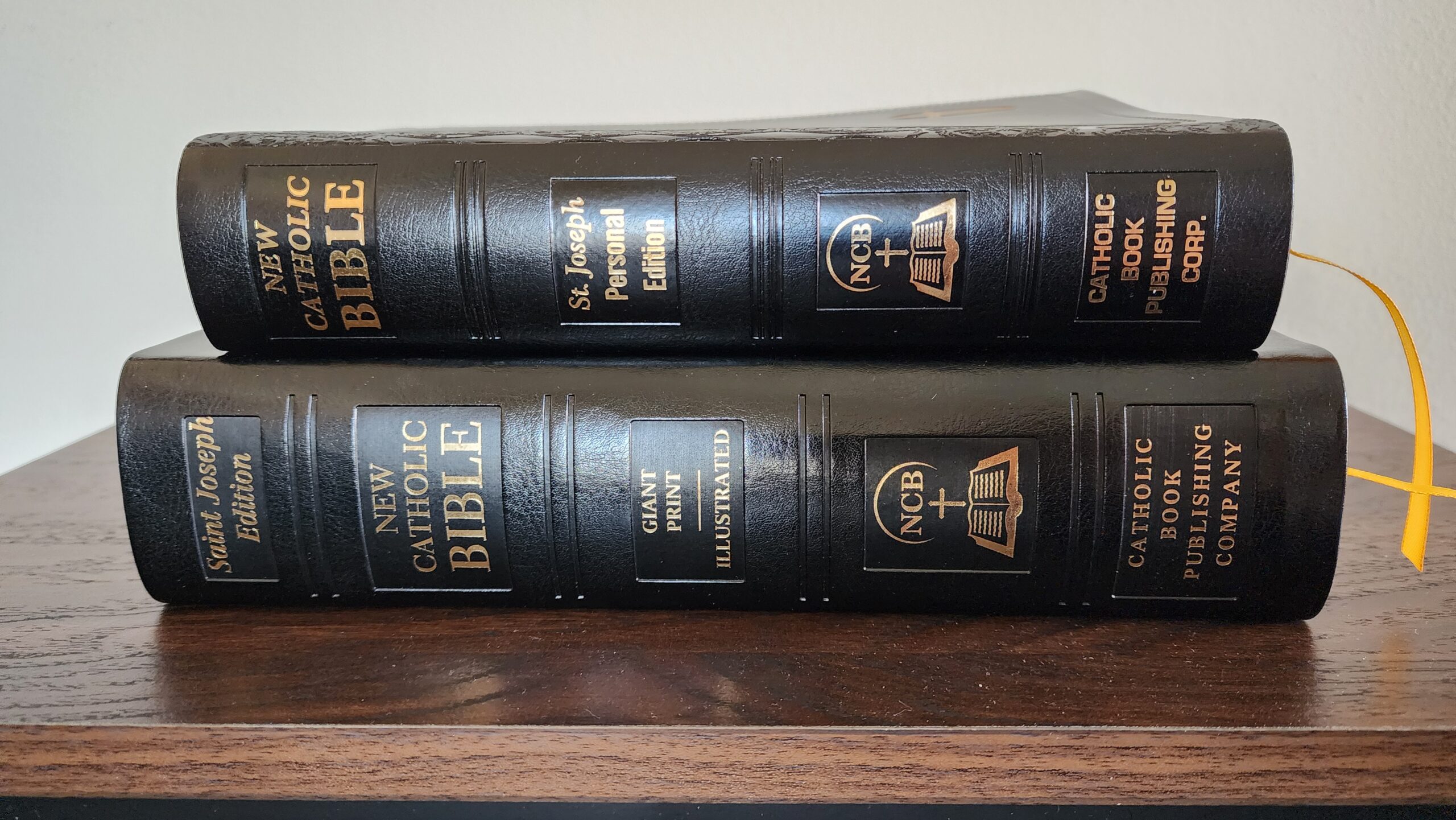
I recently purchased a Personal Size edition of the New Catholic Bible at a Catholic bookstore. When the complete Bible was first released in 2019, I received a review copy of the Giant Print edition from Catholic Book Publishing Corporation. They have subsequently released a full range of gift editions, large print editions, and youth bibles.
I reviewed the giant print edition here, and I also published an in-depth look at the translation and footnotes in the NCB beginning with this post. For anyone interested in the large print option, blog reader Leighton provided a guest review on the blog here.
I’ve hesitated to buy the personal size edition for a while. The main drawback for me is that all of the personal size NCBs are red-letter editions (where the words of Jesus are printed in red). I prefer plain black text. But I finally caved. The giant print edition is very nicely constructed, and I enjoy having the notes at the end of each book, rather than distracting me while I’m reading. But it is one of the largest bibles I own and very impractical to transport. The personal size edition is much more practical.
Physical Construction
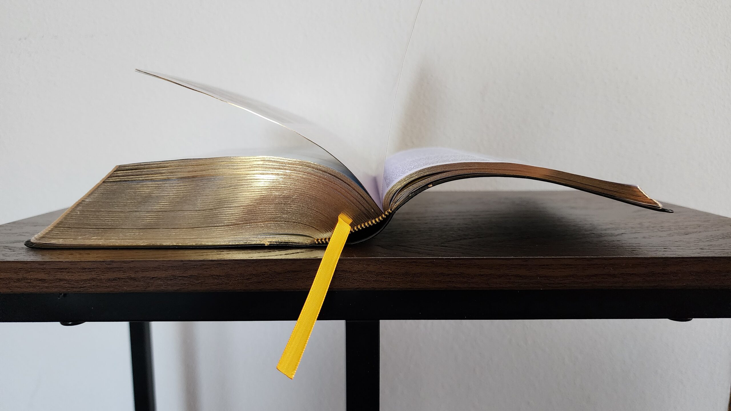
My copy measures approximately 8.5 inches long by 5.9 inches wide. The thickness is 1.75 inches. The Dura-Lux imitation leather is the same good quality as the giant print edition and feels similar to the alpha cowhide imitation leather on the Great Adventure Bible.
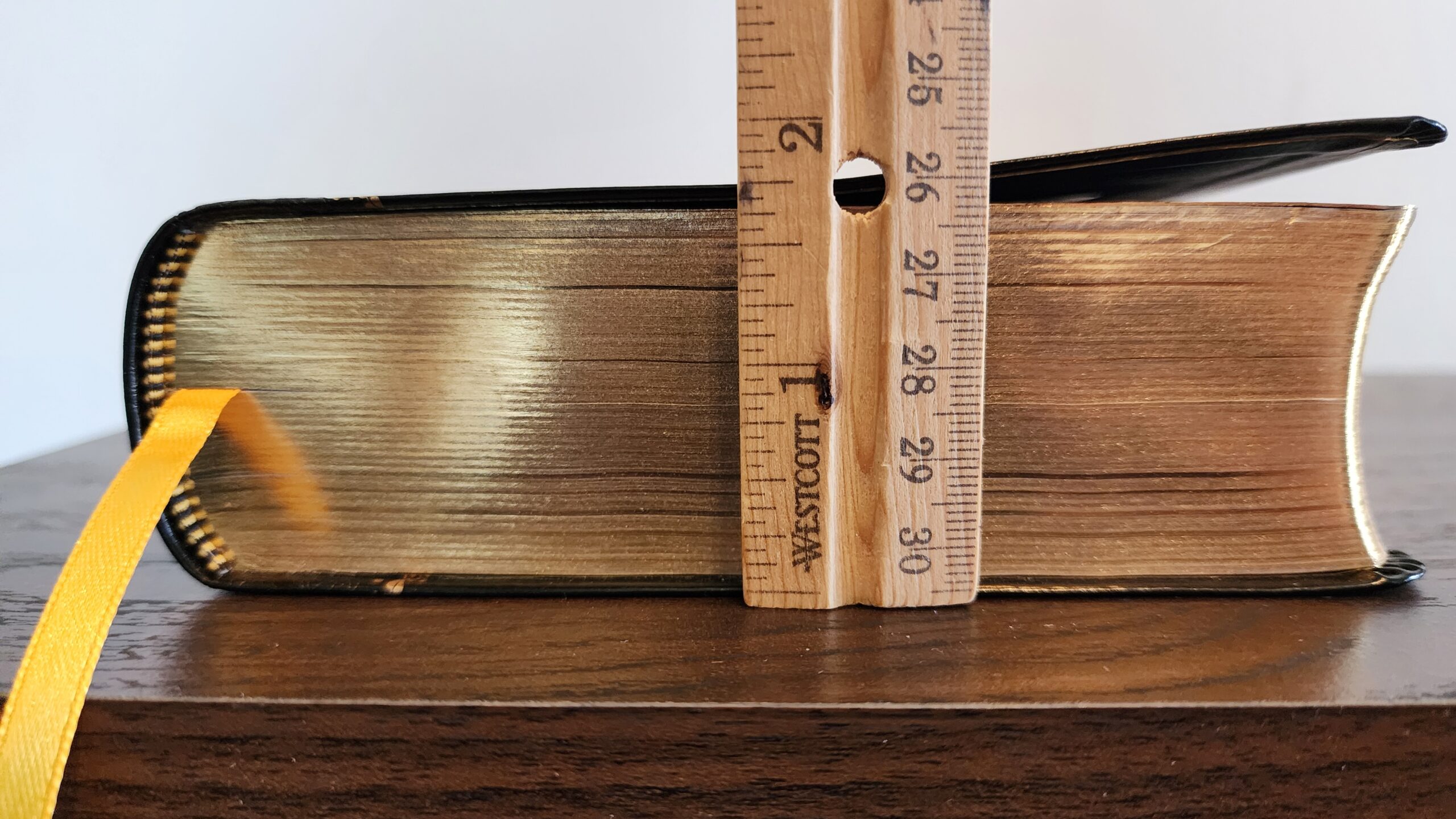
The binding is sewn, with one basic ribbon marker and good quality gold gilding on the page edges.
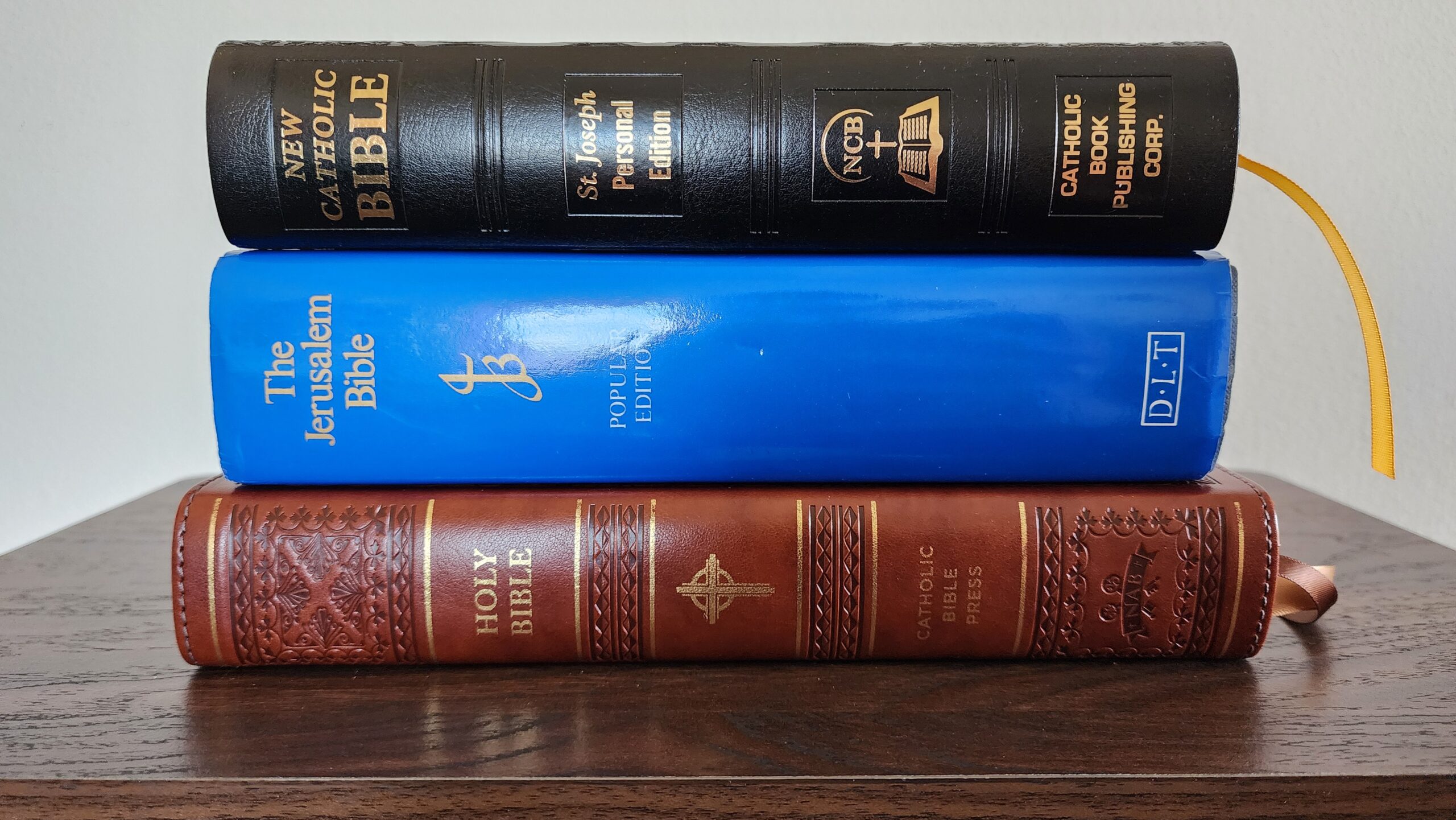
Looking at the other bibles on my shelf, the closest in size is the hardcover “popular edition” of the original Jerusalem Bible, published by Darton, Longman, and Todd (which appears to be no longer in print, but there is an Amazon listing for used copies here). The Jerusalem Bible is a bit thicker than the personal size NCB, but the overall size is similar.
Another point of comparison is the large print NABRE from Catholic Bible Press (which I reviewed here). That edition (which is my favorite edition of the NABRE currently available) is longer and wider than the personal size NCB, but also a bit thinner.
Pages, Font, and Typesetting
The paper is a standout feature of this Bible. It is bright white and extremely opaque with very minimal ghosting. I would rank this among the best bible paper I’ve seen for readability and opacity. It doesn’t have the premium, silky feel of the Schuyler RSV, but for practical readability, it is top-notch.
The biblical text is printed in clear font with a somewhat dense page layout (white space is fairly meager). The text is very readable. The promotional materials do not list a font size, but it is very comparable to the 8 point font in my Cambridge REB.
Footnotes are printed at the bottom of each page in a different, smaller font. The font used for the footnotes is one complaint I have about this edition. The style of the font does not work very well for me at such a small font size. It takes effort to read, and I suspect it would have been easier to read if they used the same font as the biblical text—just in a smaller size. It isn’t illegible, but the notes are more difficult to read than I would like.
As I mentioned at the outset, the words of Jesus are printed in red in the New Testament, and as much as I don’t like red letter editions, the red printing is well-done. The color is a vibrant crimson—a shade darker than pure bright red, but not dark enough to be called burgundy. The print quality seems consistently bold throughout. I have no trouble reading it. I prefer not to have the distraction of different text colors, but I have no complaints about the readability.
For the sake of comparison, I’ve included a side-by-side photo below of the NCB and the Great Adventure Bible, which has very subtle red lettering. The NCB’s red letters are much more vibrant in color compared to the darker burgundy color in the GAB.
Extra Features
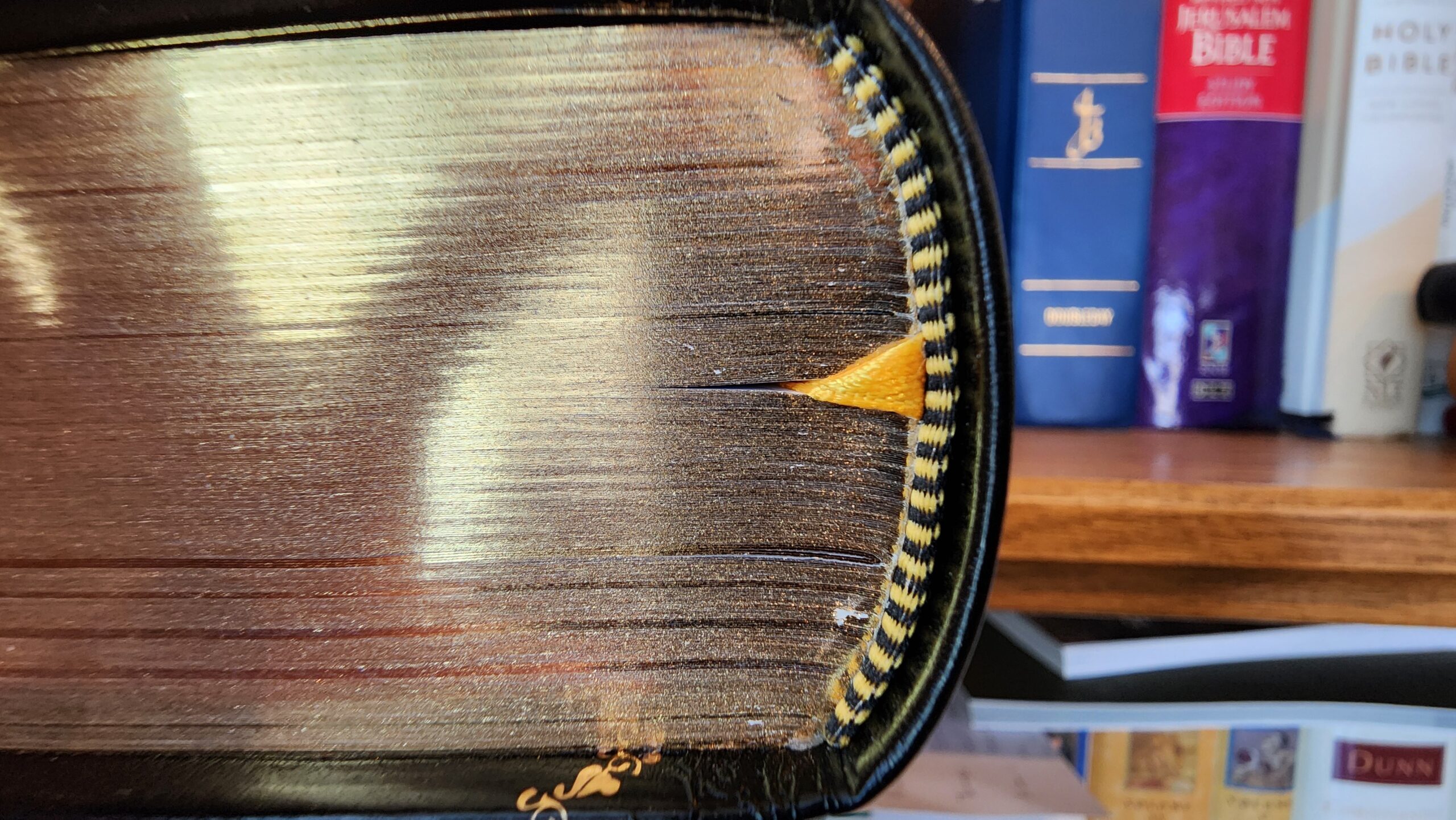
Like all St. Joseph Edition bibles from Catholic Book Publishing Corporation, this Bible has multiple glossy color pages interspersed through the biblical text with illustrations, Catholic devotions, and background information about the Bible. The photo below shows the beginning of a multi-page section on the rosary that is placed in the middle of St. Paul’s letter to the Romans.
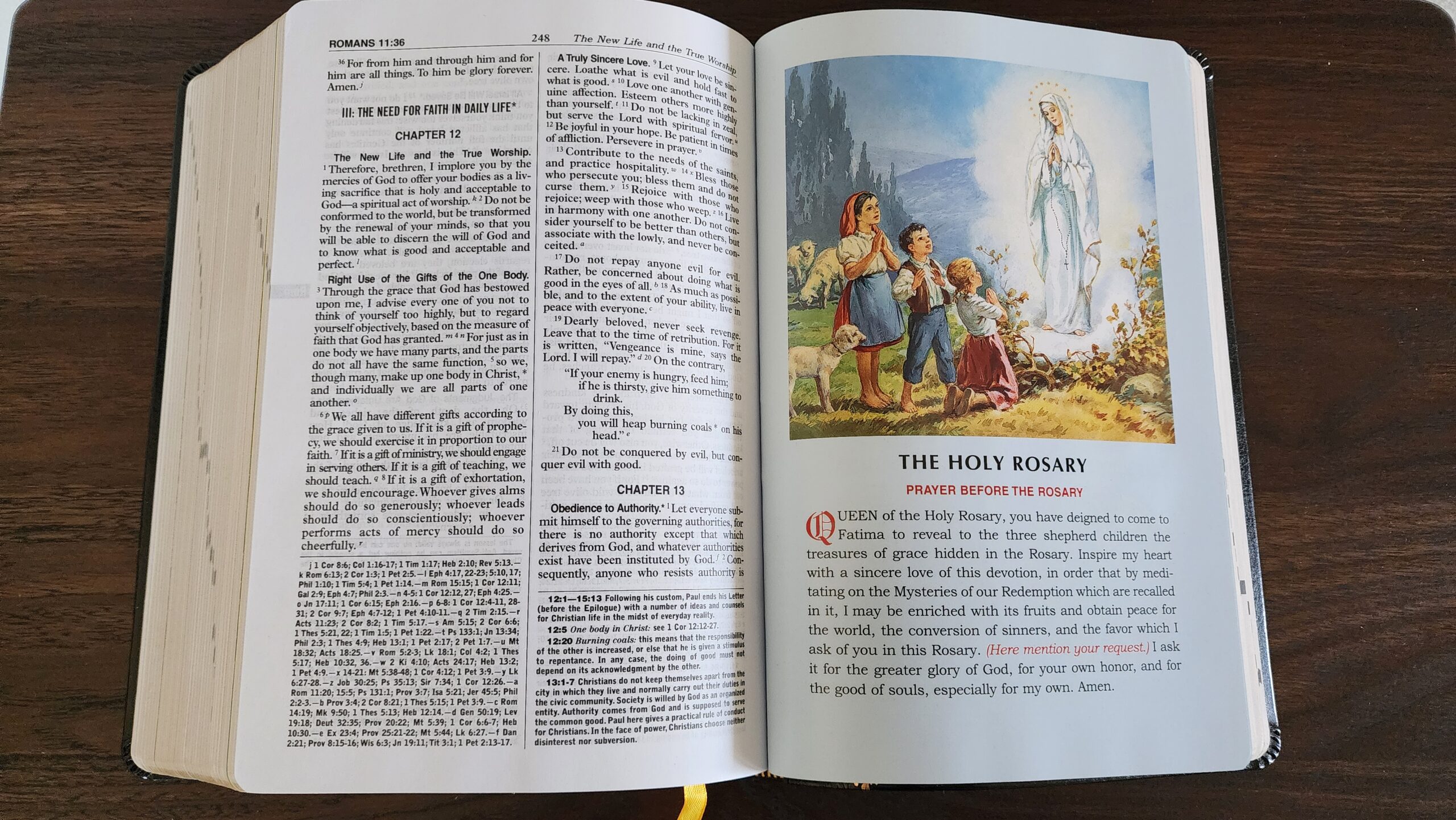
These color inserts are the biggest thing I dislike about St. Joseph Edition Bibles. The glossy paper is a different weight and thickness compared to the rest of the Bible, and if I have the misfortune of reading a passage close to one of the inserts, the stiff, glossy paper will pop up and refuse to lay flat. Here is what happens if you try to lay the Bible open at the end of a color insert section:
If the supplemental material was printed on the same paper as the rest of the Bible, I would be far less bothered by it, but I am very annoyed by the stiff glossy paper interspersed randomly throughout the Bible. In some cases there is no rhyme or reason to the location—just like the insert on the rosary placed randomly in the middle of Romans. The variations in paper weight make it difficult to smoothly flip through the Bible while scanning the book and chapter numbers in the header. Instead of smoothly flipping, the pages lurch as my thumb moves past each glossy section. Unfortunately, Catholic Book Publishing Corporation adds these color inserts to all of their premium Bibles, so the only option is to cope with them if you want a nice edition of the NCB.
Conclusion
On balance, I’m glad to own this personal size NCB. It is much more portable than the giant print edition, the paper is excellent, and the binding, gilding, and Dura-Lux are good quality. The two main drawbacks for me are the red letter printing for Jesus’ words (the print quality is excellent, but I prefer plain black text) and the abominable glossy color inserts placed randomly throughout the text like speedbumps on a wide open highway. If there were any Dura-Lux editions without the color inserts, I would have gladly bought one, but distressingly, there are none.
Catholic Book Publishing Corporation offers a nice selection of colors for their Dura-Lux covers. The full lineup can be viewed on their website here. The exact prices vary by color at Amazon, but generally these editions sell for somewhere between $30 and $40.
There is an edition of the New Catholic Bible that is a personal size that is NOT the St. Joseph edition and does NOT include the glossy thick paper inserts. It is the New Catholic Bible Deluxe Gift Bible and is available on the Catholic Book Publishing website: https://catholicbookpublishing.com/products/ncb-deluxe-gift-bible-burgundy-w2404-13bg?_pos=1&_sid=162714151&_ss=r
The one negative is that it is also a red-letter edition. IMO it’s the best option available for the NCB. I’m praying for a compact size sooner rather than later.
Oh, this is very good to know! Thank you. That looks very similar to an old edition of the New American Bible I have, which I think was published by World Publishing.
I’ve always wanted to know and have never found an answer, but what is a “St Joseph Edition”? I’ve seen this everywhere and I have no idea what it means. I even have a copy of the Sunday Missal that says “St. Joseph Edition” on the cover.
Biblical Catholic the description of the St. Joseph Edition below is taken from the New Catholic Bible page 5 in the Personal Size as well as the Large Size.
“The St. Joseph Edition is an editorial system developed over a span of fifty years. It consists in a series features intended to ensure that a text (particularly a biblical or liturgical text) is user friendly, leading to greater readabiltiy and easier understanding.
The textual features or format include large readable typeface, additional headings and subheadings, and a full measure extension for long lines of poetry that clearly indicates when a line has runover. It also includes general introductions to the Old and New Testaments as well as introdcutions to each Book……….
As for the Sunday and weekday Missals the editorial feature besides explaining the Mass etc is having those little arrows that indicate contintue on page or go to the Mass of Day/Common.
Absolutely a great edition. There’s still the red letters and the cover material is cheapy but still holds up well. I loved my personal size but the glossy pages really got to me as well I pick up this edition and has made a huge difference in using this version.
I have a copy, and generally like it and the translation. Nice bold text, and the footnotes are not heretical, like in the NABRE. My only criticism is the red lettering. Red letter bibles are cheesy and should be banned.
I disagree strongly that the NABRE’s notes are heretical, and in my view that is a slanderous claim. The US bishops sponsored the translation and reviewed and approved the notes.
There are certainly drawbacks to the NABRE notes. They focus almost entirely on trying to understand the text in the context that it was written in, rather than interpreting the text in light of later theological reflection and Church teaching. This puts a greater onus on the reader to re-integrate the historical information provided by the NABRE notes into their present life and faith. The NCB notes try to integrate historical information with the perspective of faith, and that is helpful to readers who want to understand what scripture is saying to them today.
“Heretical” is indeed a strong term, but it cannot be denied that the notes all too often cast doubt on both the truth of the scriptures and the teachings of the Church. I don’t think they endorse any heresies, but they are bad and need to be rewritten. I hope they will be, but I’m not holding my breath.
It really depends on what the goal of the notes is. In my experience of reading the NABRE notes, they have a limited goal of elucidating the historical context and probable meaning of the text on its own terms. They are not intended to provide theological reflection or spiritual edification. Keeping in mind the intended goal, I think the NABRE notes are excellent. They aren’t the be-all-end-all, and they must be paired with other resources for theological and spiritual commentary. But I really like the NABRE notes for their detail and single-minded focus on understanding the text on its own terms.
For a general purpose Bible, I can certainly see an argument that the notes should be more like the NCB’s notes, because they provide an integrated one-stop solution for readers. But for deep study, I love the NABRE’s notes and am very grateful to the translators for providing them and the bishops for having faith in normal Catholics to engage with the Bible and their faith in a deep way.
The notes say things like “This verse has often been used to refer to Purgatory but that is not what it has in mind” on I Corinthians 3:15. To say that this verse has been frequently cited is an understatement
. It was cited by everyone from the Church Fathers to Thomas Aquinas to the Council of Trent, to defend the doctrine of Purgatory. Yet this note insists, without explanation or proof, that they are all wrong and that it isn’t about Purgatory at all. What is it about? Not Purgatory that’s for sure. I’ve seen this note cited by fundamentalists in debate as “proof” that “even the Catholic Church now admits that Purgatory is a false doctrine”. How am I supposed to respond to that, because that clearly seems to be what the note is implying?
The way I see it, that note is stating the translators’ judgment about whether Paul had the doctrine of purgatory (as it is understood in current Church teaching) in mind when he wrote that sentence. It can be simultaneously true that Paul did not have a later notion of purgatory in mind when he wrote and that later theological reflection saw in this verse an expression of what the Church would come to understand as purgatory.
The fundamentalists who cite notes like this as proof that the Church admits that purgatory is a false doctrine are stealing a base. They are operating on the basis of sola scriptura, and if the Church does not object to scholars saying that Paul might not have had purgatory in mind when he wrote, therefore, purgatory must be false. But Catholics don’t accept sola scriptura. And the truth of the faith doesn’t depend on whether a particular biblical author had a fully-formed notion of Catholic teaching or not.
It is a logical fallacy for fundamentalists to take heretical or dissenting Catholics and use those damning quotes as “evidence” against the Church. They will also cite people like Raymond Brown and his apparent dismissal of Mary’s Perpetual Virginity or Hans Kung and his denial of Papal Infallibility as evidence. Of course, these situations are selective because if anything, they prove too little. Hans Kung didn’t just deny Papal Infallibility, he rejected the Resurrection the Trinity, and pretty much every belief of Christianity. Raymond Brown didn’t just seem to deny Perpetual Virginity, he seemed to deny the virginal conception as well.
These kinds of citations are also selective because they don’t understand the nature of the objection these sources offered. Raymond Brown is an odd case, he seems to say that “historically” there is no evidence for various doctrines, but “by faith” we know they are true. I don’t even know what that means, but that is the kind of stuff he said to avoid charges of heresy.
But these “Bad quotes” are difficult to respond to in general.
Says more about the US bishops than anything else…
Nailed it, JP.
Yes, Marc, they are without a doubt heretical. See, e.g.,, the note accompanying Matthew 16:21-23. It casts doubt on whether Christ knew he would die on the Cross:
“This first prediction of the passion follows Mk 8:31–33 in the main and serves as a corrective to an understanding of Jesus’ messiahship as solely one of glory and triumph. By his addition of from that time on (Mt 16:21) Matthew has emphasized that Jesus’ revelation of his coming suffering and death marks a new phase of the gospel. Neither this nor the two later passion predictions (Mt 17:22–23; 20:17–19) can be taken as sayings that, as they stand, go back to Jesus himself. However, it is probable that he foresaw that his mission would entail suffering and perhaps death, but was confident that he would ultimately be vindicated by God (see Mt 26:29).”
That kind of modernist garbage does not belong in a Catholic bible.
Once again, this debate really comes down to what readers expect from biblical footnotes. If they expect the notes to teach doctrine in a way equivalent to the Catechism of the Catholic Church, then they will find the NABRE notes woefully deficient.
The goal of the NABRE notes is not to teach doctrine, but to understand the meaning of the text from a historical-critical perspective. This perspective is limited, because it intentionally avoids considering any later theological reflection and focuses only on what can be known from the text itself and the historical context. Just like the statement about purgatory in the NABRE notes to 1 Cor 3:15 which Biblical Catholic mentioned, the “probable” statement in the note you quoted should be taken in the same light (i.e. what can a historical-critical scholar conclude about what this passage says based on the available textual and historical evidence?). It is not the final word on the matter because it is not engaging with any theological or doctrinal reflection.
From a Catholic theological perspective, we can go further and say that Jesus “enjoyed in his human knowledge the fullness of understanding of the eternal plans he had come to reveal.” (CCC 474). While the NABRE note concludes from historical methods alone that Christ probably foresaw suffering as part of his mission, the Church, on the basis of more than limited historical methodology, affirms that he fully understood the plans he came to reveal.
“The goal of the NABRE notes is not to teach doctrine, but to understand the meaning of the text from a historical-critical perspective. ”
Marc, I am fine with that. But the author of the note deliberately went out of his way to bring Christ’s divinity into question. This is the kind of modernist liberal goofiness that a graduate theology student at Fordham in 1975 would write. These kinds of notes do not belong in an “official” Catholic bible. About 120 years ago, if St. Pius X saw this kind of note in a Catholic bible, all copies would be seized and burned, and the author would face severe repercussions. Thankfully, the NCB steers clear of this 1970s felt-banner nonsense.
Dear Marc,
In appreciation for your great efforts, I would like to give you a kind “fraternal correction” prompted by this very terrififying affirmation of yours about St. Paul, no less, a few comments above: “The truth of the faith doesn’t depend on whether a particular biblical author had a fully-formed notion of Catholic teaching or not”.
Be careful with this fascination with the historical-critical approach of Bultmann, Käseman, the New Hermeneutic and all their various “geschichtes”, “genres” and the like. They are but poisonous products of the protestant “free interpretation”. This pernicious method only leads to dissecting and desacrating the Bible as merely a collection of old human writings and “flawed and unsophisticated mythologies”. It produces inexorably an absurd inferiority complex on Catholics (who possess the wealth of the multisecular Magisterium), proudfully inflated egos, overblown self complacency on one’s pretended academic prowess, utter contempt for Latin and its Biblical tradition, disrespect for the Church’s doctrinal authority [like saying that St. Paul lacked fully-formed notions of the Christian faith] and ultimately loss of faith in Holy Scripture as the divinely inspired revelation for human salvation… and appreciation and justification of heretical footnotes. Please, we’ve had way too many of those destructive “Bible experts” as it is. We don’t need any more.
The notes might not be intended to teach doctrine, but that is no excuse for denying or casting doubt on doctrine which many notes do.
I’m sympathetic to those points, Jim and BC. Again, it comes down to the goal of the notes in my opinion. And in that sense, I think Adrian’s point in his comment further down the page is apt: “the NABRE notes seem far better suited to a Bible aimed at scholars and historians than at the general Catholic audience the Bible was intended for.”
If I read the NABRE notes as written by historical-critical scholars for other historical-critical scholars, they seem far more defensible. For example, the note on Matthew 16:21-23 could then be understood this way: It is a common academic hypothesis that the passion predictions were not actually spoken by Jesus and that they were composed by the evangelists (or their source material). The note is taking a middle ground in that debate. On the one hand, it cannot be proven with historical-critical methods that the passion predictions were spoken in their current form by Jesus (the note acknowledges this), but the note also challenges scholars to consider that Jesus’ anticipation of his suffering and even death cannot be dismissed out of hand on historical grounds, and it is even historically probable that he did expect those things.
This is a far cry from the richness of what can be said through faith, and I do understand that it can easily be taken as a denial of Jesus’ knowledge of his mission by someone who expects the notes to be offering theological and doctrinal insights.
Ultimately, these historical speculations about what Jesus might have known, thought, or said using entirely historical-critical methodology end up using a lot of conjecture, and I don’t find them very helpful. So it wouldn’t bother me in the least if that note was left out.
Perhaps Trent Horn’s “cringey notes” for the NABRE would be more palatable?
https://www.catholic.com/audio/cot/cringey-notes-in-the-catholic-new-american-bible
Yes, that’s a decent video, and I don’t even care for Trent Horn that much. EVEN HE has issues with the NABRE.
And besides the awful footnotes, it is without a doubt one of the worst translations I have ever read from the standpoint of prose style. E.g., 2 Timothy 4:2, the RSV has ” preach the word, be urgent in season and out of season, convince, rebuke, and exhort, be unfailing in patience and in teaching.” Here’s how the NABRE mangles that: “proclaim the word; be persistent whether it is CONVENIENT OR INCONVENIENT; convince, reprimand, encourage through all patience and teaching.
Barf. The NABRE is the English literary translation equivalent of brutalist architecture. It lacks all soul and grace.
The problem with what he says is at the beginning: the NABRE is used in Mass “because it is simple and easy to understand”. Umm…frankly no. The NABRE is used in Mass because it is owned by the NCCB through the Confraternity of Catholic Doctrine and is thus a source of revenue.
It is actually NOT a simple or easy to understand translation, it requires a much higher reading level and a more advanced English vocabulary than nearly any other Bible on the market today. The sentences tend to be lengthy with many subclauses, and uses multisyllable words are used when a single syllable word would be more than adequate.
I could give many examples of this but perhaps the best example is from the book of Numbers. Most modern translations say that Moses a group of Israelities to ‘spy out the land” or words to that effect. The NABRE uses the most more advanced and difficult (and also much more accurate) “reconnoiter”. There is no way that “reconnoiter” is “simple and easy to understand” as Trent suggests. Most readers will probably have to get out a dictionary and lookup what this weird word “reconnoiter” even means before they can understand the story.
This is only one of several examples that I could give. I’m not saying that the high reading level required makes it a bad translation. In my mind, it actually makes it very good. But Trent is simply wrong when he says the NABRE was chosen by the bishops because it is “simple and easy to understand”, it is anything but.
In this case, a footnote would be helpful:
“sent on Recon”
That way at least the folks with military experience would feel included.
🙂
You don’t have to look any further than the opening of Genesis to see what’s in store:
“In the beginning, when God created the heavens and the earth — and the earth was without form or shape, with darkness over the abyss and a mighty wind sweeping over the waters — Then God said: Let there be light, and there was light.”
Good God, that’s a hot mess of a sentence. It’s grammatical, yes, but horribly stringy, filled with subordinate phrasing and a long parenthetical passage, with the result that the subject and verb get kicked all the way down to the third verse (“God said”). Even if you want to grammatically subordinate the creation of the heavens and the earth, and a case can be made for that, there were still numerous ways to write the opening of Genesis with far more felicity than the NABRE translators did.
It’s just an ugly, graceless translation overall.
I’ve definitely done my share of criticizing the NABRE’s English style. The stilted language in the New Testament has bugged me for a while. My least favorite phrase is “said in reply.” Why not simply say “replied” or “responded”?
In spite of all that, I’m starting to come back to the NABRE for Bible reading and study after using the RSV-2CE, REB, and NRSV as my primary translations for a good number of years. For quite some time, I’ve felt that the ideal translation should convey something of the range of writing styles in biblical literature without smoothing it all out. And I’m starting to think, somewhat begrudgingly, that the NABRE might achieve that better than many others. In the New Testament, it can be downright tortuous with Paul’s run-on sentences. But I’ve recently been studying the Book of Wisdom and found that the NABRE’s rendering is quite sophisticated with good style and a range of vocabulary. From the commentaries I’m reading, it sounds like that is very much true to the style of the Greek text. One commentary suggested that Wisdom is one of the most erudite and refined pieces of Greek in the biblical corpus.
Adrian,
The use of dashes looks similar to how Dr. Michael Heiser laid out the beginning of Genesis. To reword the NABRE in Heiser’s way, I think it’d look like this:
“When God began to create the heavens and the earth — and the earth was without form or shape, with darkness over the abyss and a mighty wind sweeping over the waters — then God said, ‘Let there be light,’ and there was light.”
As you said, though, there are much better ways of writing it than how the NABRE did. Both the NRSVue and Robert Alter do a much smoother job of using the “When God began to create” reading.
One of the problems I have with modern Bible translations is how translators try to smooth out all the differences between the various books to make the entire Bible sound exactly the same.
This isn’t the best way to translate, far from it. If you go back to the original languages, there are parts of the Bible that are better written than others.
The Greek in the Gospel of Mark is, to put it bluntly, written in a rather crude and uncouth form of Greek, exactly what might be expected from an author whose native language is Aramaic and who is not very knowledgeable about Greek and is writing in a kind of broken Greek because it is the best he can do.
On the other hand the author of the Gospel of John (probably not John the Apostle himself but rather a scribe writing down what John told him perhaps not reaching its final edition until after the apostle’s death) is an expert in Greek style, his Greek is polished and elegant, the Gospel is filled with the kind of clever puns and wordplay that only a very skilled author could write.
And yet, in most translations, Mark and John sound exactly alike, as if they were both equally skilled in Greek, This is at best misleading.
Similarly, Paul’s Greek is good overall, but his style is erratic, he writes ridiculously long sentences with half a dozen subclasses and he jumps around from topic to topic in nothing like a logical order. Parts of his work almost seem to anticipate the “stream of consciousness” style of 20th-century authors like James Joyce or William Faulkner.
Unlike most translations, I think the NABRE does a decent job of preserving the original voice and style of the original.
And frankly for all the complaints about its clumsy and awkward style, I think the awkwardness is mostly the result of trying to be as precise as possible in conveying the meaning of the original.
If the choice is between elegance and accuracy, translators should choose accuracy 100% of the time. This is one of the problems I have with the whole school of dynamic translations like the NIV or the NLT, they want to make everything elegant, simple, and easy to understand, and they are willing to sacrifice accuracy to achieve that.
I don’t understand why some people rank the NABRE as a “dynamic” translation, it is anything but, almost all of its faults stem from its hyper literalism. I would rank It in some places as even more literal than the NASB, which is usually said to be the most literal translation in print.
This is in reply to Biblical Catholic’s reply of April 28th at 11:54 AM. Thank you so much for your insight regarding Bible Translations that try to translate the Bible, so it reads as if the whole library of books was written by one author. This is something I have not always considered when reading a translation. A question to ask when reading, studying or praying with the Bible is: When does translation end and where should editing begin? There is no simple answer to this question as the translation must be readable and comprehensible to today’s reader. I would suggest that we can say that editing has gone too far when the whole Bible has the same look and feel. In the future, I will be wary (just a little) of any translation that continuously ignores the differences between prose, song and poetry (My guess is that almost all poetry was probably song).
Thank you Biblical Catholic!
And, the last time you’ve heard someone say, “I’m gonna go spy out the land” . . . ?
Marc says: “I’ve definitely done my share of criticizing the NABRE’s English style. The stilted language in the New Testament has bugged me for a while. My least favorite phrase is “said in reply.” Why not simply say “replied” or “responded”?”
Maybe, the NABRE translates it that way, because it’s exactly what the Greek states . . . ?
Thanks for the review. I seem to remember that in the original edition there were quite a few typos. Do you know if they have been corrected?
I went back through the comments on previous NCB posts to find the typos readers reported. I can confirm that Acts 18:25 (“baptism of God”), Psalm 97:4 (“lightnwing”), and Ben Sira 41:4 (“of the God”) have been fixed in the personal size edition which I’ve reviewed here.
The mostly grammatical errors noted by Sharif in the comment linked below have not been corrected, though.
https://catholicbibletalk.com/2021/01/first-look-large-print-new-catholic-bible-ncb-guest-post-by-leighton/#comment-5642
Thanks for this. Not yet time to order the NCB. I hope they fix the errors.
There was a Psalm (forgot what it was, as I gave my copy away) in the NCB that had 3 verses that sort of repeated: I copared to the Ignatius Bible, and the verses did “repeat”, but with a change each time, whereas in the NCB, the verses remained identical. So there may have been some oversight there as well.
Unfortunately, as I said, this was a while ago, and I forgot what Psalm that was. Sorry
Wow the red lettering is distracting
It looks like Catholic Book Publishing is revamping its website to offer some new options. Or maybe they’re just reshuffling things. Not sure. I find it peculiar that the links to their pages discussing the NCB translation go to “not found” pages. It’s such a good translation, and yet it seems to get so little attention, even on the company’s own website.
I have an inexpensive personal-size NCB from Catholic World Press, one of CBP’s imprints. It lacks any of those color inserts, and I’m kind of glad about that. I had one of the giant-print editions when the NCB first came out, and I remember how those stiff inserts would pop up and refuse to lay flat.
Another interesting thing about those inserts is that CBP doesn’t seem to have updated some of its artwork in decades. I have a St. Joseph Edition NAB from 1970/71, and the inserts look just like the ones I had in my 2019 NCB. Even the covers on a lot of their editions seem not to have changed in a long time and throw off a kind of ’60s/’70s vibe. Peculiar editorial choice, but maybe CBP thinks that if it isn’t broken, don’t fix it.
Try this links:
https://dev.catholicbookpublishing.com/new-catholic-bible
https://dev.catholicbookpublishing.com/new-catholic-bible/faqs
I’d really like to add the NCB to my library, but I get so bothered by uncorrected typos, especially in Bibles. Those grammatical errors mentioned above would eat away at my mind the entire time it sat on my shelf. Same reason I tracked down an original Knox version printed vs. the Baronius version, since the latter still had minor uncorrected typos in it at the time (idk if it still has them). At the end of the day, I’ll stick with the Jerusalem Bible and Confraternity-Douay for the same niche.
I have one of these in Burgundy and I really enjoy it. The size is just about perfect. As for the color inserts, my biggest gripe is the art style looks like it’s from the 1970s. Almost a parody of old style 70s cheese. Doesn’t belong with the nice format of this Bible, in my opinion. But then again, that’s Catholic Book Publishing, who seems to thrive on conservative, old school editions.
But it’s a clearly minor quibble and, if viewed from that perspective, seems quaint and wholesome.
The art literally is from the 1970s. I have one of their NAB editions from 1970-71. It has the same artwork that my 2019 giant-type NCB did. Seems odd that they’d choose not to freshen up their publications more than they do.
Biblical Catholic,
I wince every time I hear a Muslim dawagandist cite Raymond Brown like he’s Thomas Aquinas or Augustine. I’m probably missing out on some good stuff behind all the muck, but the only time I ever engage with Brown’s stuff is through more recent guys like Brant Pitre quoting him in their own works. I lament the direction of Catholic biblical scholarship post-Orchard commentary, when the “leading figures” decided to just tailgate mainline Protestant scholarship of the time, and am generally happy with how guys like Pitre, John Bergsma, and Scott Hahn have tried to right the ship.
have the typos been corrected in this version?
Hi Scott, see my reply to Russ above. Some of them have been corrected and others have not.
Hello Mark, I contacted CBPC through their website form to ask if they published an errata for the NCB. I’m waiting for their reply. I remembered that my ESV Study Bible from many years ago had been updated by Crossway several times. I don’t read it anymore but I appreciated their meticulous attention to their text. I hope CBPC would at least publish an errata as I can just manually correct the typos. Thanks for the initial list by the way. I’ve just ordered two copies of the NCB from amazon.
In writing this comment I fear that I may be wrapping myself up in straw. I offer it to all as something to think about per the note in the NABRE regarding 1 Corinthians 3:15.
Did Pope Benedict “Blow-up” Purgatory? When apologists want supporting evidence regarding 1 Corinthians 3:15 and Purgatory they will often quote Paragraph 46 of Pope Benedict’s Encyclical Spe Salvi. Not only does he cite 3:15, but he also incorporates it in the text rather than as a reference note. Hence it is important. Yet, note that the word Purgatory does not appear in Paragraph 46. Rather, this paragraph is a paragraph about process. Lastly, in this paragraph Pope Benedict emphasizes that the use of “fire” is allegorical.
Paragraph 47 “blew up” my understanding of Purgatory as being a temporal place. Thus, I need Paragraph 48. This paragraph (48) is ultimately important as it is an attempt to explain God’s time, that is, eternity. This is important to assure us that we continue praying for the souls in “purgatory” because it is important and valuable. Are Benedicts words in conflict with the Catechism? I think not. Go to CCC 1030. Now let us go back to the note on 1 Corinthinians 3:15. I would suggest that the note supports the process of purgatory but not necessarily the place. Per Benedict’s writing I would not state the note is heretical.
I don’t think the note is heretical either, but I’ve always found the tone of the NABRE notes to be aggressively skeptical to a peculiar degree, seemingly for no good reason at times. I don’t mind historical-critical notes, since the historical record points to whatever it does. But the NABRE notes seem far better suited to a Bible aimed at scholars and historians than at the general Catholic audience the Bible was intended for. They’re a good fit for the Oxford Catholic Study Bible, for instance, but I think the average Catholic would be far better served by the notes in the New Catholic Bible, the Didache Bible, or the Jerusalem/New Jerusalem.
Oddly, the original NAB has no note specifically regarding 1 Cor. 3:15, just a note on vv. 10-15 about working for the spiritual good of the community. I’ve spotted many places like that in which the notes actually got worse with the revisions — and again, by “worse” I mean tone-deaf toward the intended audience.
I’ve always heard the notes were skeptical and leaned heavily into historical-critical tones because that was the niche the NAB had hoped to occupy in American biblical studies when it was first published in 1970, and then it… didn’t. Those critical scholars kept using the RSV and then switched to the NRSV in 1989, and the NAB settled into just being the USCCB’s text; but because of those original aspirations, the NAB got stuck with those notes. But as for the notes getting more skeptical in the revision, that’s always been the one thorn in the above theory. From what I’ve heard in the rumor mill, the NAB 2025 is supposed to reverse course and become more suitable for the intended audience, at least in one edition of it, but that’s just rumors.
From what I can tell from my own personal collection of CBPC books, the NCB artwork stems all the way back to 1962 when it was used for the final version of the “New Catholic Edition” Bible (all Confraternity translation except 1 Kings – Esther, 1 & 2 Machabees Challoner.) The same artwork was used in the updated “New Catholic Picture Bible” as early as 1964.
The new Catholic Picture Bible was given a restoration of the artwork, and from what I can tell the restored images were used for the St Joseph NABRE as well since they are much sharper than those in the previous NAB edition. One curiosity, in my NAB and NABRE editions some of the artwork has been flipped backwards from how it has appeared since 1962. A mistake or an artistic decision?
Anyway, as a small child I had Zondervan Children’s Bibles with similar style paintings inside. The art really spoke to me at that age, and stuck with me. I would not read the text very often (I don’t think many kids do,) but I looked through those pictures over and over.
What would you recommend to someone looking for a Catholic Bible, large print, with commentary (hopefully throughout each chapter), sewn binding, pages not too thin?
One option would be the Large Print New Catholic Bible (a larger version of the one I reviewed above). I published a guest review of that edition at this link:
https://catholicbibletalk.com/2021/01/first-look-large-print-new-catholic-bible-ncb-guest-post-by-leighton/
I also really like the Large Print NABRE from Catholic Bible Press. That bible has endnotes at the end of each biblical book instead of footnotes at the bottom of each page. But it comes with two ribbon markers which are helpful for flipping back and forth between the notes and the biblical text. Here’s my review of that edition:
https://catholicbibletalk.com/2020/10/first-look-large-print-nabre-from-thomas-nelson-catholic-bible-press/
Another possible option would be the Little Rock Catholic Study Bible, which uses the NABRE translation in 10-point font and has footnotes and other commentary throughout the text. I have never seen that edition in person, but Timothy hosted a review of it at the following link:
https://catholicbibles.blogspot.com/2012/04/review-little-rock-catholic-study-bible.html
I discovered last night that the Little Rock Catholic Study Bible has a glued binding, so it doesn’t meet all the criteria you’re looking for.
Thanks for your help!
How big is the large type edition? I have the giant type edition, which is, well, giant. The font is huge at 14. The pictures of the layout of the large type edition look nice, but I want to make sure it’s not too large. A 10 to 12 point font works for me depending on the font.
The large type edition also has the notes at the end. For this bible I prefer that, because I’m buying it for the notes. I don’t want to flip back and forth. In the pictures the notes look more readable than in this medium type edition. But again I want to make sure it’s not huge.
Hello, would you know if there is an illustration of a triangle with an eye inside it included in the NCB? I think I saw it at a review in amazon. What does it stand for?
I don’t know if it is in the NCB, but the triangle with the eye is a traditional symbol for the all-seeing eye of God or “the Eye of Providence”, the triangle representing the trinity. Unfortunately, pop culture, especially Hollywood, has co-opted it and it has come to be associated it with secret societies, like the “illuminati” or the free masons. The original symbol is very Trinitarian and Christian, though I don’t blame anyone in the Church for not using it much when it causes so much confusion.
Is this eye in a triangle symbol related to the image on the reverse side of the US one dollar bill ?
It’s a long-used Christian symbol of the Trinity (the triangle) and/or God’s omnipotence (the ”all-seeing eye”). It only later became associated with Masonry, deism, dollar bills, etc….
I appreciate your comments Fr. Jedidiah. As I’m not in a hurry, I can wait for a version of the NCB with much less illustrations. I’d be satisfied with just some maps and timelines. As mentioned in another thread CBPC has a zippered compact edition of the NCB, which I believe won’t have a lot of pictures. But it’s not yet available at amazon. In the meantime, I’m happy with the compact Oxford NABRE with zipper cover for travel.
I checked through a few editions of the NCB that I own, and I found the image in one of them only. It is on the inside front cover of the personal size burgundy bonded leather edition. Here are pictures I took:
https://docs.google.com/document/d/e/2PACX-1vQcaH1r1Pfztu2jgVv5I6O4cUKFVeRLobcMRZfH0ueZWH2k5lfQy_vijItKBw2_uAC4iOuf0xgnUzaZ/pub
@Evan and Cory. Thank you for clarifying. I asked because I admit I found it disturbing to see in the Bible. This could be due to the “co-opting” and misuse by pop culture as you said. I also saw this figure in one of the artworks of a fringe sect in the Philippines long ago. I don’t know if it still exists but since then I have mistakenly associated the symbol with the occult. Sorry for my ignorance. In all the Catholic churches I’ve been to, this symbol is not displayed, for the same reasons I think that you’ve already explained. In any case, I’d just avoid the personal size bonded leather edition, if I decide to get a copy of the NCB. That’s an important piece of information. Thanks a lot!
I’ve noticed there are many comments about the heretical notes in the NABRE. But, if you read the goal of translators in the Prefaces…it’s to be ecumenical in accordance with Vatican 2…those “separated brethren” might have written many of those notes…and remember that, notes aren’t sacred scripture…