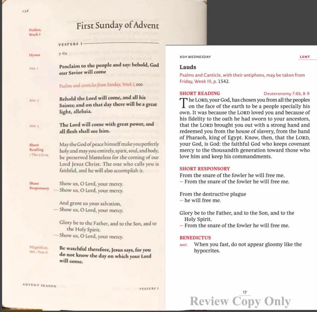
Thanks to reader Eric for this image. Eric explains: WoF said 1.25” taller, so with the regular ed (and Ascension’s) being 6.75”, I set the height for WoF to 8”
Bible Reviews, Bible Study, Translations, and more
Thanks to reader Eric for this image. Eric explains: WoF said 1.25” taller, so with the regular ed (and Ascension’s) being 6.75”, I set the height for WoF to 8”
Hmmm, the Short Reading in the WoF version seems to have very tight tracking (kerning) between the letters, almost letting them run in to one another. Seems harder to read. The Ascension version, by comparison, is very easy for me to read, even if the page is not as tall.
Well to be fair the picture from the WoF seems to be lower resolution and more heavily compressed. I agree it seems to be more aggressively kerned, but I hope that the “almost letting them run into one another” is due to resolution and compression. To me it’s the tightened spacing between words that is concerning.
Also, the “picture” of the Ascension looks to be a screenshot from a PDF, not a picture of a printed page: perfectly white background, perfectly square, and (as I said) higher resolution with less compression. So of course it looks better on first glance.
And both of these are pre-release.
I do have to wonder from WoF’s page layout if they decided their target audience is people who use printed LotH strictly at home (and an app when not at home). I think that would cover a lot of people, and allow them to go for page layouts that are more spacious at the cost of portability.
I think that photo is misleading, due to angle and photography distortion. Their official web page at http://www.liturgyofthehours.com has other page samples that look better. In particular, there’s a “II Vespers” shot that is flat, detailed and high quality, and it shows a much more relaxed and conventional spacing. Overall, I find the WoF font to be more “relaxed”. Ascension uses a smaller font, so maybe that’s why they designed their font with a larger x-height and their lines look more closely spaced as a result.
My initial reaction is that I do not like the layout of the Word on Fire edition. Your eye should not have to go to the edge of the page that often.
In theory I love Word on Fire’s commitment to beauty as a theological category and an evangelical tool, but I find their design is often too clever by a third.
I like Ascension’s choice to retain the standard breviary size. I’m not sure I will enjoy the larger form factor of the WoF. But… I find the mixture of serif and sans serif fonts throughout the Ascension book quite off-putting — so much so that I’m not sure I want to spend the money on it. I’m not sure what the reasoning was, but it just makes the design look indecisive. I’m also not very fond of the cover text. Torn on which to buy.
It’s worth noting that price absolutely favors WoF. Their version is a full grain leather cover at less than $400 and $100 cheaper than Ascension’s top grain leather edition, which is a much lower quality leather. Nearly $1,000 for a full grain version from Ascension feels very steep indeed.
I share your concern about the larger size. One note re price… It seems everyone is quoting the higher grade leather volumes, and so Ascension does seem much more expensive. But Ascension offers a bonded leather version (which WOF does not) that would be the cheapest option (by 100 even with WOF early bird discount). No? Or is there something about bonded leather that makes it not an option? (I believe that is what my current version is and it has lasted 30 years.)
Good point. Bonded leather is a workhorse. It’s just more susceptible to scratches and marks over time.
Oh is that so, I thought by how little discussion I’ve been seeing on the standard leather version that there was something wrong with it. I got worried that it would not last as long.
Like many folks over at the Divine Office subreddit, I was all-but-sold on Ascension until WoF dropped their day-of marketing promo. I’m seriously blown away by WoF’s work, and they *almost* convinced me to switch to preordering theirs. It seems less like a direct competitor to Ascension, and more like its own version entirely (like Apple and Windows, or Apple and Android, or Apple and anything else).
The *only* thing that held me back was that WoF’s four-volume has a paste-down liner, and I couldn’t find a clear picture of the inside cover, so I’m not sure how reinforced it is (Glue? Binding tape? Nothing?). It’s not a knock on WoF, but I’ve had bad experiences with leather covers with paste-down liners. Ascension’s Premium and Natural Grain Premium are both edge-lined and stitched. So, since I get reimbursed for this as a budgeted professional expense, I went with Ascension’s Natural Grain, and I will hopefully be set until Vatican III.
I’d be happy to review it here next Lent, Lord-willing.
In short, I just want an updated aesthetic of what I have now. I think Ascension does that. WoF’s looks magnificent, but it almost seems to want to offer a new experience. I’d really prefer something continuous with the breviary I love, only now with mid-20th century hiccups worked out. I’m not crazy about the red cover, but it’s not totally off putting. Couldn’t have been brown? The WoF cover almost seems too flashy to me. Gustave Dore is great, but I really appreciate contemporary sacred art that is rooted in the iconographic Canons of the West, which is what I see in the Ascension edition.
Here’s a question for the thread: I see the red cover is bonded leather. The MTF daily missal is also bonded leather but it’s puffy, which I don’t like. Does anyone know if any of Ascension’s editions are “puffy” or can explain why the MTF bonded leather is so?
Ascension commented on a Reddit post saying that their leather binding is not padded.