I received my pre-ordered copy of the newly-published RNJB Popular Bible in black imitation leather (published by Hodder & Stoughton) on Friday, and I’ve had a few days to look it over.
Top-Line Conclusions
Overall, this is a nicely constructed Bible (decent imitation leather, tasteful color combination, sewn binding) which is plagued by ghosting and some variations in print quality from one page to the next (some pages have darker text than others). It is nearly a perfect size for portability, and some readers may be willing to accept the ghosting in return for portability. But if you are looking for a Bible that earns a nearly perfect score in all categories, this is not it.
Physical Construction
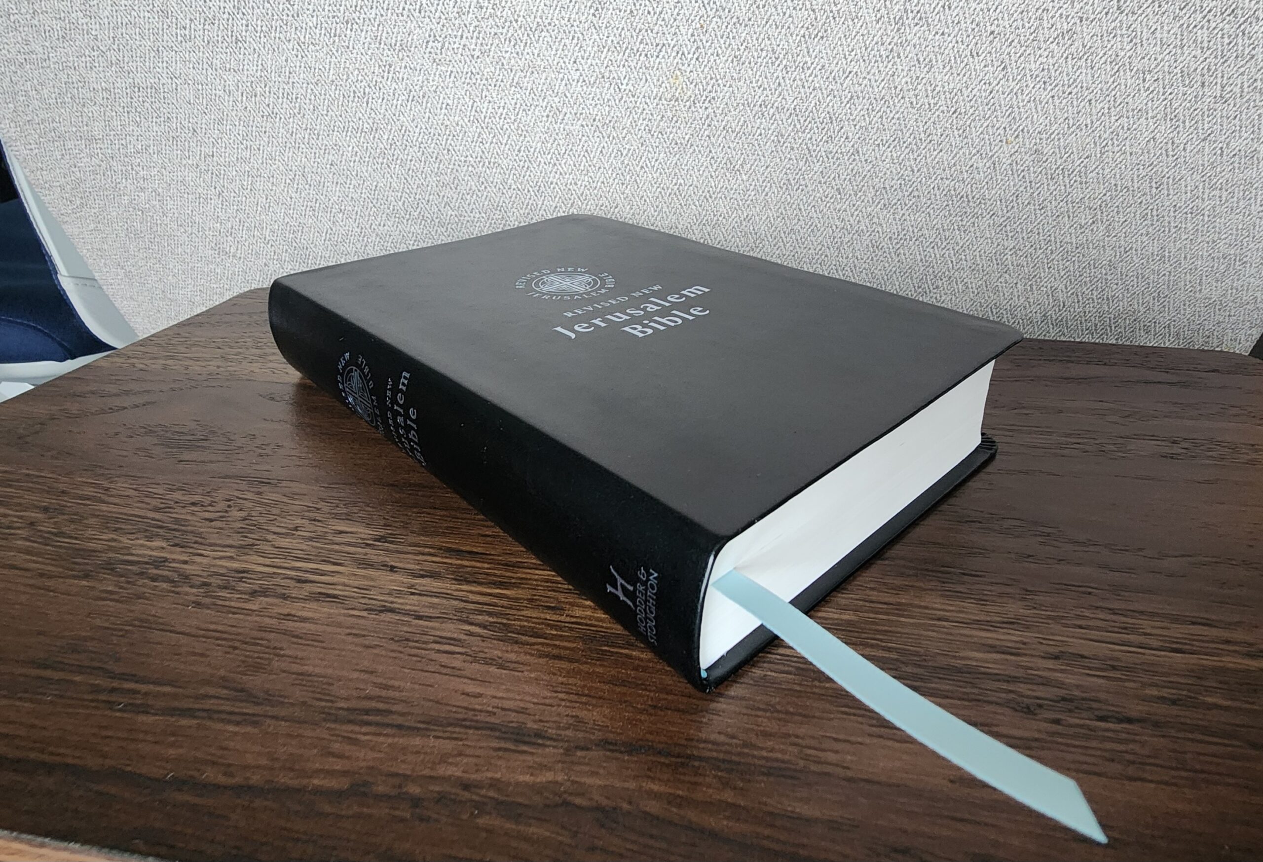
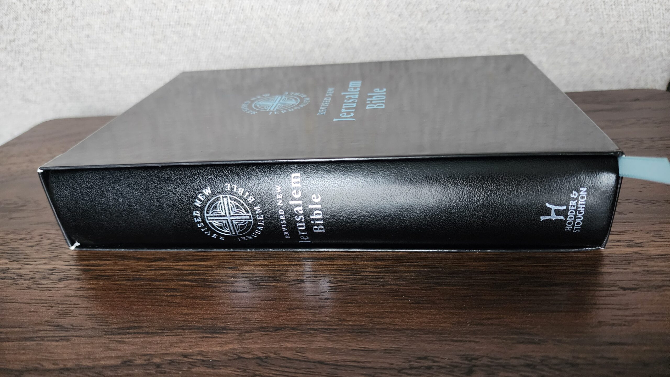
The Bible comes in a tasteful paperboard slip case with a subdued design. It features the newly designed logo for the RNJB on the front and a few sentences of description on the back. I am very happy to have the slip case. It provides just a bit of extra protection for the Bible if I plan on packing it in a carry on bag, putting it in a backpack, or bringing it in my car. An included slip case is a major factor in why I’ve come to like the Fireside Librosario NABRE as a general purpose Bible to bring with me anywhere, so I welcome a slip case on the RNJB. It’s worth noting that the RNJB slip case is made of thin paperboard, while the Fireside NABRE’s slip case is made of thick, sturdy paperboard. I think the RNJB slip case will not hold up forever, but it will protect the Bible from some light bumps and scratches.
The Bible has a sewn binding, plain white page edges, and a really tasteful sky-blue headband and tail band with a single matching ribbon marker. The end sheets also match the sky-blue color scheme and add a nice pop of color without being gaudy or excessive. I personally like the physical design of this Bible quite well. It’s thoughtful and pleasing to look at without being loud or obnoxious.

The imitation leather also feels reasonably good to hold and has a textured surface to mimic a fine-grained leather.
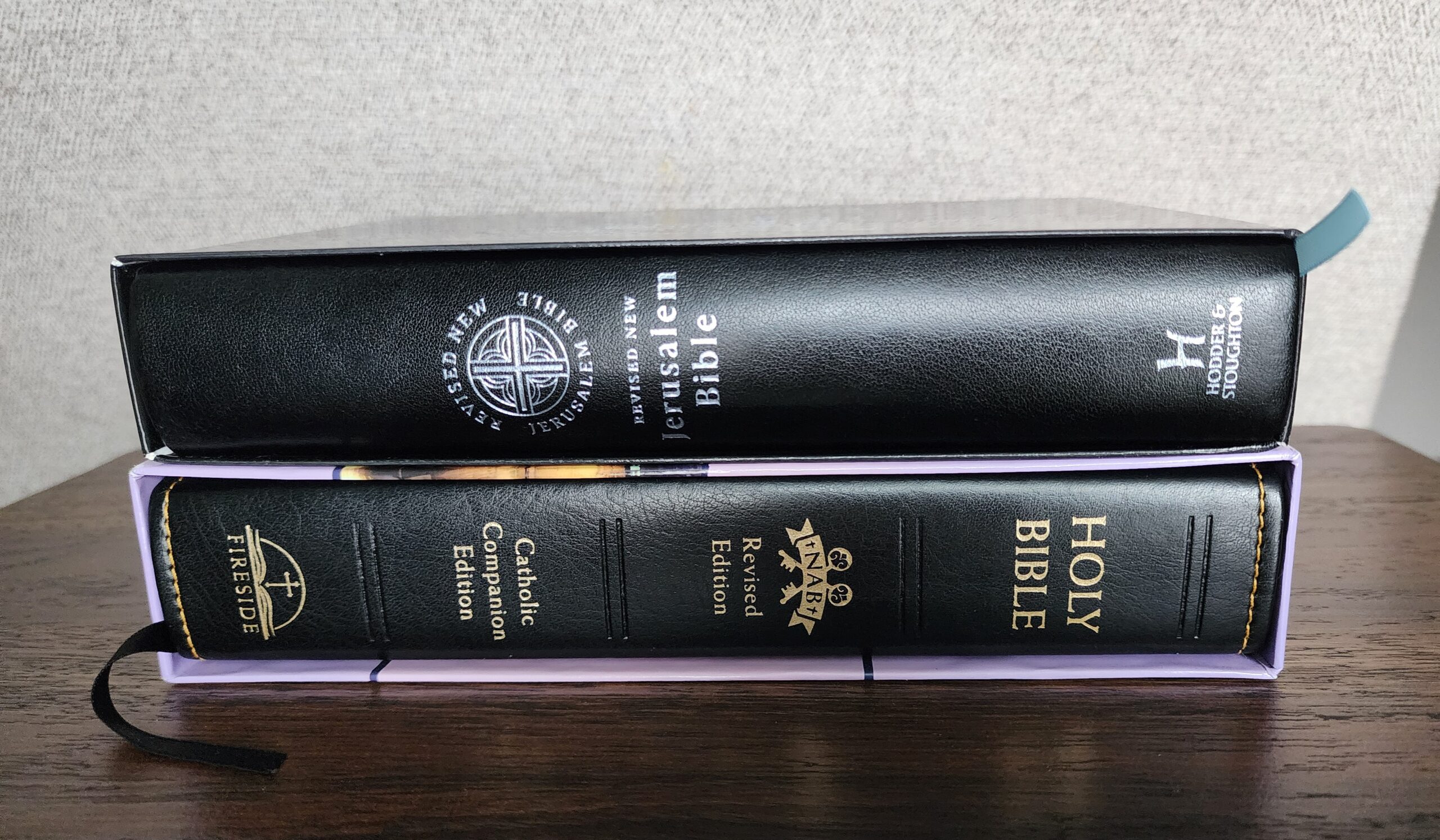
The dimensions of this Bible are 8 1/8 X 5 3/4 X 1 3/8 inches. It is similar in size to the Fireside Librosario NABRE, which is a great portable size for holding in my hands and reading. The RNJB is slightly thinner than the Fireside edition, although the difference in thickness isn’t noticeable in the photo below:
Page Layout, Typesetting, and Ghosting
The page layout in this Bible appears to be identical to the RNJB paperback reader’s edition, which I reviewed in this post. In general, most books of the Bible are printed in double-column format, but the following books are printed in single-column format: Job (except for the first two chapters, which are double-column), Psalms, Proverbs, Song of Songs, Wisdom, Ecclesiasticus (Sirach), and Lamentations. There are no footnotes or cross references, but there are short introductions to each biblical book written by Fr. Henry Wansbrough, OSB (the translator for the entire RNJB Bible).
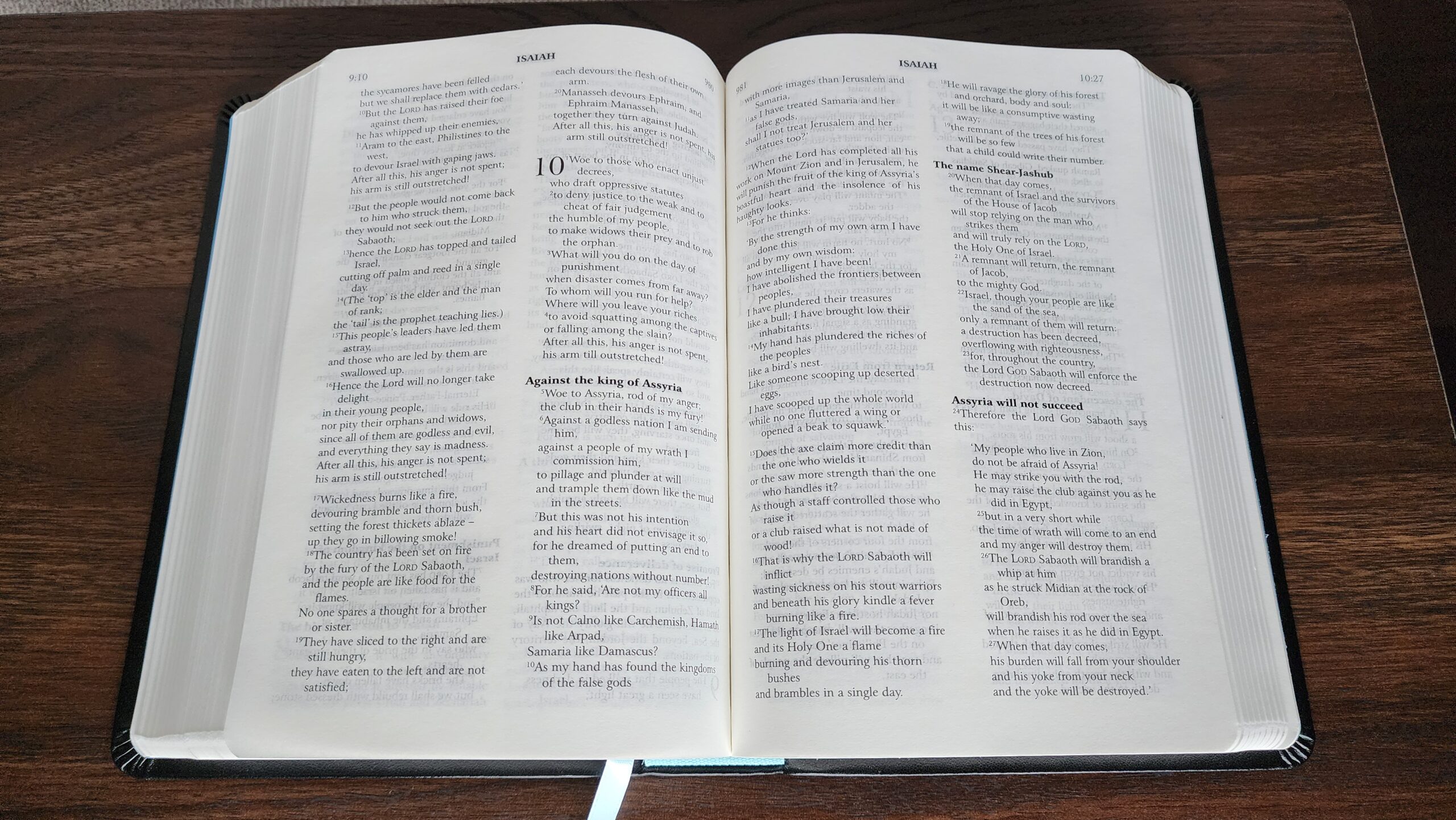
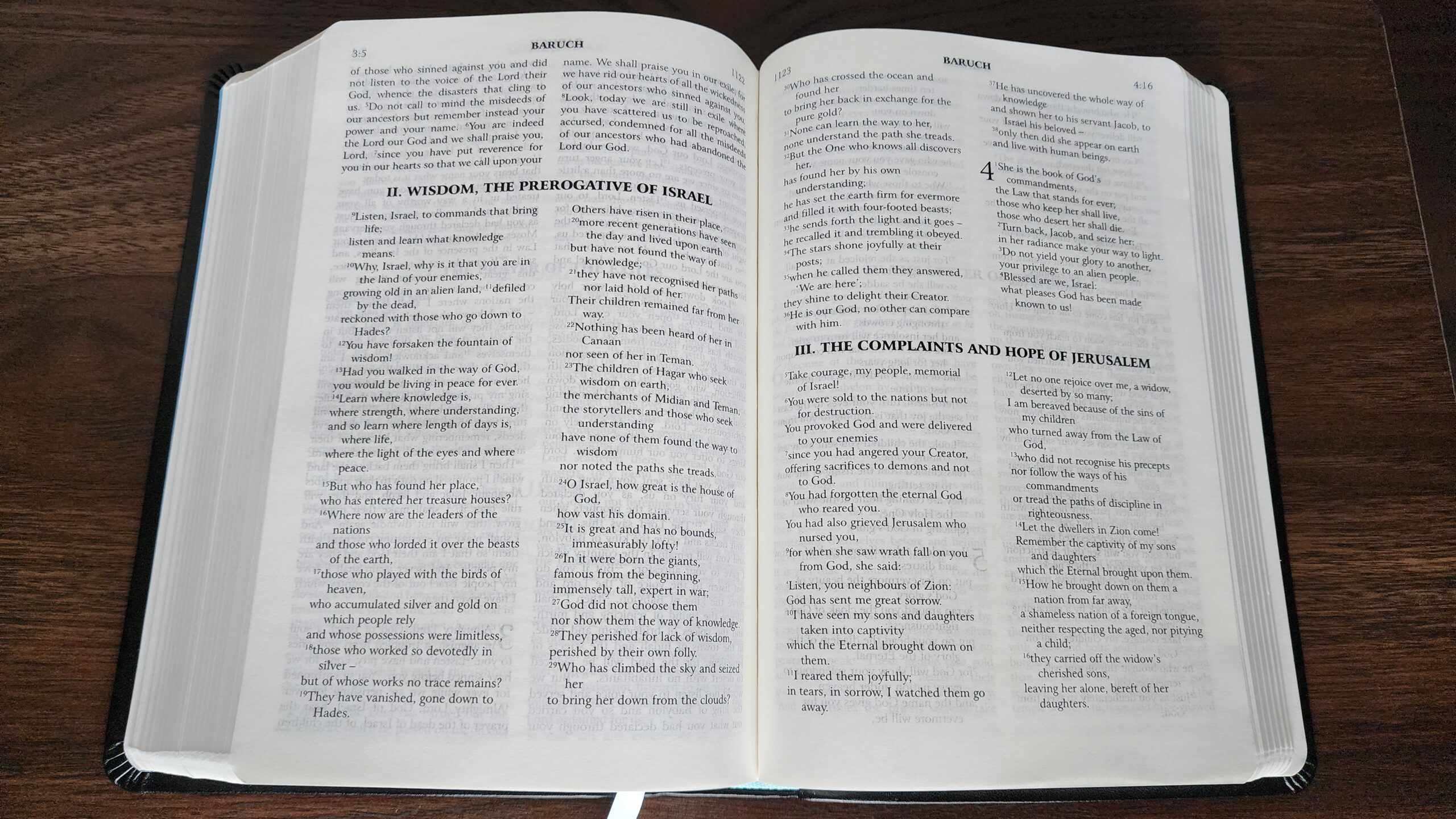
Headings identifying individual pericopes are printed in very bold font. Major section headings, which delineate major sections in the outline of a biblical book, are printed in a single line which spans the two columns of text. These section headings break up the flow of text, which is slightly confusing at first glance. In the photo below from the book of Baruch, one must read all the text above the section heading (left and right columns) and then proceed to the upper left column below the heading to continue reading. These bold headings, which are printed in larger font than the rest of the biblical text, are one reason why the text is not line-matched, and in turn, the lack of line-matching makes the ghosting worse.
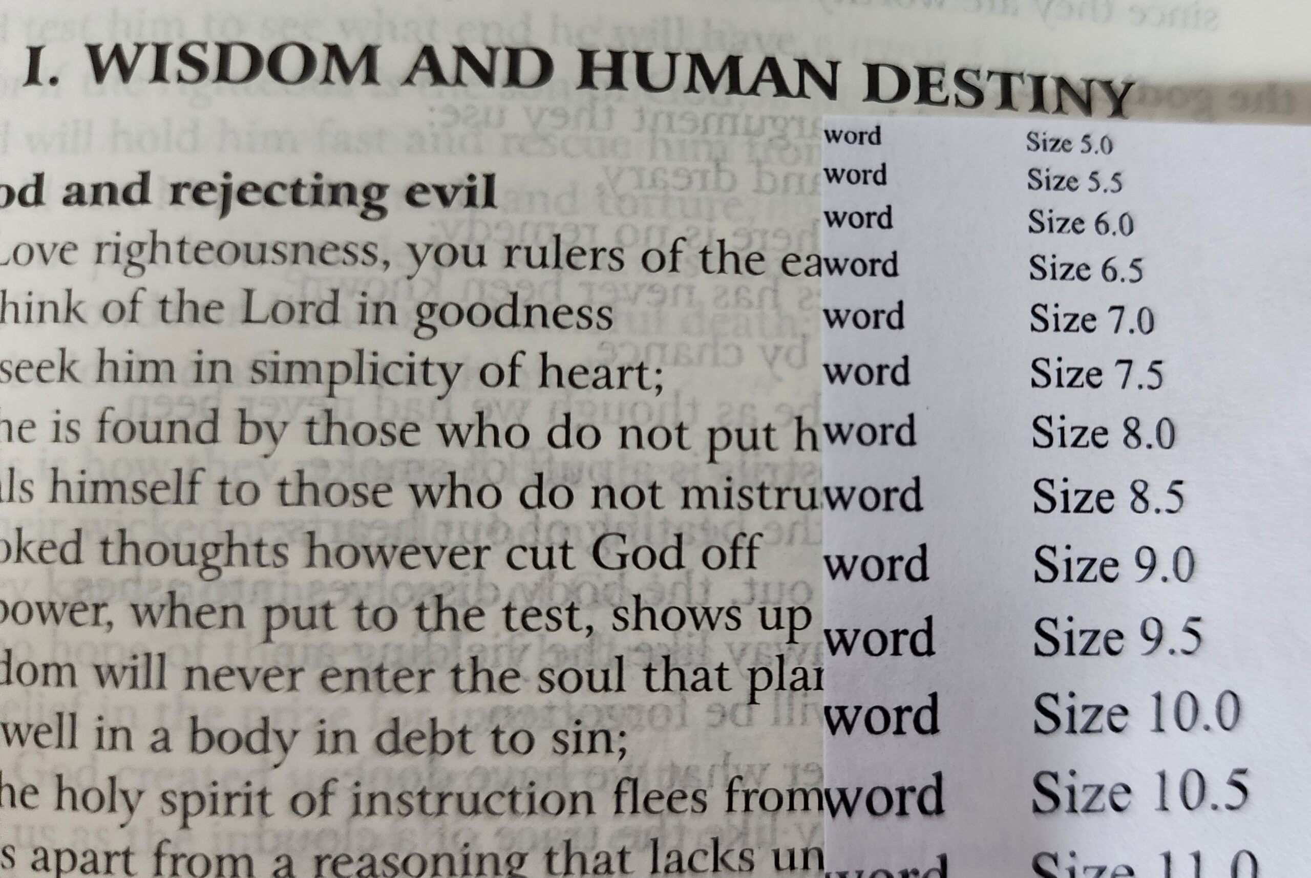
The text is advertised as 8-point font. According to my homemade font size comparison sheet (which I printed using Times New Roman font), the lower case letters are just a hair smaller than 8.5, as shown below:
The photo above really shows the ghosting in all its ghastly glory. Text from subsequent pages is visible, and the lack of line-matching makes it more noticeable. I’ve found that it looks better or worse depending on the lighting. It is noticeably improved if I lift the page I’m reading and let it fall gently back down on its own without pressing it. This creates just enough air space between the page and neighboring pages to reduce the ghosting. With tricks like this, it’s possible to improve the ghosting and make it easier to read, but ultimately, better paper would be preferable to resorting to tricks and workarounds.
Comparison with RNJB Study Edition from Darton, Longman, and Todd
In my experience, the ghosting is less noticeable (or less distracting) in the RNJB Study Edition from Darton, Longman, and Todd (DLT). The DLT edition is no longer in print, and the Study Edition is now published by Hodder & Stoughton. A commenter on this blog recently purchased the Hodder & Stoughton edition and noted that the ghosting was terrible, so it’s possible that the same type of paper is now used in both editions. Nonetheless, here is a side-by-side comparison showing the DLT study edition and the new Popular edition:
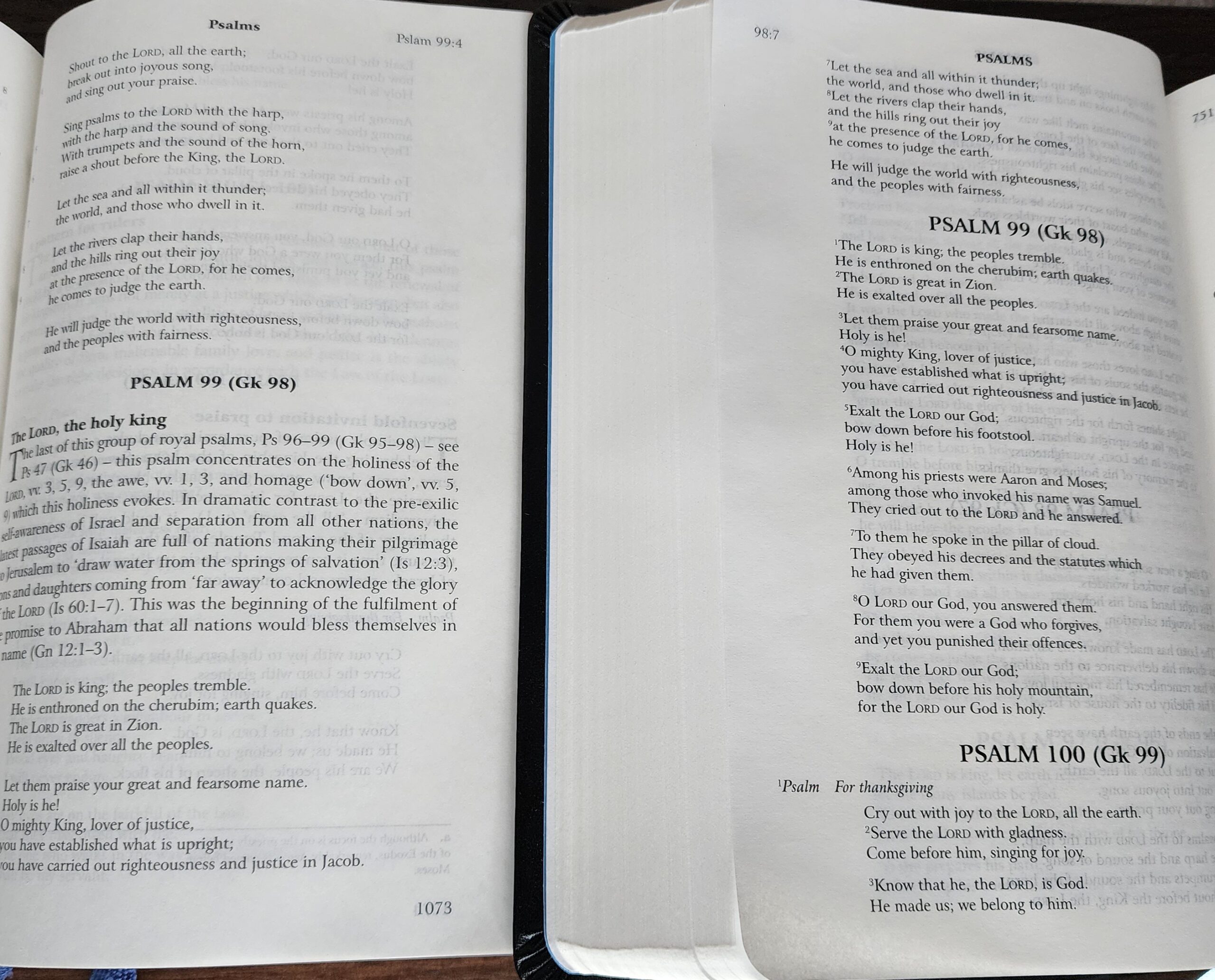
As the photo above shows, the Study Edition includes introductions for each psalm which are not included in the Popular Bible.
Overall, I prefer the DLT Study Edition over the Popular Bible. I enjoy the single-column format for the entire biblical text in the Study Edition, and I really appreciate the cross references printed in the margin. I think I also prefer to have Fr. Henry Wansbrough’s footnotes which are included in the study edition. They are often helpful and thought-provoking, without being as voluminous as the NABRE notes, which can significantly interrupt the flow of reading (but also provide a wealth of information and historical background). It should be noted that Wansbrough’s notes are historical-critical (similar to the NABRE notes), and they occasionally critique or judge the Biblical text in a way that is jarring for someone looking for encouragement or edification.
Finally, the Study Edition is much thicker than the new Popular Bible. As such, the Popular Bible is more lightweight and easy to hold while reading. I can hold the Study Edition for a shorter time before looking to set it down on a desk or book stand.
Conclusion
Overall, this Bible is a reasonable attempt which is undercut by its paper quality. I would list the pros and cons as follows:
Pros:
- Perfect size for portability
- Paperboard slip case provides extra protection when traveling
- Sewn binding
- Design and color scheme are tasteful and not gaudy
- Good layout for minimizing thickness (single-column in poetic books, double-column for prose)
Cons:
- Ghosting is distracting, and lack of line-matching accentuates the problem
- Major section headings break up the page in a counterintuitive way for reading
- Extremely bold text for headings contributes to ghosting
- Uneven print darkness in some areas
I would ultimately like to see a similar size Bible with better paper (accepting that this implies a thicker Bible overall). I would also prefer some tweaks to the page layout, with section headings that do not break up the flow of the columns and heading text that is not so bold and loud. If the section headings were printed in the same font size as the rest of the biblical text, the page could be line-matched to keep the ghosting under control.
Thanks for another great review! My first time seeing this interesting publication.
I really wish Bible publishers would just read the books they sell as part of QA before selling them. Word of advice for them in doing so: If you have to squint or place a sheet of paper behind a page in order to read the page, you need to fix your printing and paper situation.
Wait, when you say no footnotes, are you saying there are no textual notes in addition to no “study” notes? If so, that sounds kinda problematic. Not giving textual variants in a translated Bible seems counterproductive.
Yep, that’s correct. I haven’t found any textual footnotes or translator’s notes anywhere in this Bible.
In that case, I’m going to keep my eye out for the now-OOP DLT study edition on the secondhand market. Imperfect notes and decent paper are better than zero notes and subpar paper.
No notes of any kind? That’s interesting, especially since the DLT edition had notes.
You said that Baruch is in single-column format, but the picture shows double columns. And shouldn’t Isaiah count as predominantly poetry? It’s double column too.
Good catch. Thank you. I think I must have mixed up Lamentations and Baruch in my mind as I was writing. I will update the post. Baruch is printed in double-column, and Lamentations is printed in single-column.
The books which are printed in single-column are:
Job (except for chapters 1 and 2, which are printed in double-column)
Psalms
Proverbs
Song of Songs
Wisdom
Ecclesiasticus (Sirach)
Lamentations
Note that Ecclesiastes (Qoheleth) is the only one of the wisdom books printed in double-column format.
What a shame. I was so looking forward to this Bible. Maybe they’re will be more editions of the RNJB once the Irish and Aussies adopt the RNJB for their lectionaries.
I purchased this Bible with it arriving on Nov. 29th. and I’ve been reading through it (mainly Jeremiah and Isaiah. I am an elder millennial, but I don’t have difficulty reading this this Bible under normal light. Also, I honestly didn’t even think about ghosting in this edition until I read your post. But I once I saw this post, I did compare to all the other Bibles in my possession, and yes it has the most ghosting. Is this more of an issue with older eyes? Is it really that difficult for people to read? Or is this more you teach yourself to notice ghosting when becoming a “connoisseur” of Bible editions, so you can no longer ignore it when attempting to read? Honest questions.
Can’t speak for this edition, but I remember when I briefly owned Crossway’s “The Hebrew Old Testament, Reader’s Edition” as a companion to the “Tyndale House Greek New Testament, Reader’s Edition.” This was in 2022 I think, before I became more knowledgeable about book production and quality, and even then I immediately recognized the ghosting issue and sent it back.
I only just realized I didn’t finish my first sentence! Oops! Let me try again:
Can’t speak for this edition, but I remember when I briefly owned Crossway’s “The Hebrew Old Testament, Reader’s Edition” as a companion to the “Tyndale House Greek New Testament, Reader’s Edition,” the ghosting immediately caught my attention, because the latter volume had such good paper and clearly readable type, whereas the former was of noticeably lesser quality.
I’m glad to hear your reaction, Devin. I always worry that when I do a review within a few days of receiving a new Bible, I will lock in on a first impression which would otherwise change with time. I spent some more time reading from this Bible today and comparing it to a few others. I do personally find the ghosting distracting in this Bible. For reference, I’m also a millennial in my mid-30s, and I don’t wear dedicated reading glasses or bifocals.
The text is still fully readable for me. I don’t have any trouble making out the words. But as I read, it feels like my eyes are having trouble focusing on the text. Another analogy for how it feels is “tunnel vision” where my eyes are spending more effort focusing on the word in front of me, rather than scanning along the line. The problem varies with the angle and type of light for me. With natural light from a window directly behind me, I find it better, because the contrast on the page seems more pronounced to my eyes in bright light. But under indoor lights or with natural light shining at an angle on the page, I notice the feeling of difficulty focusing my eyes on the text.
It is certainly possible that my standards have shifted as I have been exposed to premium Bibles, but I usually try to apply this basic test when I review a new edition: when I read, do I feel like I’m having to exert more effort because of the ghosting?
I feel like that is a good metric, especially in helping people choose a Bible. Of all books, the Bible should be the one someone should feel comfortable reading for a long period of time in variable lighting conditions.
I’m in my mid-30’s, and an avid reader, and I started noticing an issue a few years ago when reading St. Benedict Press’s DR, which has 8 pt font. I was like… Why can’t I focus, and why am I getting a headache? I can’t go less than 9.5 pt font now, unfortunately.
Oh gosh! I’m dreading the day when I will eventually need to give up my small, portable bibles with 8 or 8.5 pt. font. So far, I don’t have a major issue reading 8.5 pt font in other Bibles, but I do feel fatigue after reading footnotes in 6.5 pt font.
If you are accustomed to never seeing ghosting when you read, whether it’s the Bible or any other book, then it really is hard to read a Bible with ghosting. Not hard to actually read the words, but hard to become absorbed in the text because the ghosting is so distracting. Even if the ghosting is minimal to moderate and it’s line matched, it is still too distracting for me; I can’t get into “the zone” and step out of the room and into the story. It’s probably because the only Bibles I ever used, and the only books I ever read, were high opacity and didn’t have ghosting.
I’m 47 and am having issues reading due to my health issues. Letters will blur and if the ghosting is bad enough, the blurring will make the text virtually impossible to read.
I’m sorry to hear that.
I just got mine in the mail today. I was relieved that the ghosting is not nearly as bad as I feared it might be, though it’s definitely there. In fact, I was afraid the ghosting would be as bad as the DLT popular edition, which is terrible; it drives me crazy to try to read from it. Thankfully, my DTLM RNJB hardcover full notes edition (shown above in the photo) doesn’t have that terrible ghosting.
Overall, I really like this edition. It’s compact but I can read the text quite easily, and though I’d prefer premium leather edition, the synthetic “leather” is quite nice. I can easily see this becoming my primary carry-around bible for Mass, the chapel, and ministry and catechesis.
Interesting. Where is it printed?
This edition was printed in China.
Aw man.
The DLT Readers’ edition looks so much better. Did they sell publication rights to Hodder and Stoughton?
”I found a typo in Genesis 48:9 of my RNJB (ISBN: 978-0-232-53362-0). The word ‘please’ is printed as ‘ple ase’ with a random space in the middle. I checked both my physical copy and the e-book, and they both have the same issue. Does anyone else have this typo in their edition, or is it just a specific printing error?”