In my previous review of the St. Joseph personal size edition of the New Catholic Bible (NCB), I complained about the glossy color illustrations and family record pages which Catholic Book Publishing Corporation (CBPC) interspersed throughout the biblical text. Readers pointed out in the comments that the NCB gift Bibles from World Catholic Press (a publishing imprint of CBPC) do not include any glossy insert pages. I finally purchased a copy of the “deluxe gift Bible” in burgundy bonded leather to review, and I’ve now owned it for a couple of months.
Top-Line Conclusions
I’m surprised at how good this Bible is. It has the same excellent, bright white paper (with minimal ghosting) as the St. Joseph personal size edition. It also has a sewn binding. It is an excellent size for both reading and portability. It has no glossy inserts of any kind and is a red-letter edition (with the words of Christ printed in bright red). The main drawbacks are a slightly more cramped line spacing (compared to the St. Joseph personal size edition), and all poetry is printed in a font size that is a half-point smaller than prose.
Physical Construction
This Bible measures 9 X 6 X 1.25 inches — almost identical in size to the NRSV-CE personal size edition from Catholic Bible Press. It has a textured burgundy bonded leather cover which feels better to hold than I expected. In recent years, I think imitation leather often has a softer texture than bonded leather, and that remains true when I compare this Bible to the imitation leather on the NRSV-CE personal size edition. But this bonded leather cover is not bad by any means. it feels substantial enough that it will probably hold up to a decent amount of use before it starts to wear out. If the New Catholic Bible is your preferred translation, I could see this Bible being a good candidate for a leather rebind.
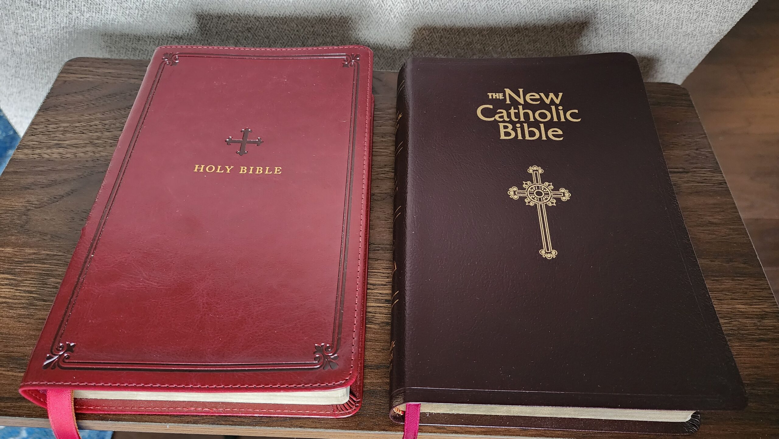
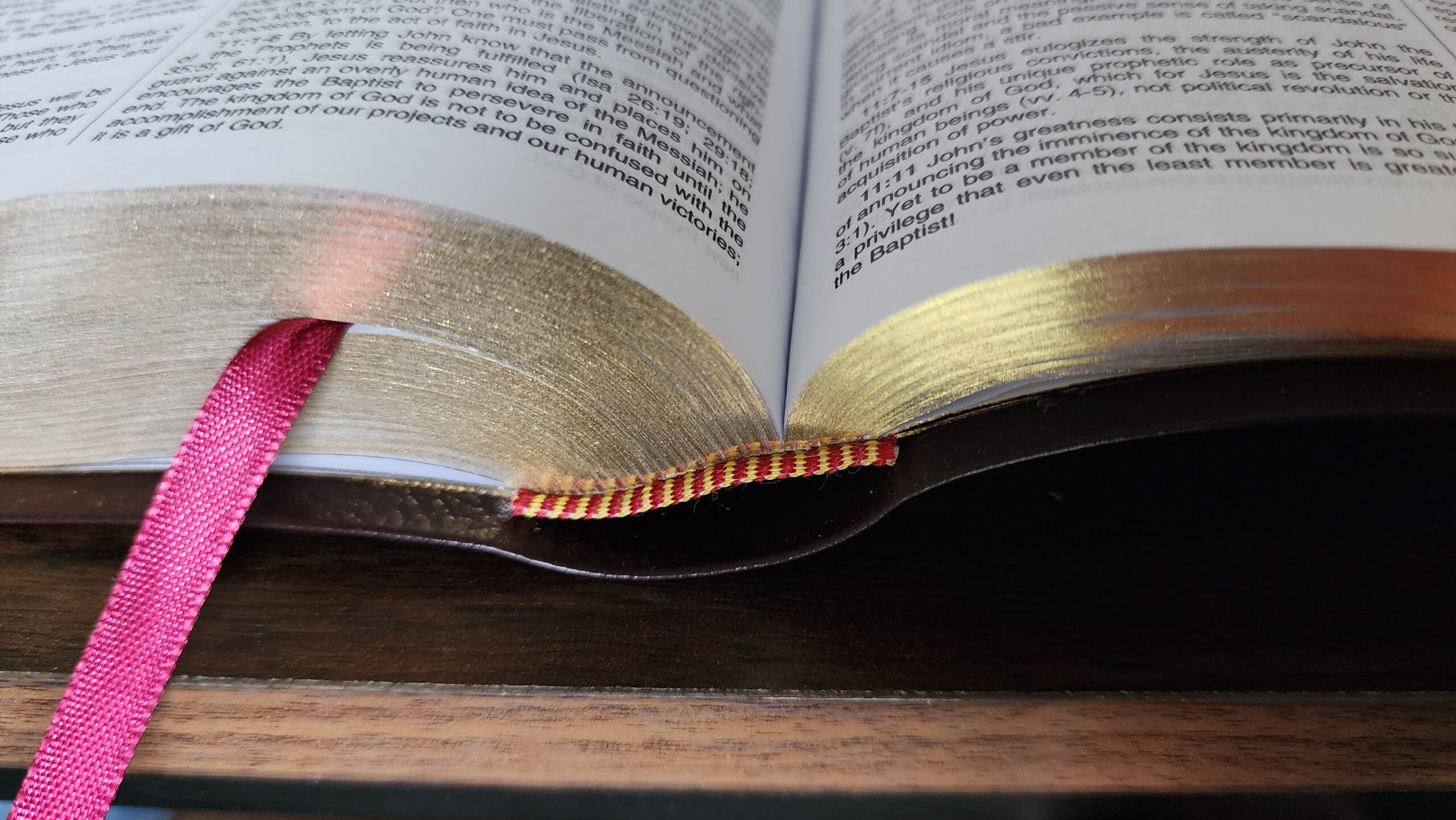
The binding is sewn, with a red and gold headband and tailband and a single, basic, burgundy ribbon marker. The gold gilding on the page edges is pretty good — not a high-end mirror-like gilding, but noticeably better than many basic Bibles.
The Bible arrives in a two-piece paperboard gift box which could be used to protect it in a backpack or travel bag.
Page Layout, Typesetting, and Ghosting
In recent years, Catholic Book Publishing Corporation has been using some of the best paper in the business outside of the high-end premium Bible market. It is stunningly opaque and bright white. The text is also printed bolder and darker than many other Bibles in my collection (including the St. Benedict Press NABRE). Their ability to achieve high-contrast printing with almost no ghosting is remarkable and unparalleled among other Catholic Bibles at this price point ($50 and below), with the single exception of the paperback Great Adventure Catholic Bible, which also has excellent paper.
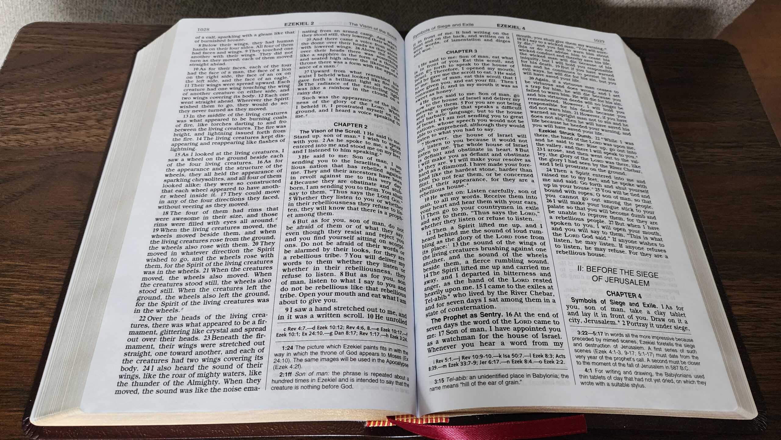
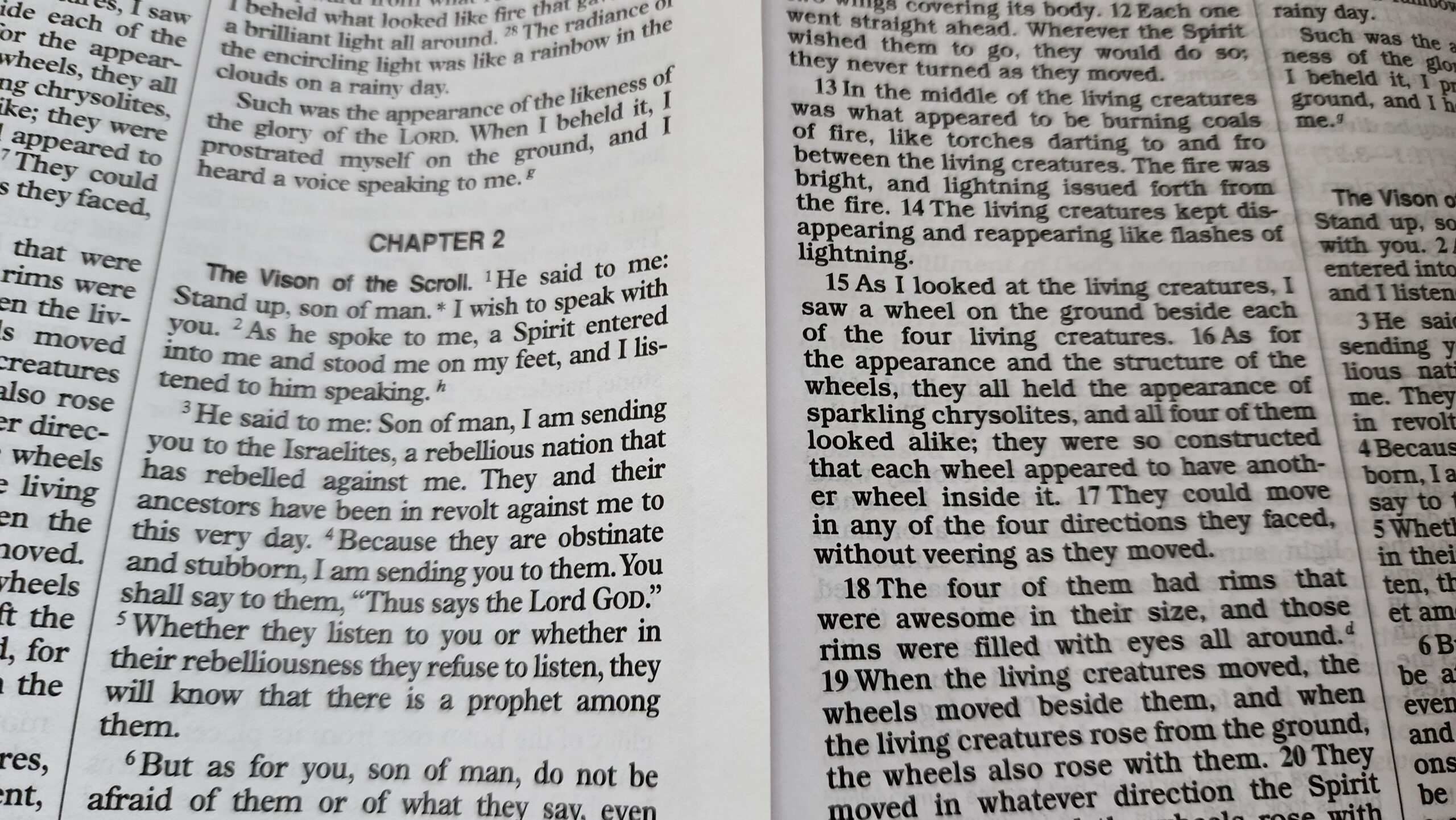
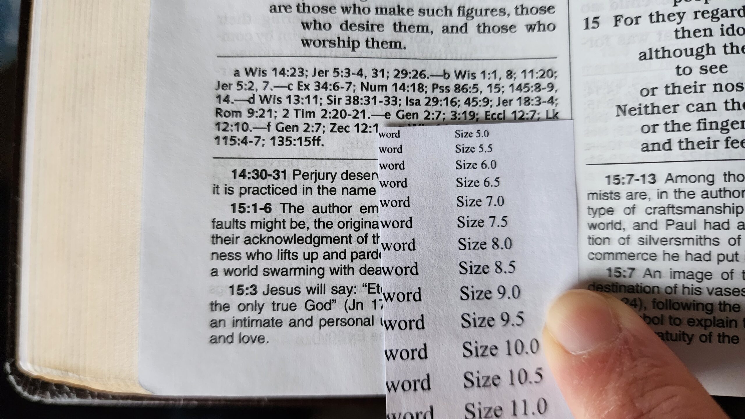
According to my homemade font size comparison sheet, the biblical text is printed in 9 pt. font in prose sections and 8.5 pt. font in poetic sections. This applies to all poetry, even short snippets of verse interspersed with prose. Here is an example from Jeremiah with poetry on the left side of the page and prose on the right side:
By comparison, the St. Joseph personal size edition uses 9 pt. font for both prose and poetry. The line spacing is also slightly wider in the St. Joseph edition. Finally, it’s worth noting that the verse numbers in the World Catholic Press Bible are large and bold, while the St. Joseph edition uses smaller, superscript-style verse numbers.
The footnotes are easier to read in the World Catholic Press edition compared to the St. Joseph edition. They are printed in 7.5 pt. sans-serif font (similar to Arial). The St. Joseph edition uses a blocky, very bold, 7 pt. font which is harder to read.
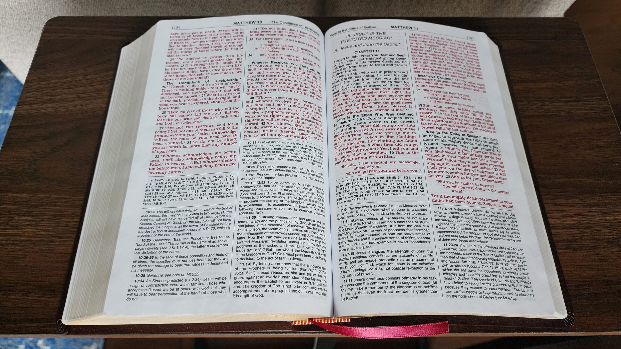
Finally, this Bible is a red letter edition, with the words of Christ printed in the same bright red ink that is used in the St. Joseph edition:
Conclusion
I can easily recommend this edition. I hesitated to buy a copy for a long time, because I’ve owned a New American Bible from World Catholic Press since the late 1990s (which I received as a confirmation Bible). That edition is a good bare-bones Bible, but the cover is not high quality and the gilding is mediocre. I struggled to justify paying $45 for what I expected to be a lower-quality edition compared to the St. Joseph Edition. I’m very happy that the quality is substantially better than I expected.
It’s worth noting that there are three variants of this Bible:
- NCB Gift and Award Bible (imitation leather) – $21 MSRP
- NCB Deluxe Gift Bible (bonded leather) – $45 MSRP
- NCB Deluxe Gift Bible with thumb index (bonded leather) – $54 MSRP
I suspect the imitation leather gift and award Bible (with its lower purchase price) would be the modern equivalent of the NAB confirmation Bible which I received. Given the overall improvement in paper quality of CBPC’s books in recent years, it’s possible that the gift and award Bible is now higher quality than the older version, but I have not seen it in person to make a judgment.
I think the $45 price for the Deluxe Gift Edition is fair for the overall quality of the paper and printing. This is a nearly ideal-sized Bible for daily use in my opinion. The only drawbacks are a slightly more cramped page layout compared to the St. Joseph personal size edition and a half-point smaller font used for poetry.
Nice review! I May want to purchase one because of the font type
Thanks for the review Mark. It’s good to know that the overall typographic quality of the NCB seem to be very high across different publishers regardless of the supplementary stuff. I can attest also that the paper of my NCBs are top quality and the typeface of the biblical text have excellent readability. The typeface of your CWP-NCB notes, however, looks a bit more elegant than the blocky ones on the CBPC-NCB notes.
Might I ask a few things:
1. When you said there are no glossy inserts of any kind in your NCB (World Catholic Press edition) edition, did you mean there are no, non-glossy illustrations, as well?
2. Are the book introductions in your NCB written in italics? In my NCB-St. Joseph Edition (Catholic Book Publishing Corporation) they are, and I find them unnecessarily distracting to read even with their large font size.
3. Would you mind looking at 2 Chronicles 11:1. My NCB reads:
“When Rehoboam reached Jerusalem, he mustered one hundred and eighty thousand chosen warriors of the house of Judah and Benjamin to fight against David and restore the kingdom to him.”
I think “David” in this context should have been “Jeroboam” or “Israel.” As it stands the verse seems to suggest that Rehoboam fought against his own house, the house of his father Solomon, son of David, which didn’t make sense. I wrote an email to CBPC politely asking whether perhaps this was a typo, or did they have new interpretation. So far, I haven’t gotten a reply.
Personally I think this was just a typo considering that the mention of the names of the kings elsewhere in the book are in their proper context. Still I hope that if it is, they would at least correct it in future printing, or even just on their online version (like in biblegateway).
Thank you and Merry Christmas!
1. There are very few illustrations in this edition. So far, I’ve only seen two: A black-and-white illustration of Moses at the beginning of the Pentateuch and a black-and-white illustration of the four evangelists at the beginning of the New Testament. I should have also mentioned in the review that there are 8 pages of black-and-white maps, printed on normal Bible paper, at the back of this Bible.
2. Yes, the book introductions are printed in italics. There are also section introductions (like the Pentateuch, the poetic and wisdom literature, the New Testament, etc.), and those are printed in normal font.
3. The text of 2 Chronicles 11:1 in this Bible is identical to the text you quoted above, saying that Rehoboam mustered warriors to fight against David.
Hi all. I am avid reader of this blog and grateful for the discussions and things I have learned over the years reading it. Does anyone know if the many typos in the NCB have been corrected? I want to embrace this version, but have been frustrated with and distracted by the typos in the past. God bless.
Yeah, I’m quite saddened by the typos since it’s such a great translation.
Hello! I have a couple of NCBs I bought this year. They seem to be corrected already.
Thanks for the review, Marc. I was hoping that someone would review this edition at some point.
A couple of comments…
1) I don’t own this edition, but I do own the St. Joseph Personal Size edition and the NCB Student Edition.
From what I can tell based on this and other sources, the typesetting and the page layouts are virtually identical (perhaps completely identical) in the NCB Student Edition and the NCB Deluxe Gift Edition by WCP. The photo of Ezekiel above looks like it could have been taken from the Student edition. The Student edition even has the illustrations of Moses and the four evangelists. (The Student edition has the words of Christ in black, though – as a cost-saving measure I am sure.)
Also, with respect to Ram’s Question #2… In the Student edition, the book introductions are also in italics. However, it seems to me like the italic font in the Student edition is less “flowery” than it is in the St. Joseph edition. Presumably the NCB Deluxe Gift edition uses the same font as the Student edition, and I think, Ram, you would find it less distracting than what you are used to.
I just put the WCP Deluxe Gift Bible next to the St. Joseph personal size Bible and compared the introduction to the book of Wisdom. To me, it looks like the same italic font in both editions, but the Deluxe Gift edition is both bold and italic, while the St. Joseph edition is only italic. The line spacing is also significantly wider in the St Joseph edition.
Very interesting, and thanks for checking. When I compare the Student edition to the St. Joseph Personal edition, I can see that there is a difference in the fonts used in the introductions. It is unmistakable, for instance, when I look at the bottom of a lowercase “g”, which looks like a hook in the Student edition but looks like an oval in my St. Joseph’s Personal edition. So maybe there is a difference between the fonts used in the Student edition and the WCP Deluxe Gift Bible.
Oh…well, now that you pointed out the difference in the shape of the “g,” I do see a difference between the St. Joseph and the Deluxe Gift editions. At a first glance, it looked to my eyes like one font was simply bolder than the other. But the shape of the lowercase “g” is definitely different between the two. The lower part of the “g” is oval-shaped in the Deluxe Gift Bible. I just published a new post with extra photos showing the book introductions, the maps, and the illustrations of Moses and the evangelists.
Hello Marc, I appreciate your taking the time to reply. Those few B&W illustrations should be what some would prefer. Even though I initially thought I wouldnt like red letters, it grew on me and now I prefer my red letter NCB over the one with black text only. So, CWP also followed the type face CBPC used in book intros. I forgot a detail: it’s not just italics but script-style italics, which made it look, at least to me, a little too distracting.
@Pete
In my first email to CBPC (through their website form, September 9, 2025) I asked if they have an errata where they list errors they corrected. They replied that they didn’t since they have not been made aware of any errors at that time. However, from previous discussions here, I gathered that CBPC quietly corrected some typos. Between my two NCBs, my hardcover version have some typos already corrected, typos which are still in my NCB imitation leather edition.
In my follow up email of September 21, 2025, requesting for some clarification on the above-mentioned 2 Chronicles 11:1 verse, they have not replied yet.
God bless, everyone.
I have both a St Joseph NCB and a deluxe NCB black bonded leather. I can’t be sure but the paper in the deluxe seems worse than that in the St Joseph. Both are inferior to my old St Joseph NAB. The paper is a big let down for me, because as OP pointed out, the quality of the bonded leather is quite high by catholic bible standards.