About a year ago, I reviewed the personal size New Catholic Bible (NCB) in black dura-lux imitation leather. The biggest drawback for me in that edition is the glossy color illustrations and information pages, which are printed on thicker paper than the biblical text and interspersed throughout the Bible. These inserts make it impossible to lay the Bible flat on a desk and read, because they are stiffer than nearby pages and they “pop up” and refuse to stay flat.
Recently, blog commenter “Doubting Thomas No More” emailed me several photos of the hardcover NCB Student Edition which could be a viable alternative for anyone who finds the variations in paper thickness frustrating.
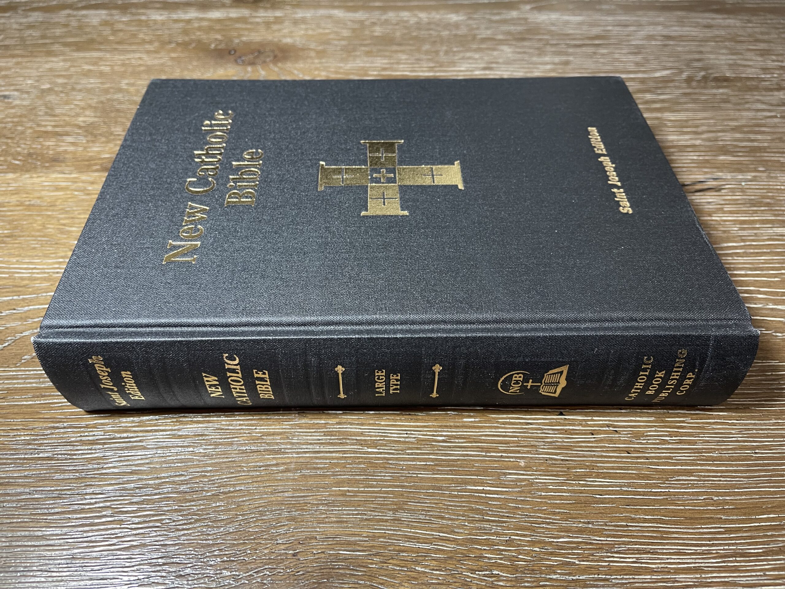
The Student Edition is printed on the same paper throughout (except for a family record section at the very back of the book), and it’s available in both hardcover and paperback, as well as both personal size and large print. Here is a link to a page on the Catholic Book Publishing Corporation (CBPC) website which lists all available Student Edition options. I will share photos of the large print hardcover edition in this post.
Physical Construction
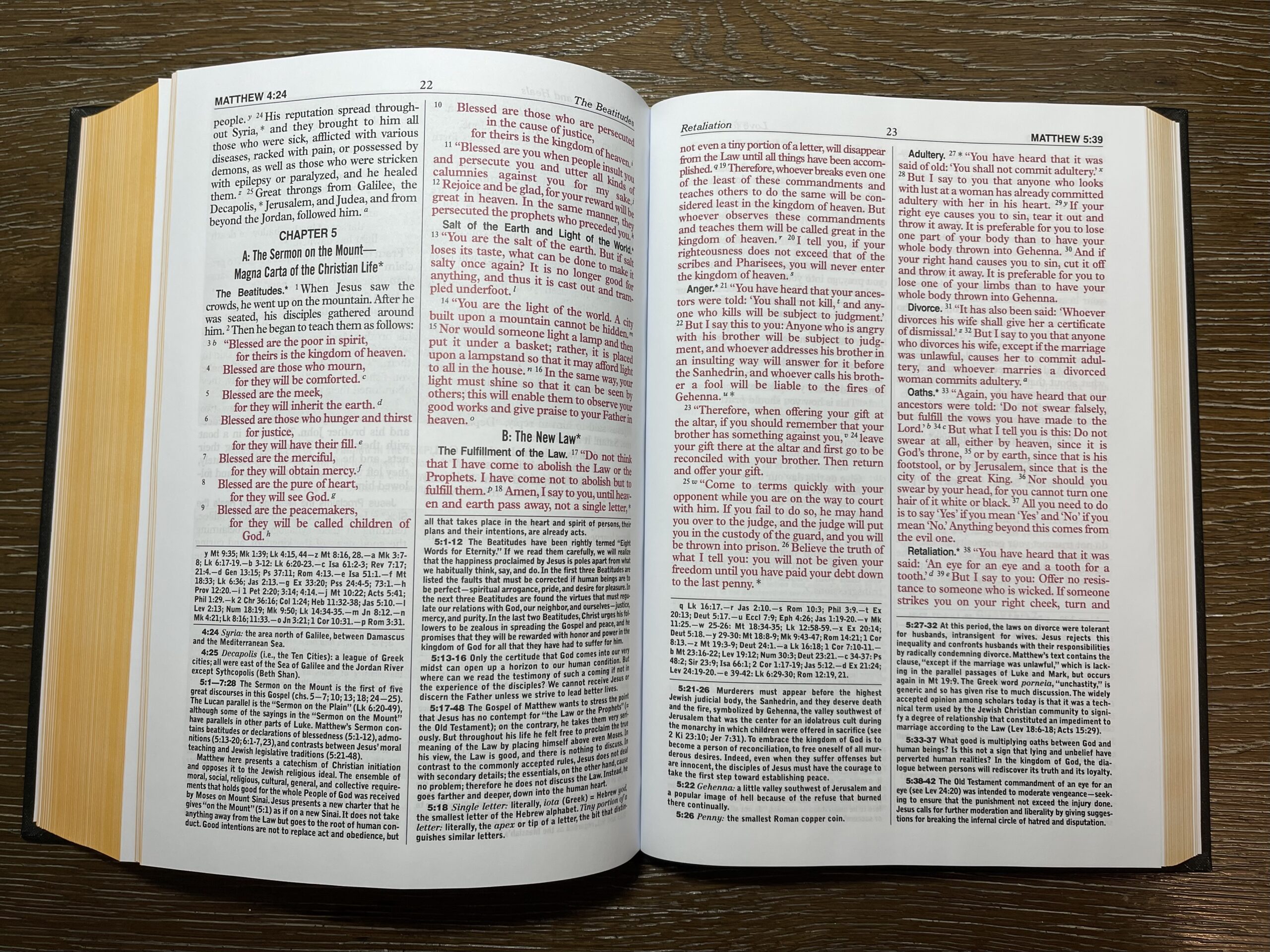
The interior pages in the large print hardcover Student Edition measure 6.5 X 9.25 inches. The biblical text is printed in double-column format, with footnotes at the bottom of each column and cross references in the left column of each page.
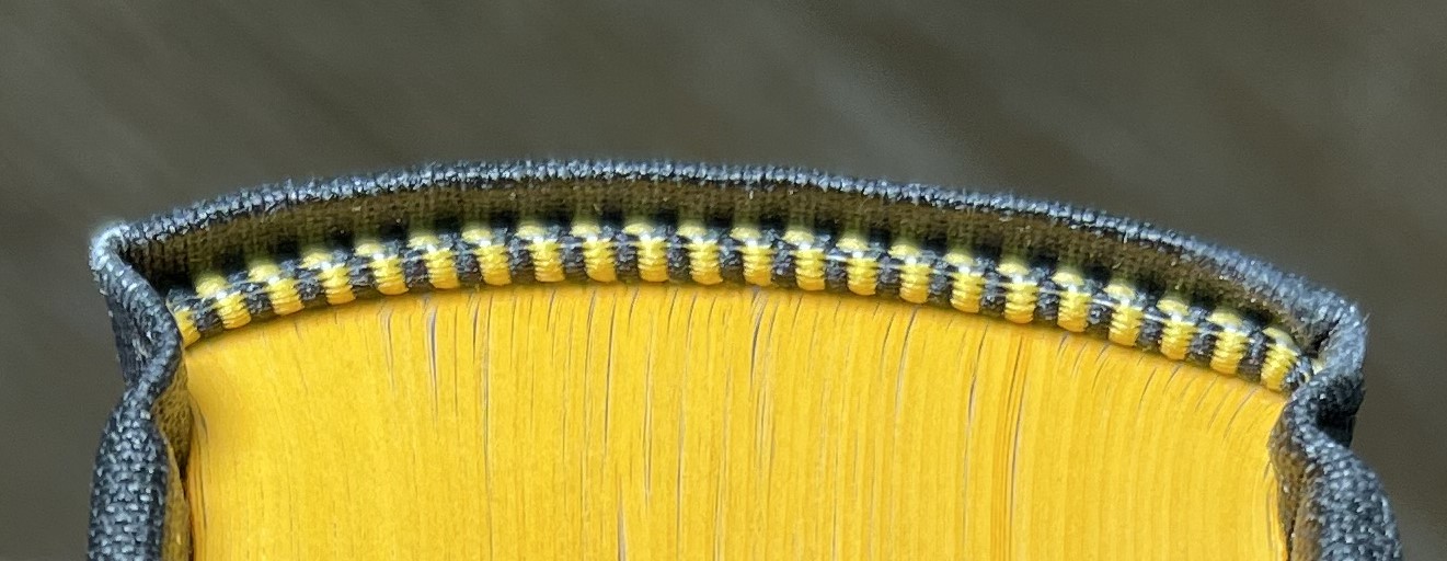
The binding is sewn, and the page edges are painted yellow. The corners of the pages are square (as opposed to rounded).
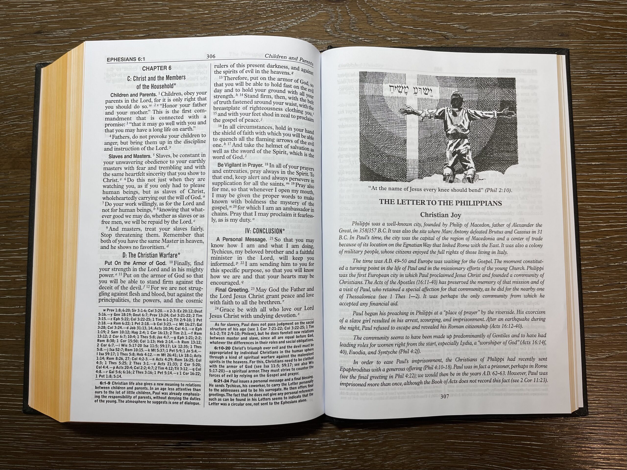
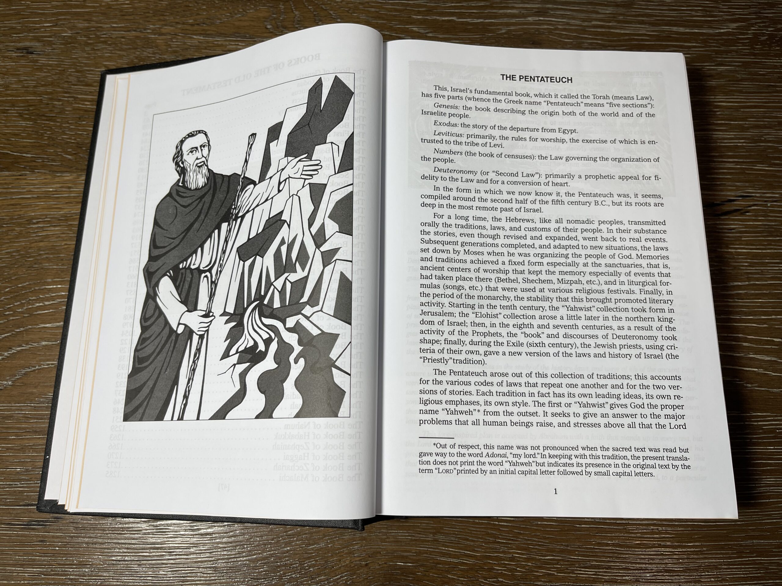
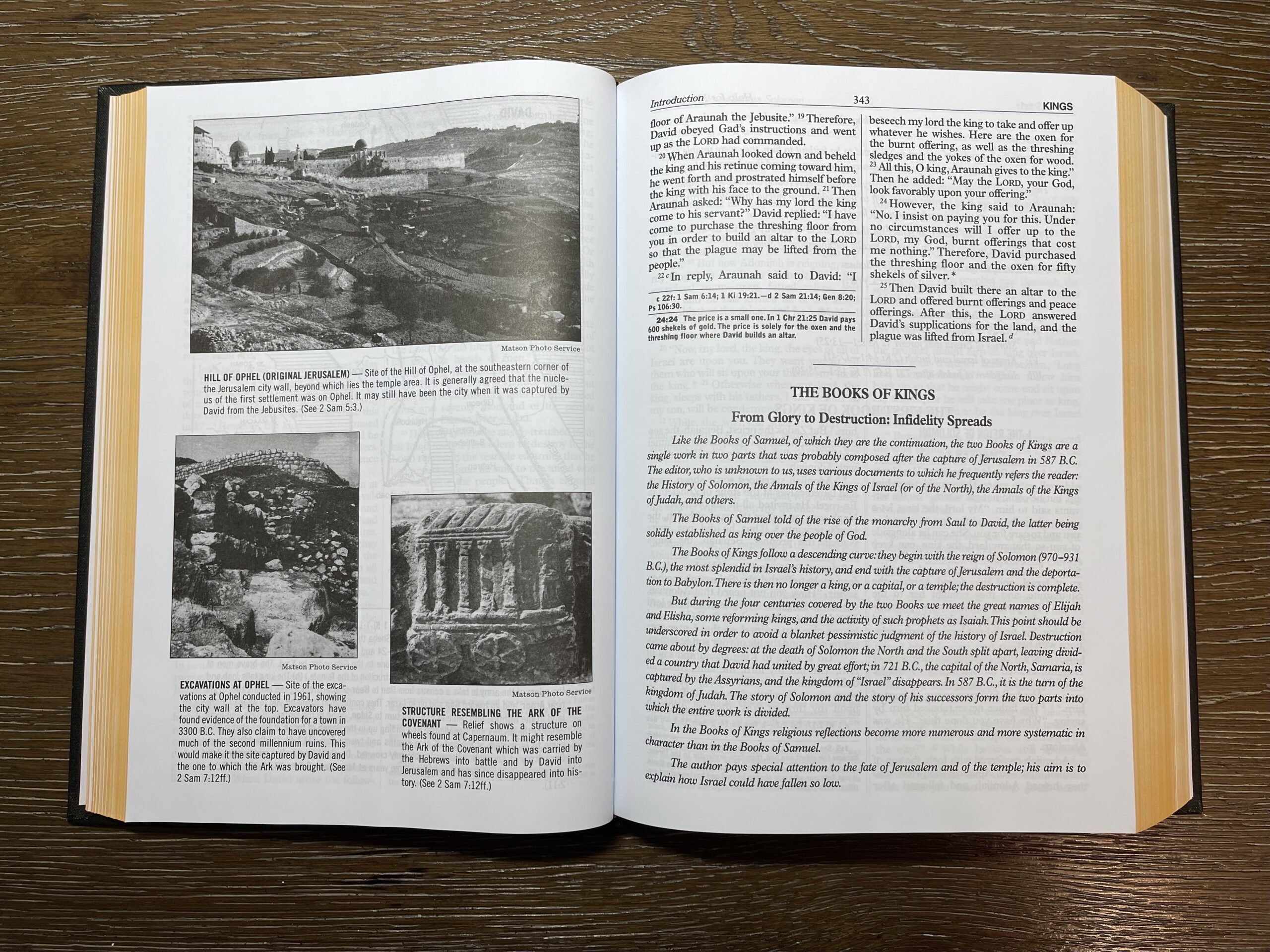
Most informational pages and illustrations are printed in black-and-white, as shown below:
This is a red-letter edition, so the words of Christ are printed in red throughout the New Testament:
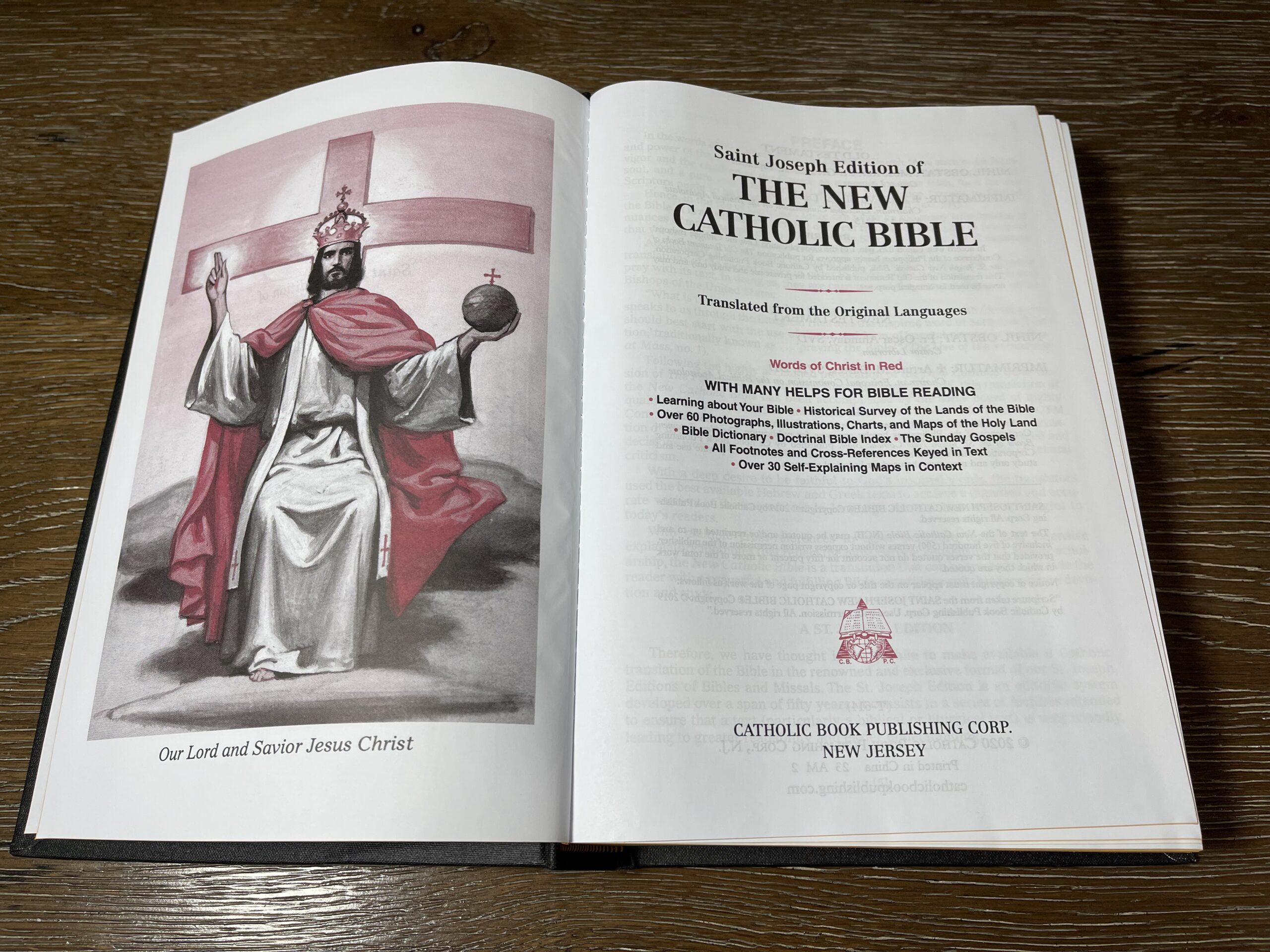
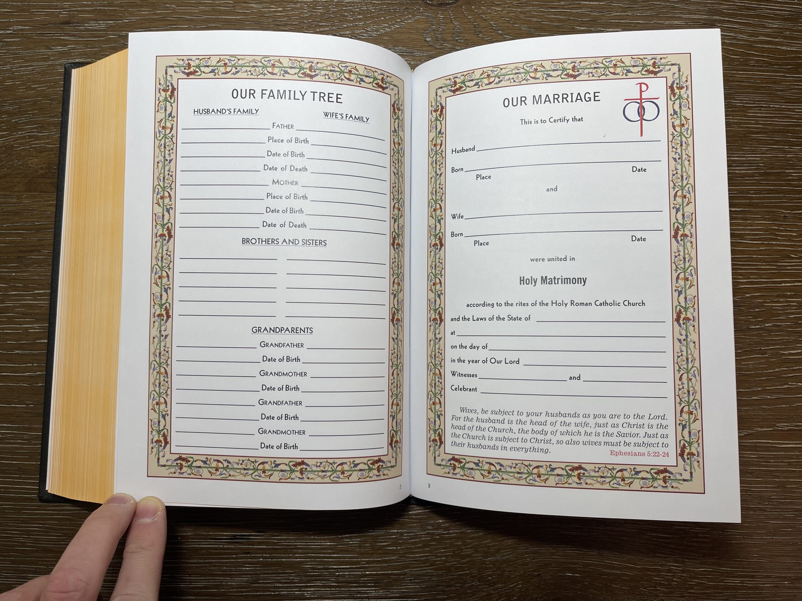
The only color illustrations appear to be a red-and-black picture of Christ on the title page for the Bible, and the family record section at the back with space for family tree and marriage details.
Conclusion
This appears to be a good quality economical hardcover (list price is $24.95 from CBPC). Since it’s available in both personal size and large print options, it could be a viable alternative to the dura-lux editions in either of those sizes, for anyone who finds the glossy color inserts in the dura-lux editions frustrating. Many thanks to Doubting Thomas No More for sharing the photos!
One small correction: the family records inserts are in between OT and NT.
CBPC’s products like the NCB feel like comfort food to me. They have their shortcomings (at times questionable art and design choices) but also plenty that makes you feel really good (great paper and print, great pastoral notes, a translation that reads well). I use a standalone NCB volume on Psalms pretty much every day and love it.
Oh gosh, it’s between the two testaments? That’s concerning. If you have the Bible open near the beginning of Matthew or the end of the OT (Zechariah or Malachi), do the family record pages pop up and refuse to lay flat?
I checked the end of Zechariah and the beginning of Matthew and while the family insert doesn’t lay completely flat, it is not popping up fully either. The paper used for regular text appears heavy enough to mitigate the issue (e.g., before you get to Mt 1, there is some introductory NT material that weighs the family insert down).
For me, this is the platonic ideal of an unattractive, unappealing, uninviting edition, from the cover to the typeface to the illustrations to the paper to the red ink. And yet–I recognize that I have so much to learn from the person who can happily stick their nose in this Bible and encounter Christ there. I am sure they have things to teach me about my sinful judging, my consumerism, and my reducing the faith to aesthetics.
But still: Catholic Bible Press has a good NABRE out that is pretty cheap for what it is, and there is still that very underrated Harper One hardcover. Those two are no frills and look way nicer than this at a similar price point. They would be my go-to NABREs.
Oh my goodness, the entire time I was writing my comment I was thinking this was an NABRE, not an NCB.
You people are way too nice to me.
I didn’t realize you were confusing the two but instead thought you were specifically referencing an NABRE because NCB seems to have been meant as an alternative to the NABRE. CBPC has published editions of both.
At one point I personally didn’t realize Catholic Bible Press and Catholic Book Publishing Corp were two distinct companies. I was hoping to get a stylish edition of the NCB from Catholic Bible Press… I would say that while CBP has more stylish designs, I have definitely liked the paper quality better from CBPC.
Yeah, I agree. Catholic Book Publishing Corp usually uses good paper with very well-controlled ghosting. That’s one thing they consistently get right.
Catholic World Press has the NCB Deluxe Gift edition in Bonded Leather. This is the best edition of the NCB available right now. No thick inserts whatsoever. I can’t stand red letter bibles but tolerate that with this NCB.
Doubting Thom: comfort food is such a funny way to describe CBPC’s materials. The Bible I have the most affection for and use the most is a CBPC nabre st joseph large type. I think of it as the book equivalent of a suburban parish built in the 80s. It feels like home and it’s well made but you wouldn’t call it beautiful.
I wish CBPC acted like a normal, contemporary Bible publisher and had more transparency and engagement with the market. I mean, does anyone know anyone who works there or owns the company? Who’s involved in their design choices and supplementary materials they put in their bibles? Why did they stop with the NAB and produce the NCB? Will they produce the forthcoming liturgical bible?
Dale in a Tincan (a YouTube channel by an elderly gentleman who posts quite a bit about Catholic books, including CBPC books) did a video recently about a slightly different edition of the NCB in which he spoke a little about the history of CBPC and noted that it was a family-owned company now in its fourth generation.
https://youtu.be/6Air4SnEQiY?si=EQeppkAyoa75Bbbi
Bren:
If you go to the Catholicbookpublishing.com and scroll down to the bottom of the front page and click on About Us you will read a brief history about the company. As for any sales information they are not obliged to share that as they are privately owned.
They also have information about the NCB.
If it was printed in India I would use it, unless someone has an argument that “Printed in China” is a good thing, or that CBP does something really good with the profits that justified the country of origin!
Mia,
I’m in complete agreement with you. I sent CBPC an email asking if they had any printings of the NCB from a country other than the PRC. They did not. I told them to let me know if in the future they have an edition printed in any other country. For now I’m going to sit this one out.
Mark
I hope more people send emails like that to Catholic publishers. Ascension is another. The original Great Adventure Bible was printed in the US, but was regrettably glued. But when they fixed that by making it sewn, they did so only after moving printing to the PRC. Even the now high-end premium Great Adventure Bible is PRC printed! It’s annoying because I think the Ascension Catechism is the only non-paperback copy with the updated CCC 2267 from 2018, but it’s only PRC printed.
I don’t care which other country they pick, if they need to print elsewhere: India, Taiwan, Japan, Mexico. I’m not the type of person who needs every Bible printed in the US or Europe or else, but surely other countries besides the PRC have printing presses!
FWIW, my copy of the NCB NT+Psalms says it’s printed in Korea. I realize it’s not the full Bible.
I did a short review of this Bible version here:
https://thefullnessoftruthapostolate.wordpress.com/2021/02/21/the-new-catholic-bible/
Hello! My NCBs just arrived. I’d like to share some updates on the cloth hardcover, large print student edition No. 614/22 (ISBN 978-1-953152-27-5) featured by Marc above. In my copy…
1. The cloth is pure black with super fine weaving, not like the one in the photo above.
2. The words of Jesus are not in red but black.
3. There are 4-leaves insert for family record between OT and NT but matt not glossy. They could be the same material as the main paper except much thicker. There are no other inserts.
4. The image of Jesus at the front matter is black and white. In fact all illustrations are black and white, except for the family record section.
5. It is printed in India not China.
6. There’s no drawing of a triangle with an eye or hand in the middle.
7. For U$24-26 at amazon, it’s a great value.
8. The large main font for biblical text is identical to that in the Oxford Annotated Bible with Apocrypha RSV (the one by Bruce Metzger).
9. Footnotes are smaller sans-serif but bold. No problem with legibility.
10. Thin white paper with negligible ghosting.
11. No ribbon marker, no tabbed index.
12. Some photos are too dark they lose detail.
13. Yellow edge color. I think this yellow edge edition distinguished their budget versions from their premium version which is gold edge. Just my conjecture.
Overall, well illustrated with black and white photos, drawings, and maps that do not distract at all. I’m still getting familiar with it but for now I’d say, I love it.
If you’re buying an NCB and want the edition with full treatment of color inserts look for an edition with gold gilding (not painted yellow), and ones where the photo of the box clearly describes the product inside it. The CBPC product page for their bibles uses generic description. The budget versions (yellow edge) do not contain the same supplements found in their premium editions (gold edge). It can get confusing. Luckily, I got what I wanted.
You note that the NCB Large-Print Student Edition now appears to be printed in India and Chris W above mentions South Korea for the NCB NT + Psalms. I recently saw a new NKJV published by Thomas Nelson which is also printed in South Korea. I wonder if this signals a wider trend of Bible publishers leaving the PRC for alternative countries, or if these are isolated cases. I hope for the former!
As far as I know this student edition is newer than most. For instance, it has already corrected the errors mentioned in another post:
1 Kings 7:26 handsbreath already edited to handsbreadth
1 Kings 7:50 censors edited to censers
1 Kings 14:31 Abijah edited to Abijam
I’m sure that CBPC will continue to correct typos once they’re aware of it. As for place of printing economic factors will always have a big impact on where they decide to manufacture. This India made edition was well made and budget friendly so I think it’s a good sign.
I would love to get a NCB without the red lettering. Is the link below the exact edition you ordered on Amazon?
https://www.amazon.com/St-Joseph-Catholic-Bible-Student/dp/1953152279/ref=sr_1_13?crid=3L55H90WMVS91&dib=eyJ2IjoiMSJ9.W0cD4u3MSiutaqD8qzvPmGMVyEjoHaQSGV2lQV6LGLtsmjv6rpgiJl7gCuYCxIWGBww9fWc55fb65FM1l7MCEvICx2x04QbwTRyxiITIZpCxNUjVwl5NyctE1Zfx3dsxypqE-o-O46-YglXSOGp6E05oAXiqx7myZbH9NZ6pQz06r1vFulZHm-yeVe3zQCk2K3QUOTc28_j7GYPE4jbLqoxX70hGezBjwuXBUo8FOkc.RqBTHaxyxhj7BZMELB_gdjb–25ULhKhPiC1nAlisMw&dib_tag=se&keywords=New+Catholic+Bible%2C+Hardcover&qid=1758693968&s=books&sprefix=new+catholic+bible%2C+hardcover%2Cstripbooks%2C76&sr=1-13
Yes, that is correct (No. 614/22 ISBN 978-1-953152-27-5). I clicked your link and it brought me to the exact product page that says I previously ordered it. The back of the slip case that came with it says red letters for the word of Jesus- this is incorrect. I’ll upload a review of it soon at amazon. As to my comments on its contents, it would be the same assessment I did for the imitation leather edition review I already uploaded at amazon (No. 614/10B ISBN 978-1-947070-76-9). Caveats: it’s a layman’s review. I’m not a biblical expert.
Finally decided to get myself an NCB, and decided on this simple hardcover edition. Having purchased it just a day ago after Amazon and received it today, I can confirm that it’s still as Ram described above. The cover texture reminds me of those “book socks” school libraries had you put over the textbooks you were borrowing for the year. It is, indeed, still printed in India. Also, maybe it’s just my copy, but the yellow page edges seem really dark yellow, more like orange. The words of Christ are in black, as are all the parts on the illustrations or logos/symbols that had red in Marc’s copy. And while the paper sleeve that the Bible came in still erroneously advertises “Words of Christ in Red,” those same words that appear on the title page of Marc’s copy are now absent, meaning this particular “student edition” is now intentionally a black-letter edition; CBPC just never updated the packaging. So, if anyone wants an NCB but, like me, isn’t a fan of red letters, then this is the edition for you. Not bad for under $20, thanks to a coupon I got.
About six months ago, I asked Catholic Book Publishing Corporation if they offered the New Catholic Bible without the red lettering. They said that this particular edition had it. So, this is a change for them, probably due to many requests for all black lettering.
I’ve come to like this version very much, even though there is an awkward choice of words here and there. Still, it’s a far more traditional version than the NABRE, even if it isn’t the extreme of formal equivalence. It’s perfect for teaching and devotional reading. And this edition has fairly large and heavy lettering and a bright white page that are easy on the eyes.