
It was a blessing to be able to receive the new Tan Books Reader’s Edition Douay Rheims a bit early. I had pre-ordered from Target, but having seen a Reddit comment about it being on Amazon I immediately canceled that order and got the one on Amazon in 2 days! I was very much anticipating this release, and I thought I would share some pictures, a few comments, and reflections. I have been collecting Catholic Bibles and following the Catholic Bibles Blog and this blog since my conversion in 2009, and it is amazing what great Bibles we have since that time. I can’t help but wonder if that is in part due to the participation, criticism, and comments of the great people such as who are reading this post right now.
The Douay Rheims Bible has been an ongoing source of prayer and devotion for me. Its apologetic notes played a part in my conversion to the Catholic Church, and I have turned to its pages in difficult times of penance, prayer, and supplication. For me it is an important part of our Catholic heritage, drawing on an ancient understanding and interpretation of scripture. I know it is not everyone’s cup of tea but I think that its language is beautiful to read devotionally: silently and out loud. I love to read the passages that are tugging at my soul after receiving Holy Communion, and there are many times the Douay Rheims hits me in a profound way. I make a distinction between the Challoner DR and the modern English editions that are translations of “new” Latin and based on critical editions. In other words, I don’t consider the Pius XII Psalter translations and Confraternity NT to be successors to the Challoner, but they are a different animal altogether. Sometimes people think that the DR is for “trads” because of its use in many older missals, but I think that the DR is a treasure that appropriate for all of English speaking Christendom, not even just Catholics, as the Vulgate hearkens back to a time of ancient and apostolic unity.
Now on to the physical construction of the Bible. I was not disappointed in any way from the moment I unwrapped, and in the time I have spent in its pages thus far. The cover is very soft and attractive, the ribbons are of good quality and well spaced, and the paper and the construction seem very solid. It is a sewn binding, and the Bible will lay open about midway through Genesis but that may improve as I break it in. The binding does not seem tight or constricted at all and the pages open up wide with no crinkling. The Reader’s edition is slightly smaller than the medium size Baronius DR, but thicker than the previous Tan edition.
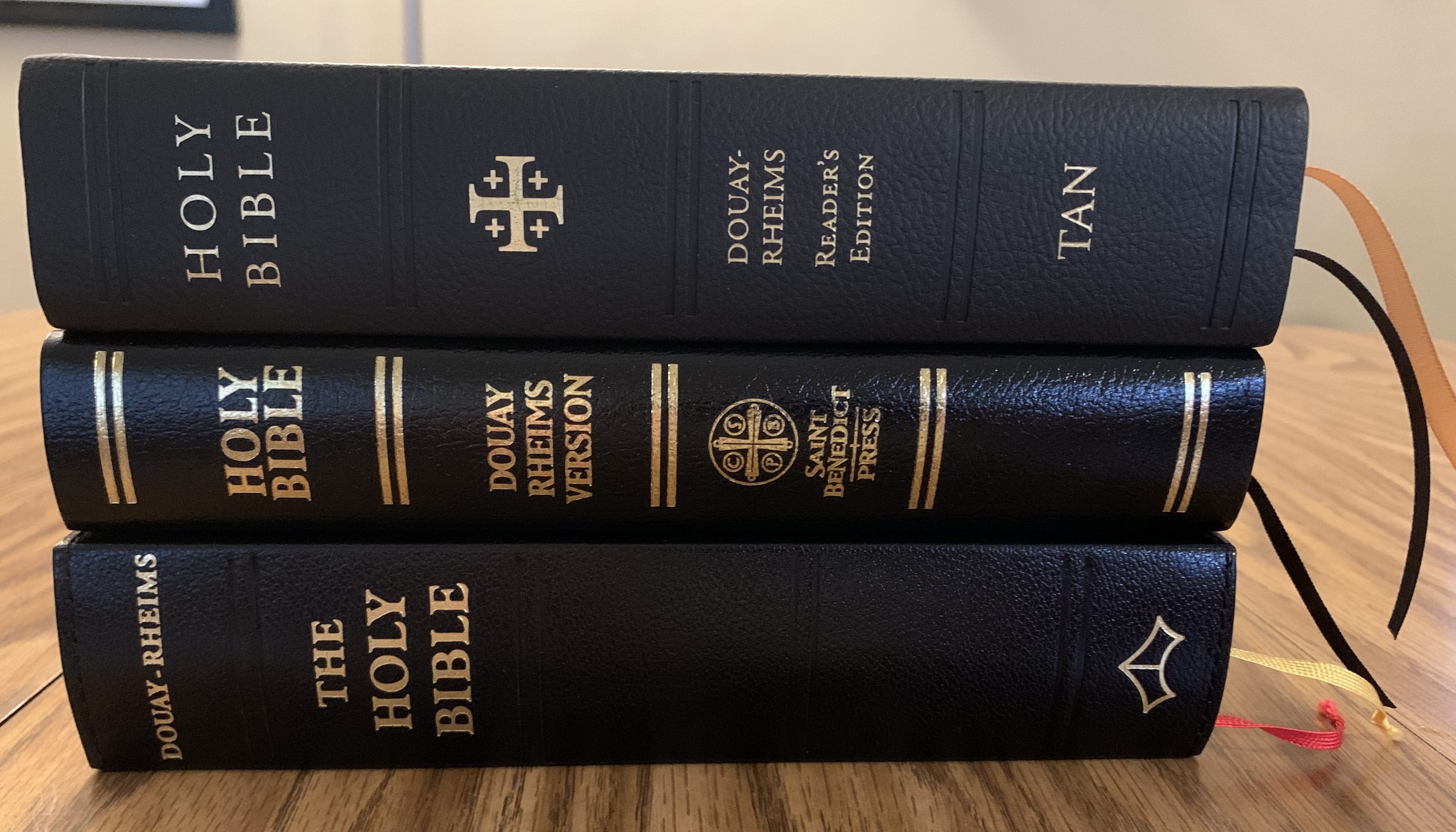
The new Tan version is about 420 pages longer, which is probably due to the generous margins. The book block is about 1.5″ thick and the pages show very little ghosting. At this point in my journey, I do not care about expensive leather covers, I just want a Book that looks and feels nice. If it is a Bible or devotional I prefer a soft cover with gold edges with a typeface that does not look tacky. A pet peeve of mine is when the text crowds any part of the book, especially the gutter. This reader’s edition checks all the boxes for what makes a physical Bible enjoyable for me.
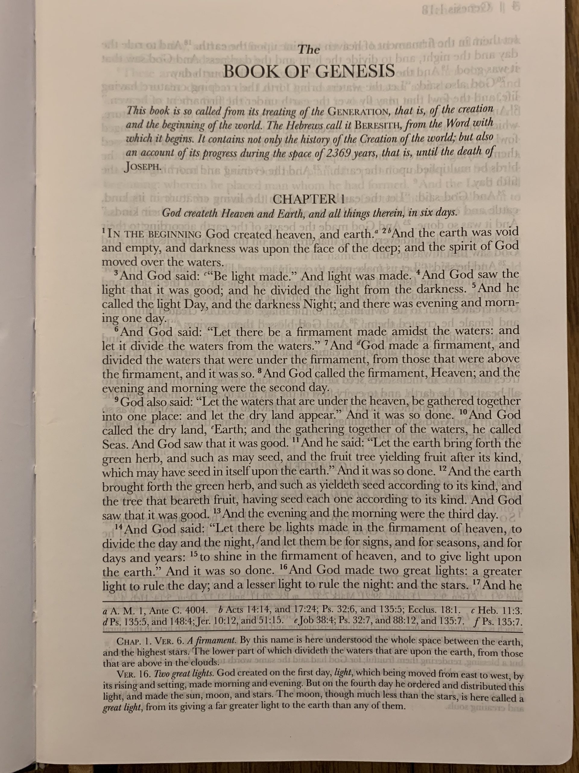
The biggest benefit of the new edition is of course the paragraph formatting and modern punctuation including the use of quotation marks. I have a lot of experience with the DR so the previous edition was not an obstacle, but this new edition will no doubt make the DR more accessible to first time readers. A few other noteworthy features of the new edition:
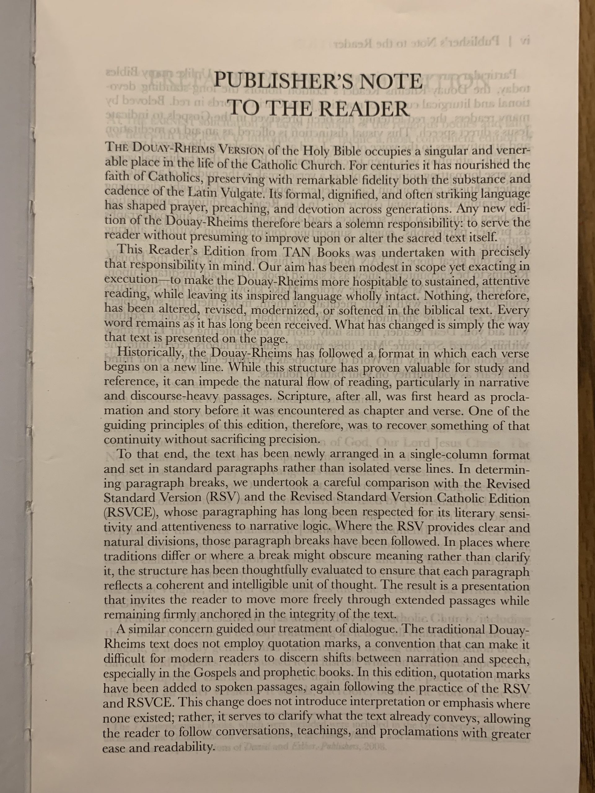
1. The Reader’s Edition actually contains a “Publisher’s Note to the Reader.” This is very thoughtful and considerate as we know that the Catholic Bible fans want to know the editorial decisions that went into the making of this edition. An important revelation here was that Tan referenced the RSV and RSV-CE extensively to standardize paragraphs and quotations when possible. Another important point was that this is faithfully the 1899 edition. The handful of minor typos that were discussed here previously do remain here for that reason. I did write Tan an email regarding this, but seeing how quickly these Bibles were available after their announcement I doubt my correspondence was received in enough time to make any changes.
2. The red letters are included for the words of Jesus on earth. That is to say, they begin in Matthew and end in Acts 1:8. The red print is well done, evenly spaced, and to my eyes do not present an obstacle for reading.
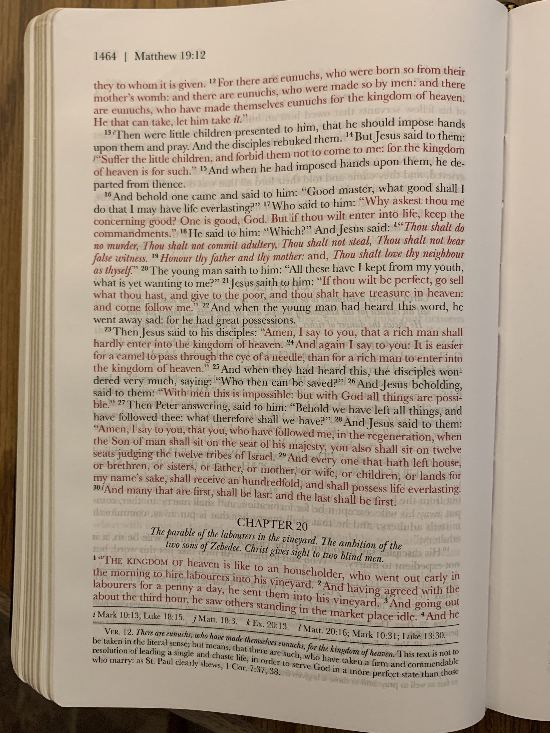
3. The use of Scripture quotations are presented well. Quotations are spaced out from the text and in italics.
4. The poetic sections are faithful to the verse by verse presentation of the older editions, but the numbering is spaced out from the text, and it is also spaced out into stanzas. This, combined with the single column format make the poetry much more enjoyable and easier to read.
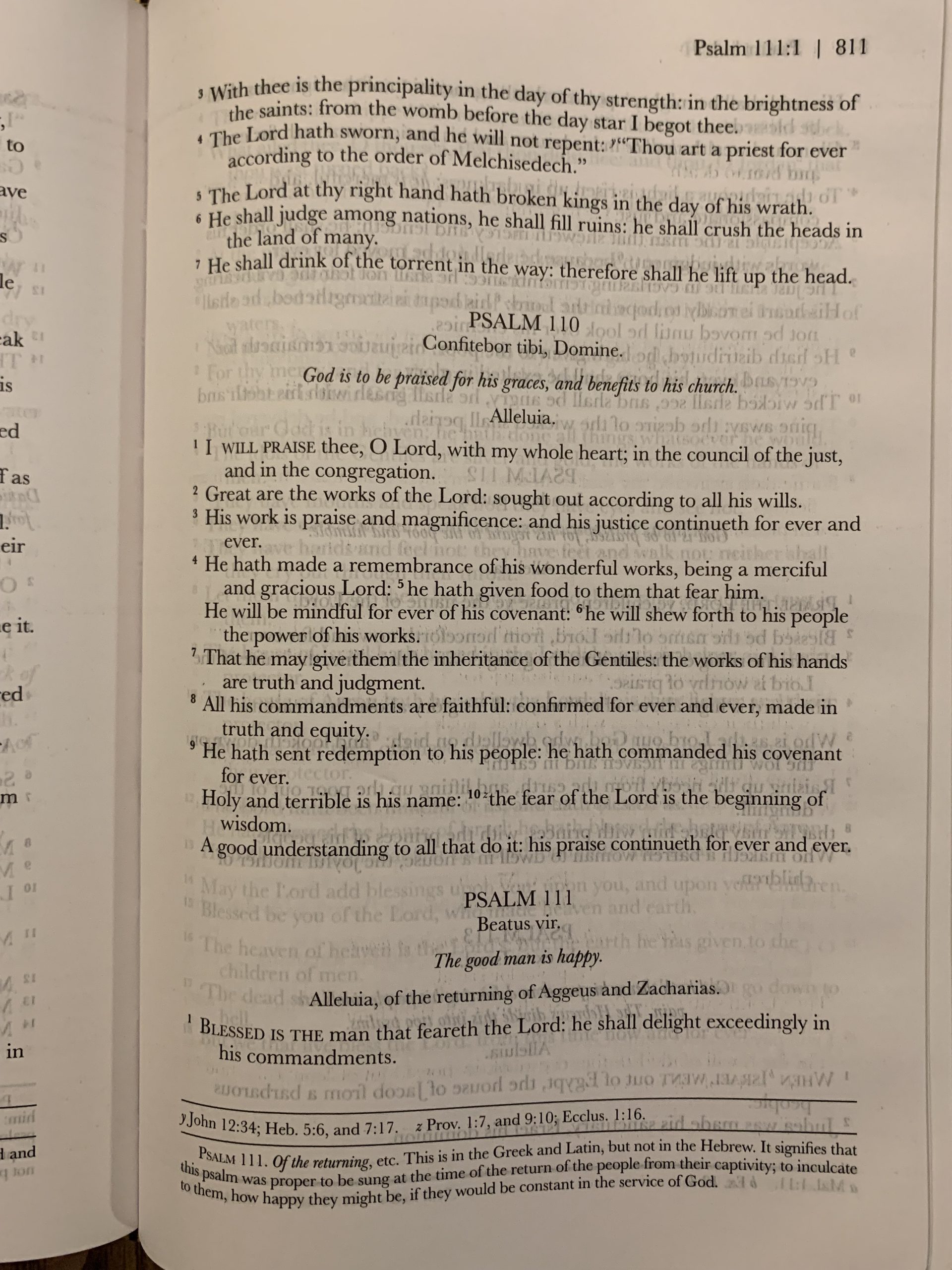
5. The Reader’s Edition retains the notes, references, and dates of the 1899 edition. Also included are the timelines, Tables of Epistles and Gospels, selected prayers, succession of Popes, and the same maps in previous Tan editions. Unlike previous offerings from Tan the maps in this edition are printed on Bible paper, not the thick, glossy inserts.
I have been collecting Bibles for many years, and with so many resources available online now I have become more selective of my physical purchases. This is one edition that I would wholeheartedly recommend picking up the physical copy. The only exception here is if you need large print, this is not large print. The print is comparable to the medium size Baronius and Tan Bibles of similar dimensions. I think it is possible that Tan will release a large print version of this especially if this sells well. Unless you do need large print, the Reader’s Edition is much easier on the eyes than any other available edition.
Are the words of Christ in the Apocalypse not in red?