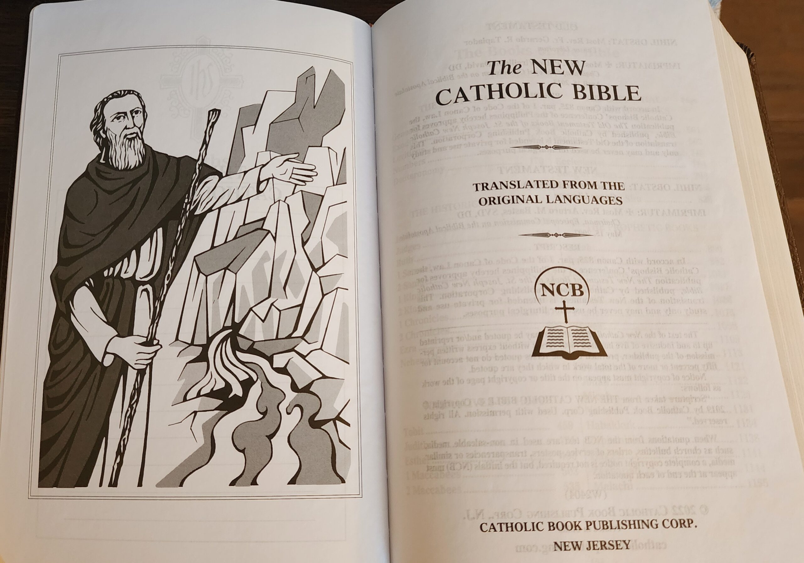
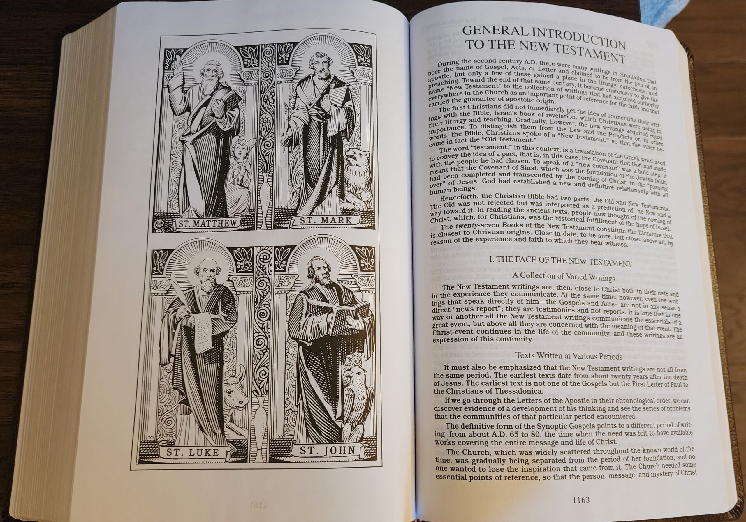
In response to a few questions in the comments on my review of the NCB Deluxe Gift Bible, here are a few more photos showing the italic font which is used in the introductions to each biblical book, the black-and-white maps at the back of the Bible, and the two black-and-white illustrations of Moses and the four evangelists (which are the only illustrations I have found in this Bible.
Italic Font in Book Introductions
Both the St. Joseph Personal Size Edition and the Deluxe Gift Bible have book introductions printed in italics. On a first comparison, I thought the font was the same in the two editions, but the Deluxe Gift BIble’s introductions are printed in bold (and italics) with narrower line spacing. Based on a comment from Josh on the previous review post, I can see that the font is actually different. The shape of a lower-case “g” is different between the two fonts. Here is a comparison photo:
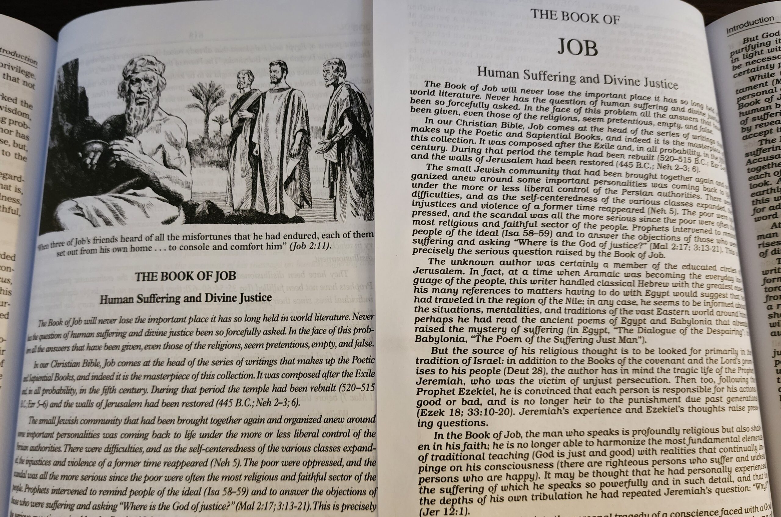
Illustrations
The only two illustrations I’ve found in the Deluxe Gift Bible are a picture of Moses at the beginning of the Bible and a picture of the four evangelists at the beginning of the New Testament:
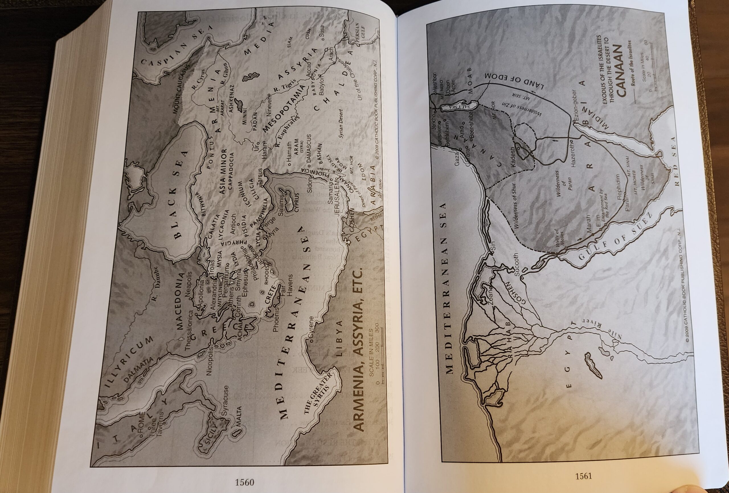
Black-and-White Maps
There are 8 pages of maps at the back of the Deluxe Gift Bible, printed in black-and-white on normal Bible paper. Here is a photo of two of the maps:
Thanks for posting these extra photos, as well as the additional comments in the other thread.
Thanks Marc. The italics used in the NCB Deluxe Gift Bible looks easier to read than the squiggly script-style italics of the NCB St. Joseph Edition. The maps seem better positioned too, being collected at the back for easier referencing.
Welp, just ordered this in the indexed one. Thank you for your work boss.