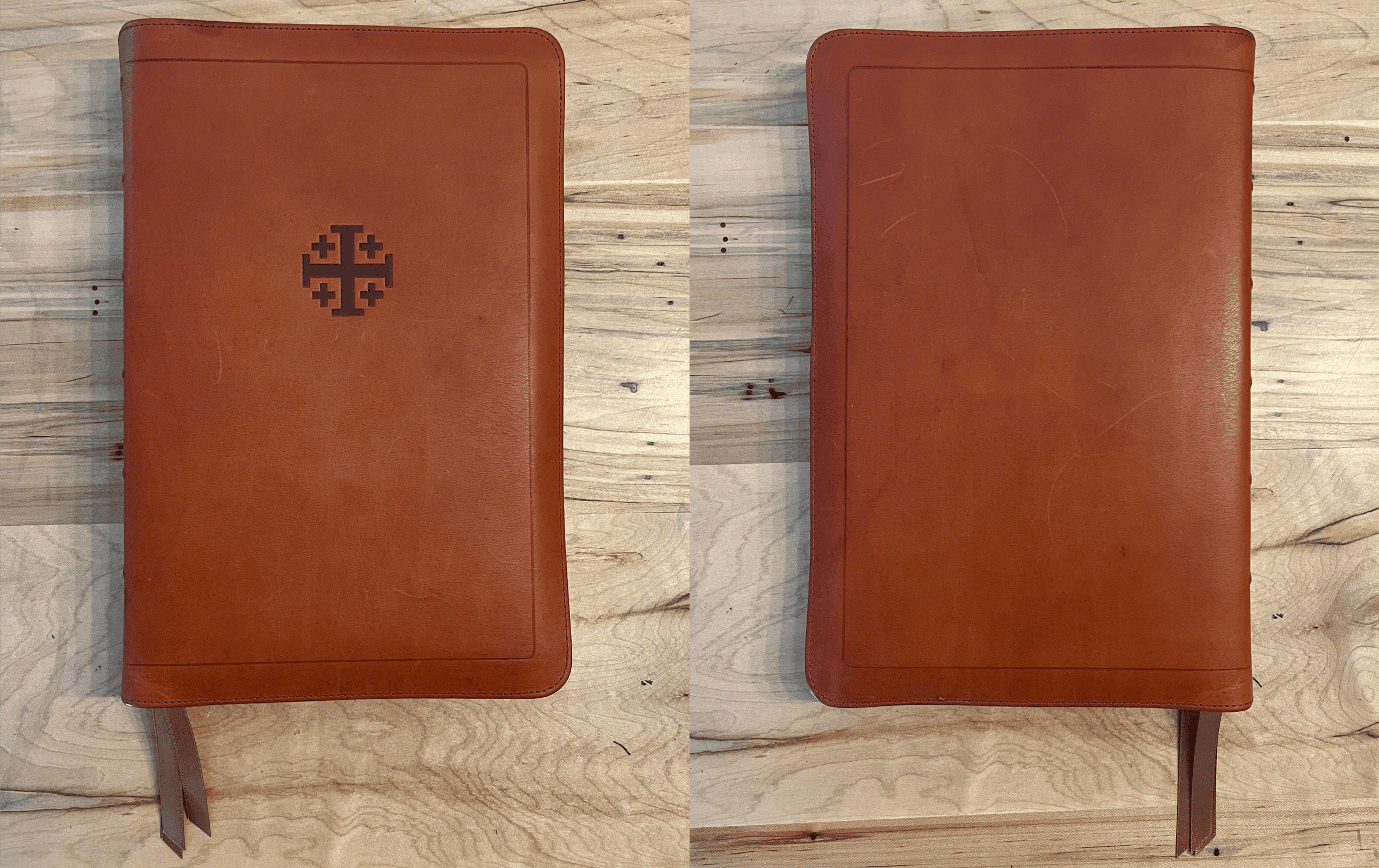
There is a new option now available for Catholics looking for a premium Bible thanks to the recent release of the updated Schuyler Quentel ESV with Apocrypha. Schuyler released the RSV with Apocrypha (reviewed here) several years ago, and announced earlier this year that the ESV Quentel was being redesigned and rereleased with some options including the Apocrypha. My first impression of the new Schuyler ESV Quentel with Apocrypha is that it is an incredible and beautiful Bible, though I would prefer a smaller version for daily use.
For the last year I have been reading from the Cambridge ESV Diadem, which I selected thanks to this review and as well Dr. Mark Giszczak’s excellent book on the topic, Bible Translation & the Making of the ESV Catholic Edition (Q&A here, my notes here). The ESV Quentel is only the second premium Bible I own after the Diadem, and is in fact the first Schuyler Bible I have seen in person. Therefore, my impressions and opinions are as a newcomer, and I will include some comparisons to the Diadem since it is my closest point of reference.
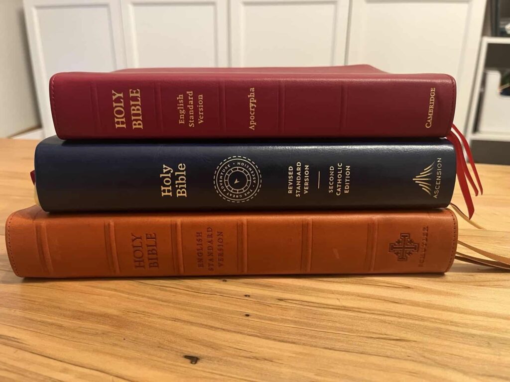
I preordered the Full Yapp Siena Calfskin version in early April, specs for which from the EvangelicalBible.com website are below:
ESV Text Edition: 2016
Full Yapp Siena Italian Aniline Natural Grain Calfskin with Dark Brown Calfskin Liner
10 point Milo font
Ornamental Drop Caps
PDF sampler of the text
Line Matching
28 GSM
Page size: 6.1″ x 9.13″ x ~1.1″ (155 mm x 232 mm x 29 mm)
3 x 1 cm ribbons (Gold)
Art-Gilt edging (brown under gold) with gilt line (gold line inside the cover)
Blind embossing on spine (embossing will also be blind)
Raised Spine Ribs
Smyth Sewn
Black letter text (chapter numbers, page headers and page numbers in red)
More than 80,000 entry cross references
Expanded Edition of The Apocryphal/Deuterocanonical Books
Concordance
Presentation and family records pages
Extensive Schuyler Bible Maps
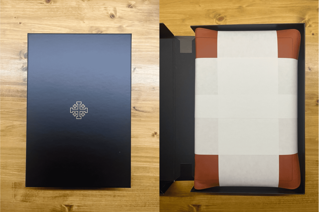
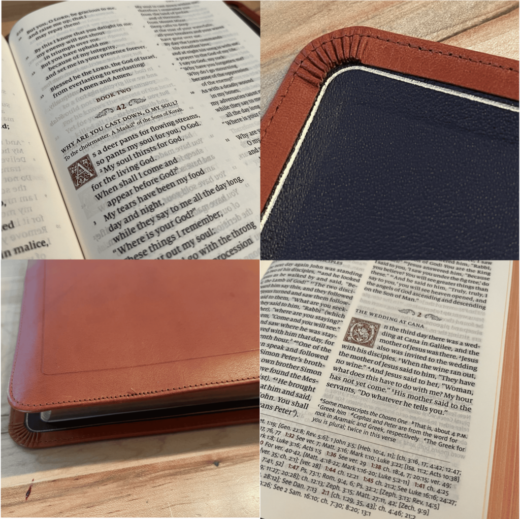
After reading about Schuyler Bibles for several years but never seeing one in person, opening the box and holding one for the first time was a surreal experience. This Bible is simply an exquisite work of craftsmanship down to the smallest detail.
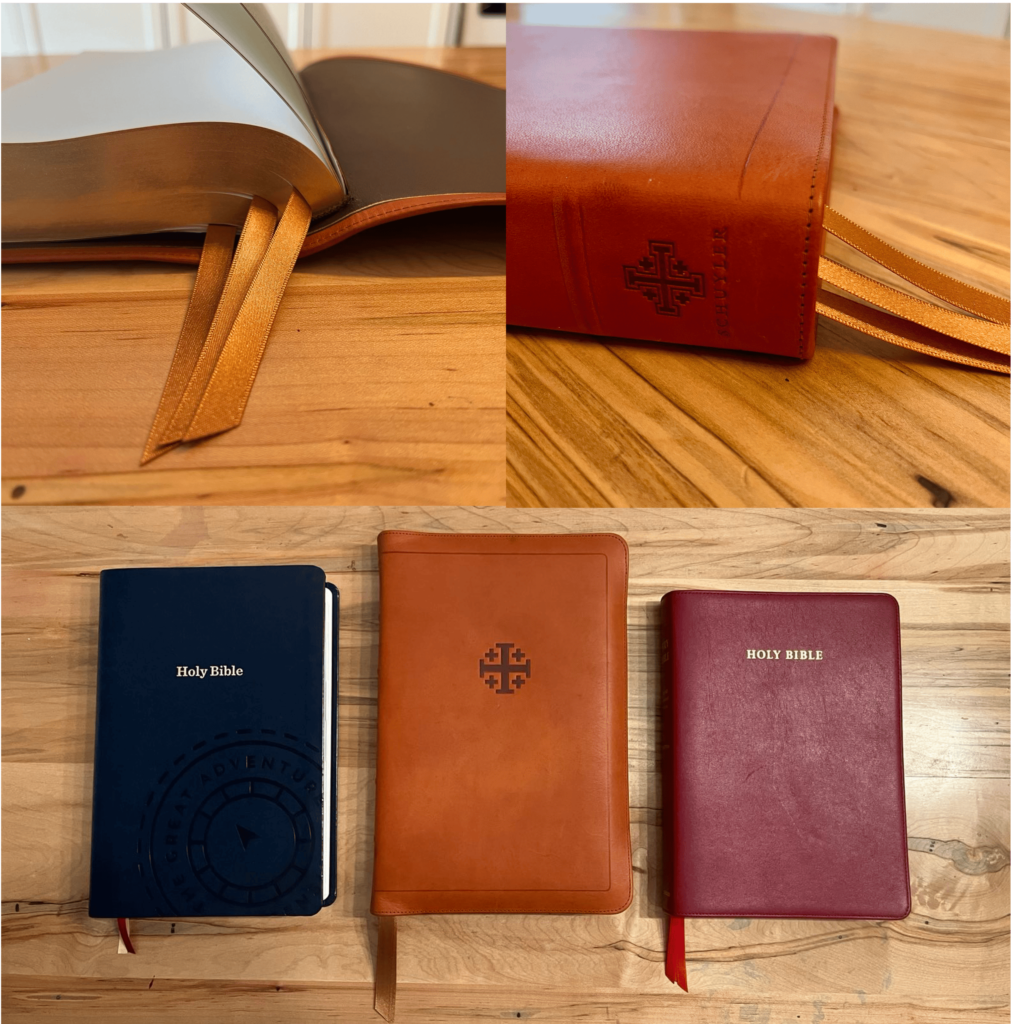
The Siena calfskin is beautiful. It smells incredible. I appreciate the subtlety and simplicity of the blind embossing on the cover and spine without gold gilding. The cover is noticeably stiffer than the Diadem and not as soft and buttery, though I’m sure this will soften up as it breaks in. It has a very natural feel to it and will certainly patina—it easily shows small scratches and marks from only a couple days of use, so I’m excited to see how this breaks in while I read through it over the rest of the year.
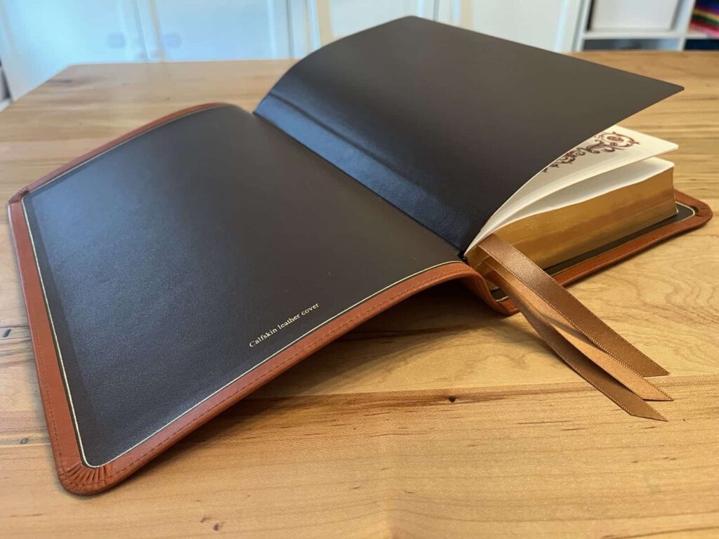
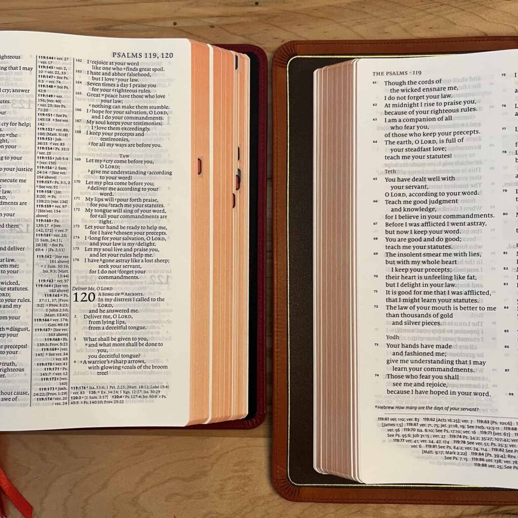
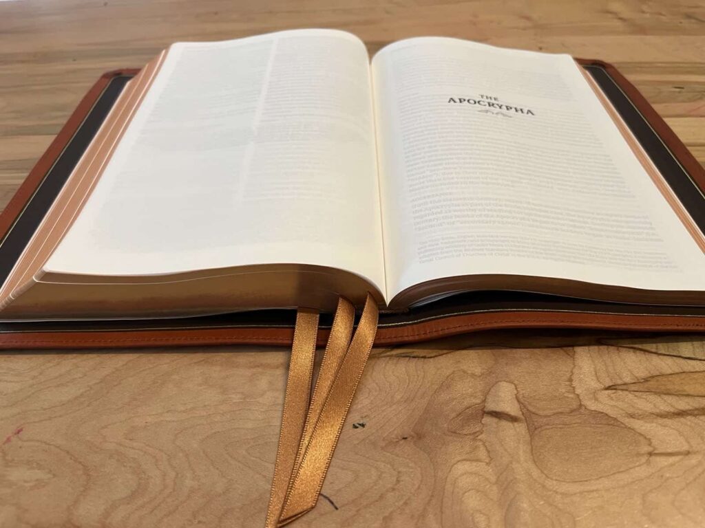
Opening the cover and seeing the dark brown calfskin liner with gold gilt line and perfect corners is what really puts this Bible a step ahead of the Diadem with its synthetic liner. This is especially noticeable and beautiful when reading given the framing of the full yapp. The beautiful gold 1 cm ribbons are much more substantial than the rather anemic ones on the Diadem. The only two slight imperfections in the construction of this Bible (if you could even call them that) are one small thread sticking out in the perimeter stitching on the back of the cover, and a small exposed portion of the bottom tail band.
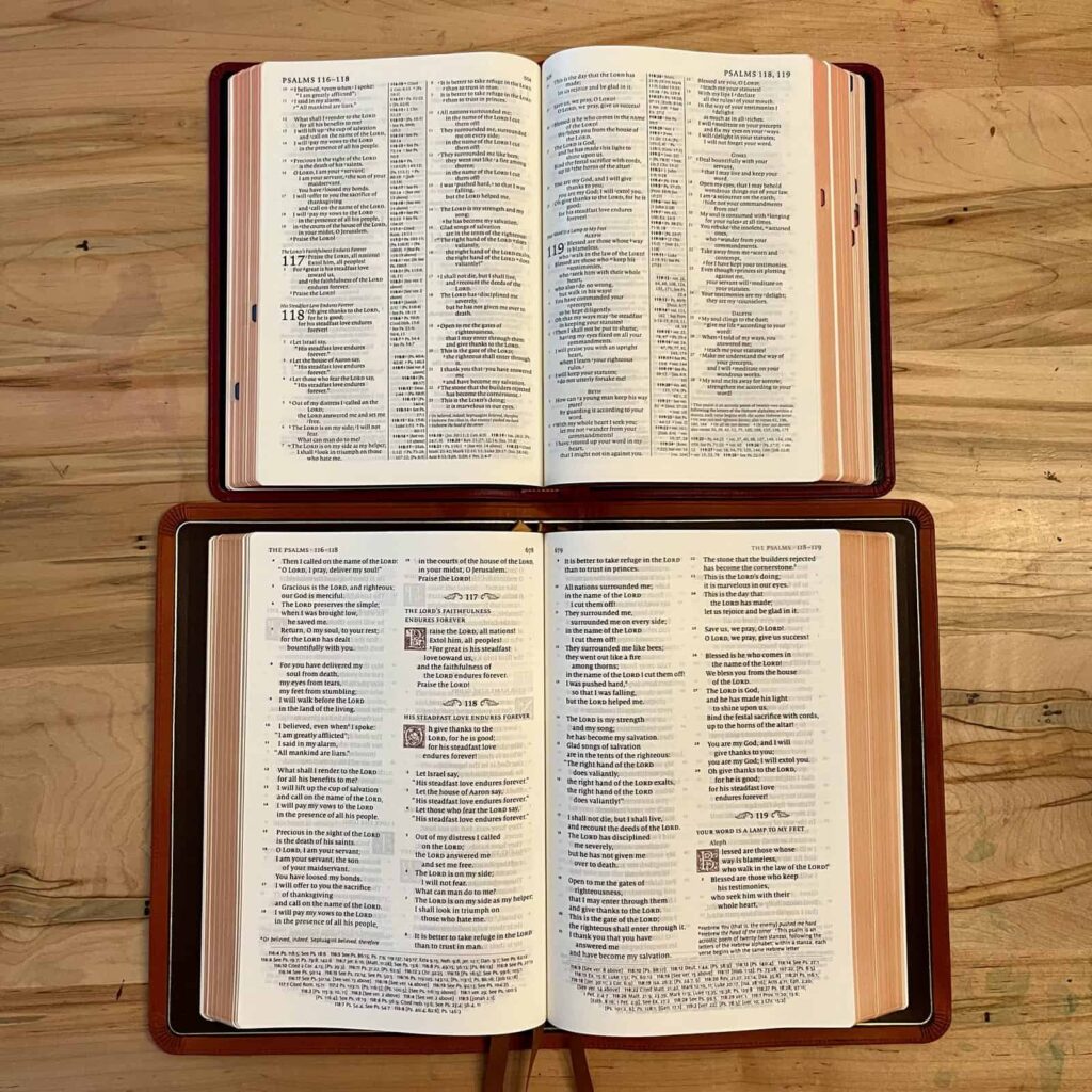
This is a hefty Bible that is well constructed and ready for many years of use that I look forward to if the Lord wills (cf. James 4:15). If there is one downside to this Bible, however, it is that heft. With the text block at 6.1″ x 9.13″, the external dimensions with full yapp come out to 7″ wide by 10 1/2″ tall by 1 3/4″ thick. If Schuyler were to release a Personal Size Quentel (sometimes abbreviated as PSQ) ESV with Apocrypha that may indeed be the closest thing to the ultimate premium Catholic Bible given my preference for a smaller footprint (the Diadem is just about the perfect size in my opinion). Sadly when I asked EvangelicalBible.com about this I was told they “don’t currently have plans to release the PSQ with Apocrypha.” Schuyler and EvangelicalBible.com, if you’re reading this: please, please consider bringing the Apocrypha to the PSQ! And Cambridge, I would love to see a Pitt Minion with Apocrypha to pair with the Diadem!
The typesetting is simple and elegant (sample pdf here). My first reaction was how clear and large it seems. The 10 point Milo font in the Quentel veritably leaps off the page in comparison to the tightly packed 8.1 pt. Lexicon font in the Diadem. I suspect my eyes will age more comfortably with the Quentel. The red accents look great, and make for an easier reading of the cross references. I was pleased to see the minimal indentation the Quentel uses for poetry, which minimizes line breaks and makes the text flow more naturally. This is one frustration I have with the Diadem: despite its otherwise very efficient use of space, it unnecessarily indents poetry resulting in lots of wasted space and more difficulty reading.
I think the ornamental drop caps and “winged” chapter headers are beautiful, but I would actually prefer standard chapter numbers for readability and to conserve space. I would also remove the bolding on verse numbers so that they both recede from notice and also contrast with the text itself.
On practical grounds alone, I was excited to see the Apocrypha included after the New Testament rather than between the Old and New Testaments as is the case in the Diadem (and as was the case in Luther’s Bible of 1534 and the King James Version of 1611: see chapter 10 of Why Catholic Bibles are Bigger). Rather than being frustrated that the Deuterocanon is relegated to a location of “lesser” importance (or called “Apocrypha” in the first place), for entirely practical reasons it makes reading the New Testament easier by placing it more in the middle of the text block. There are 303 pages of the Deuterocanon, 62 pages of the Concordance, lined note paper, and Bible maps to sit behind the New Testament. Apart from reading through the whole Bible annually, I spend more time in the New Testament (as guided by the Church, see Dei Verbum 17 and look at a chart of Vatican II scripture citations to illustrate the point). Why, though, did they need to re-start the page numbers with this location choice?
Finally, let me close with a brief rationale as to why a Catholic is reading a Protestant translation published by a Protestant printing house. First, the ESV is a good translation and suitable for Catholics: Dr. Mark Giszczak’s book and the forthcoming use of the ESV-CE in lectionaries abroad convinced me of this. At the end of the day, the differences between the ESV and the RSV-2CE are minimal (from reading the ESV while listening to Fr. Mike read the Bible in a Year from the RSV-2CE), and the differences between the ESV and ESV-CE are laughably negligible (at least for someone at my elementary level of understanding, see this list which has been shared here before). Second, I believe Catholic use of the ESV can be a gesture of friendship toward our Protestant brethren. I pray earnestly for the unity of all Christians. I haven’t met many Protestants who are interested in or aware of the Douay-Rheims or NABRE, but I have met a lot of Protestants who read the ESV. In return, let’s pray that the Deuterocanon continues its apparent resurgence. Points 1 and 2 together make the ESV a natural choice for Catholics to use alongside multiple other translations to engage deeply with Sacred Scripture alongside all Christians.
The main reason, however, is that I’m not aware of a more beautiful and well-made ESV (or other mainstream translation) with Apocrypha available currently. The Word of God is such whatever it is printed on, but other things equal I want to read and spend time with a beautiful Bible. God created us body and soul, and beautiful material objects help draw our physical selves into spiritual communion with God in his Word. I have this quote from the French Carmelite friar Pére Jacques copied in the first few pages of my Diadem (it will soon be in the Quentel also):
Live the Bible by picking up the rosary. Take up the Bible not as an ordinary book but on your knees, kissing the book before and after reading. Scripture does not disclose itself at the first reading. It is a difficult book, just as sainthood is difficult, but it too contains within itself a mysterious assistance to one who would understand it.
The Schuyler ESV Quentel is a Bible that conveys the inestimable riches of its contents in its physical construction, and indeed one to be read on the knees, kissing it before and after reading.
Matthew,
Thank you for your extensive review. Over the past two years my main reading has come from either the Schuyler RSV or the ESV (in both the Diadem and AI editions.) I agree with your assessment about the ideal being a PSQ in the ESV w/Apocrypha, but it doesn’t seem like something that will happen anytime soon. And while I very much admire my Schuyler RSV, you made the point that it is a tad large. I very much agree with you on that. I do prefer carrying around and reading from the Diadem and AI over the Schuyler RSV. Hence, my hesitation at this point to getting this new edition. But, in the end, that is a personal preference. I am sure many will find this to be an outstanding Bible. And the craftsmanship is unmatched. Thanks again for the review and the photos!
Thank you so much for sharing this review, Matthew! While I’m waiting for my copy to arrive, could you confirm whether the deuterocanonical books in this edition are the same 2016 version (which includes the updates from the ESV-CE) as was used in the Cambridge ESV Diadem?
I missed the Apocrypha preface at first because it is located with the Apocrypha rather than at the front as in the Diadem. The preface is almost identical to the Diadem preface, with the addition of a note on Esther having the Greek portions in italics. A footnote indicates that “The text of the ESV Apocrypha was first published by Oxford University Press in 2009…The Apocrypha was subsequently reviewed and approved by members of the ESV Translation Oversight Committee in 2017, including the special case of Tobit.”
Which bible would you recommend for me to read? I’m beginning the process of converting to Catholicism. Thank you
Welcome, Sarah! There are several translations and options that are available for Catholics, and my recommendation would vary depending on your prior experience with the Bible and exactly what you’re looking for. Could you give me a little more info on how familiar you are with the Bible and what you’re looking for in a Catholic edition?
Personal recommendation: I’d recommend the Great Adventure Catholic Bible from Ascension Press. It’s a great translation, and there are great introductions on how to read the Bible (including a “big picture” reading-plan) and how to situate each book in it’s proper historical and spiritual context. And, if you’re more of an audiobook/podcast person, the Bible in a Year Podcast uses the same translation, so you can follow along!
Really thorough review, and I enjoyed your notes on Dr. Giszczak’s book. Thanks for taking the time to write this!
Is there any hope that Augustine Institute will make a travel size, or at least smaller, version of their ESV? I’ve really come to enjoy the ESV but hope for a smaller edition. My daily go-to is the Ignatius press New Testament and Psalms RSV2CE. Can we get an ESV version?!
Crossway publishes a nice-looking ESV New Testament with Psalms and Proverbs (in both imitation and genuine leather). I’ve had it sitting in my shopping list on Amazon for a little while, but I haven’t purchased it yet. It might fit what you’re looking for. Here’s a video review from Tim Wildsmith showing both cover options:
https://www.youtube.com/watch?v=Ca60zzcZ5CE
It appears that AI is focusing its energies on its Catholic Standard Version Bible.
I’d recommend a pocket edition of the ESV-CE from ATC Books:
https://www.atcbooks.in/product/esv-ce-pocket-hb/
I have this one myself, the print is a bit small, but it is a pocket Bible so, that’s kinda par for the course. I wouldn’t say it’s in any way a premium bible by ANY stretch of the imagination, but it appears to me to be a sewn binding, and the paper, while kind rough feeling, doesn’t have a lot of show through. It’s a decently priced rough and ready portable ESV-CE though, and I haven’t seen one of similar compact size anywhere else.
As far as compact ESV-CE editions, there is a new pocket ESV-CE Bible from SPCK Publishing available on Amazon on 10/17/24: https://www.amazon.co.uk/ESV-CE-Catholic-Bible-Anglicized-Pocket/dp/0281090734
CTS is also publishing an ESV-CE Bible that may be compact as well. CTS has a web page where you can be notified when the ESV-CE Bible is on sale. Just go to the following link and enter your name, email address, and check the box, “Bible (ESV and Abbey Psalter)”:
https://www.ctsbooks.org/…/register-your-interest…/
Sorry that second link didn’t work for CTS Books. It should be: https://www.ctsbooks.org/lectionary-site/register-your-interest-lectionary/?
A thing of beauty, no doubt, but I’ll stick with the ESV-CE Cornerstone edition from Cambridge, not least because it’s Anglicised. I live in the UK where we’re about to change to the ESV for the Lectionary (with Abbey psalms). Next year CTS will release an edition of the ESV-CE with the Abbey psalms.
Schuyler bibles most definitely set the gold standard aesthetically but the cost is too prohibitive. I’m also put off by the typographical errors in their (now out of print) RSV with “Apocrypha”. Plus, I’m quite content with my (still in print) Oxford RSV with “Apocrypha”, which similarly places those books after the New Testament. The ESV deuterocanon is, after all, taken from the RSV.
I can’t recommend Mark Giszczak’s book highly enough. He makes a clear case, on Christological grounds, for the ESV over both the RSV and NRSV.
Hi
Just a note that I received an email that Vol 4 of the WOF Bible: The Promised Land is being released early as of today for 20% off from the Word on Fire site, for those who are interested.
I have an ESV-CE. My nephew (who is nine) and I have been reading it, so I think ESV is a decent enough translation. Mine is nowhere near as nice as this. Something about my brain calling the “Deuterocanonical” books “Apocrypha” is grating to my ears, though. That being said, I noticed my brother’s girlfriend has an NRSV with Apocrypha, and I actually thought it was great that at least some Protestants read these books. (I knew Anglicans do, her mom’s family is Methodist).
I have some family KJVs (sadly, without the “Apocrypha”), that are really nice, though!
According to Mark Giszczak’s book, the lectionary version of the ESV-CE will be slightly more Catholic, using “full of grace” instead of “highly favored,” “bishop” instead of “overseer,” etc. Does anyone know if the CTS’s “ESV-CE with Abbey Psalms” will do likewise? I’m thinking it would, as it is geared to the lectionary in the U.K., yes?
Why on Earth has Augustine Institute not made Mark Giszczak’s book available in Kindle or EPUB?
Did you run into any printing issues? I pre-ordered a copy, and found that several pages in the Gospels of Matthew and Mark were printed so lightly that I could barely see them. A replacement copy had the same problems, if not worse. I’m not one to be finicky about stuff, but if I’m spending nearly $300 for a bible, I expect the printing quality to be pretty well near perfect. I’m returning my copy for a refund and not a replacement.
Wow, that’s really disappointing (and surprising!). I received my red calfskin edition last week and have been spending some time with it before writing a review. I haven’t seen any printing issues so far, and when I saw your comment, I paged through the Gospels of Matthew and Mark. The printing looked good to me. My eyes might have detected some slight variations in boldness, but if so, they were very slight. Nothing like the problem you had.
Yeah, I was pretty bummed…. For the sake of charity, Beth at Evangelicalbible was extraordinarily helpful in getting the return set up. I might reassess in the future. I recall that the first printings of the RSV w/ Apocrypha had typos and a too-tight binding, which was later remedied in subsequent printings.
I noticed an issue in Mark for the Gospel reading last weekend: there is a clear gradient where it is overly bold/dark on the left side of the page and very faint on the right side. Flipping through now I see this same issue on a few other pages in Matthew and Mark. Luke and Pslams have some slight but noticeable variation in boldness from one page to the next but without the gradient across the page. Otherwise, through Judges, I haven’t seen any issues. Even the worst examples I have found are still legible, but definitely disappointing and very noticeable on the pages with the gradient across the page.
I put my copy in the sunlight to take photos today, and I’m seeing a similar thing to what Matthew described. On some pages in the gospels of Matthew and Mark, the right-most column of text is noticeably faded. I’ll be posting photos with my review soon. It’s interesting that when I flipped through the gospels a few days ago in low light, I could hardly see it. I thought I might be seeing some slight variation, but it was hard to say for sure. It’s definitely visible in bright light, though.
Tim Nickels just made a community post on his Bible-reviewing YouTube channel about this and removed his videos on the ESV Quentel with Apocrypha. This appears to be a more widespread issue than just your copies.
Here is Tim Nickels’ comment: https://www.youtube.com/post/Ugkx5aULIz8ROZhvtr7eJ-rOzhR4vJinSq5a
He references the issue on pages 1089, 1097, 1105, 1113, 1121, 1129. These are the same pages where I noticed the issue in my copy.
What is the ISBN so that I can order one?