I received my pre-ordered copy of the imperial blue Schuyler Quentel RSV with Apocrypha on Monday after a brief shipping delay with FedEx, and I’ve had a couple of days to look it over, take photos, and compare it to a few other Bibles on my shelf. I have purposely avoided reading or watching other reviews so far, so this review will focus on my own first impressions.
This is the first Schuyler Bible I’ve ever held in my hands. For many years, Schuyler has maintained a top-notch reputation for publishing premium bibles for a protestant audience, and the photos of those editions have always been spectacular. My expectations for this edition were very high. Overall, this Bible lives up to high standards. Also, as expected, this edition uses the 1971 text of the Revised Standard Version which incorporates many of the changes from the 1966 Catholic Edition of the RSV.
This Bible has many of the features that are standard in premium bibles:
- Premium goatskin cover
- Sewn binding
- High-quality ribbon-markers
- Line-matched printing
- High quality paper
- Excellent typesetting
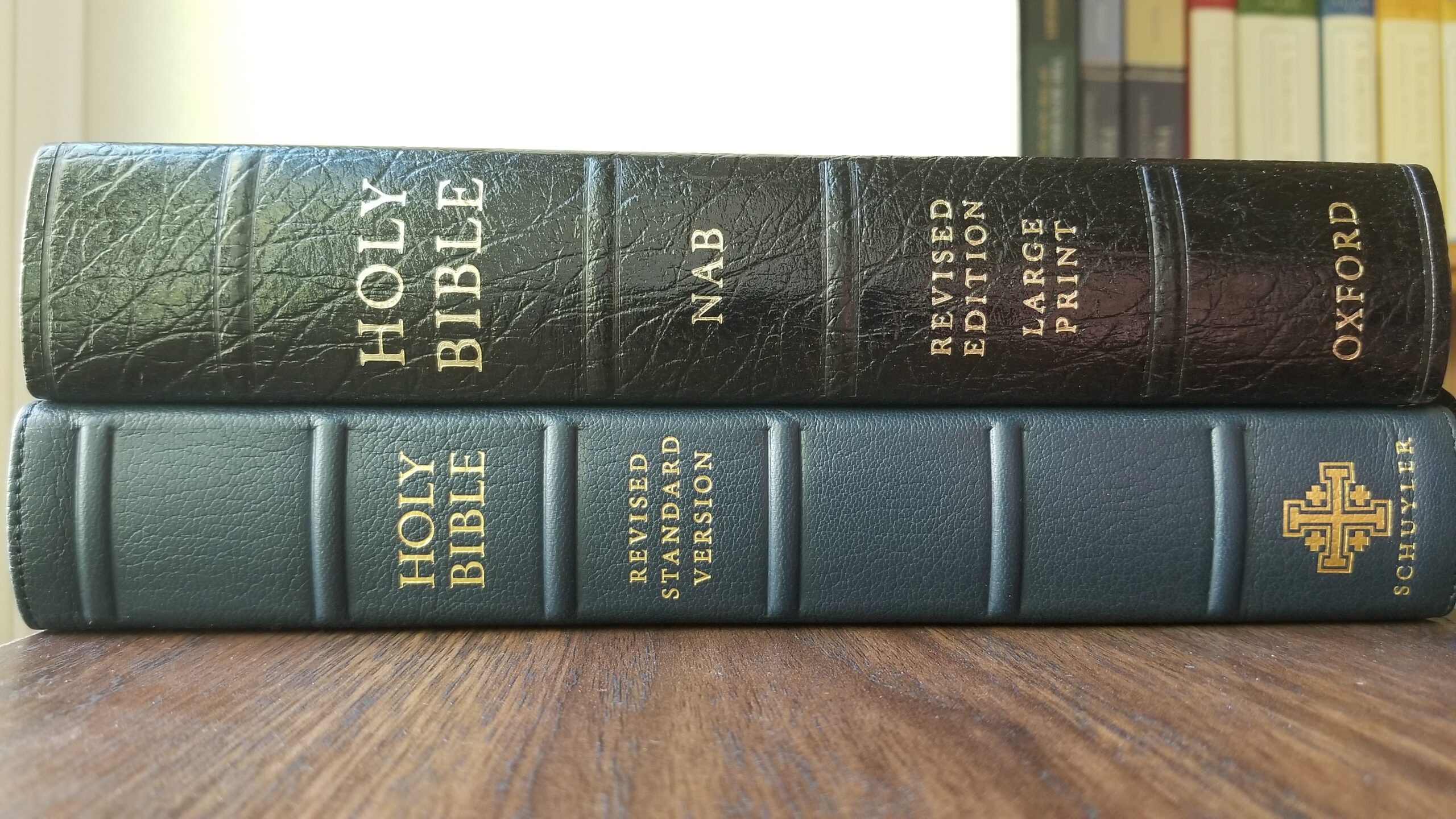
My first impression was mild surprise at the size of this edition (in length and width). My copy measures 9 13/16 X 6 11/16 inches. It is thinner than most Bibles in the same size class at approximately 1 1/4 inches. The length and width rival many other large bibles on my shelf. As an example, the Oxford Large Print NABRE is slightly shorter and narrower (but thicker) as shown in the two photos below.
For premium quality, the closest comparison I own is the Cambridge Reference NRSV with Apocrypha in burgundy goatskin which was released in early 2018. The Cambridge edition is almost exactly the same width, but significantly shorter in length. The goatskin cover on the Cambridge edition is much more prominent and coarser in texture than the Schuyler, but both are extremely flexible and feel wonderful to hold.
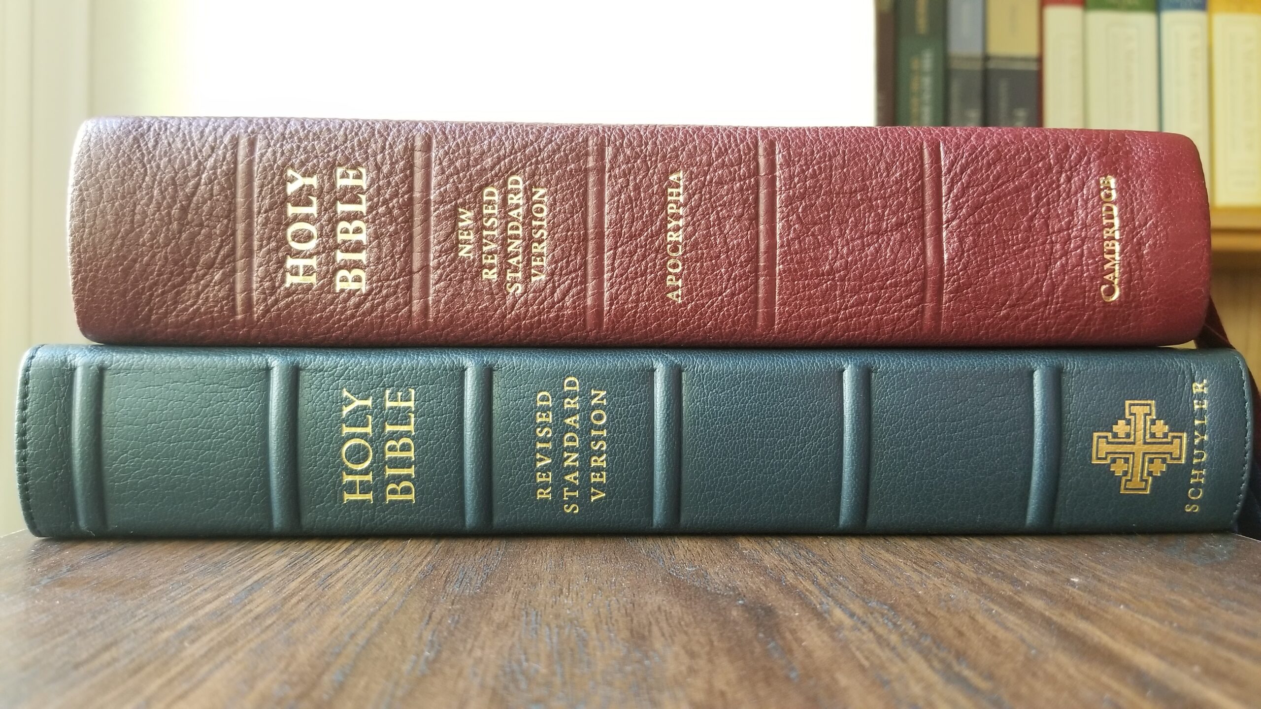
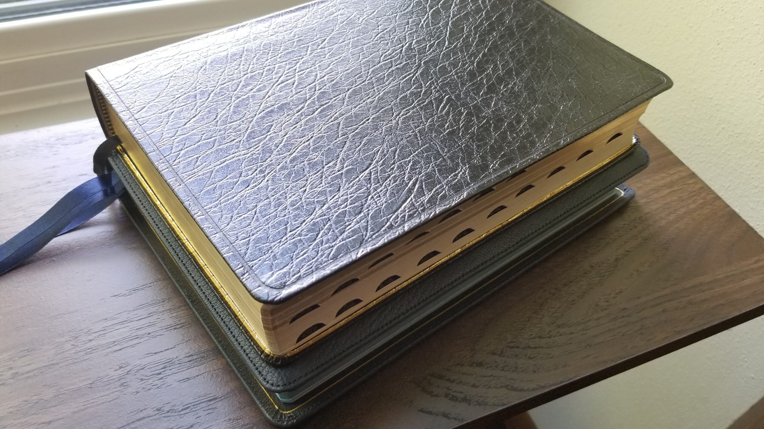
Both editions also feature gilded page edges combined with color. The Cambridge features red and gold page edges, and the Schuyler features blue and gold (other color options are available from Schuyler). Overall, I prefer the Cambridge style of gilding. It is smooth and highly reflective. The Schuyler is far less smooth and more muted in appearance:
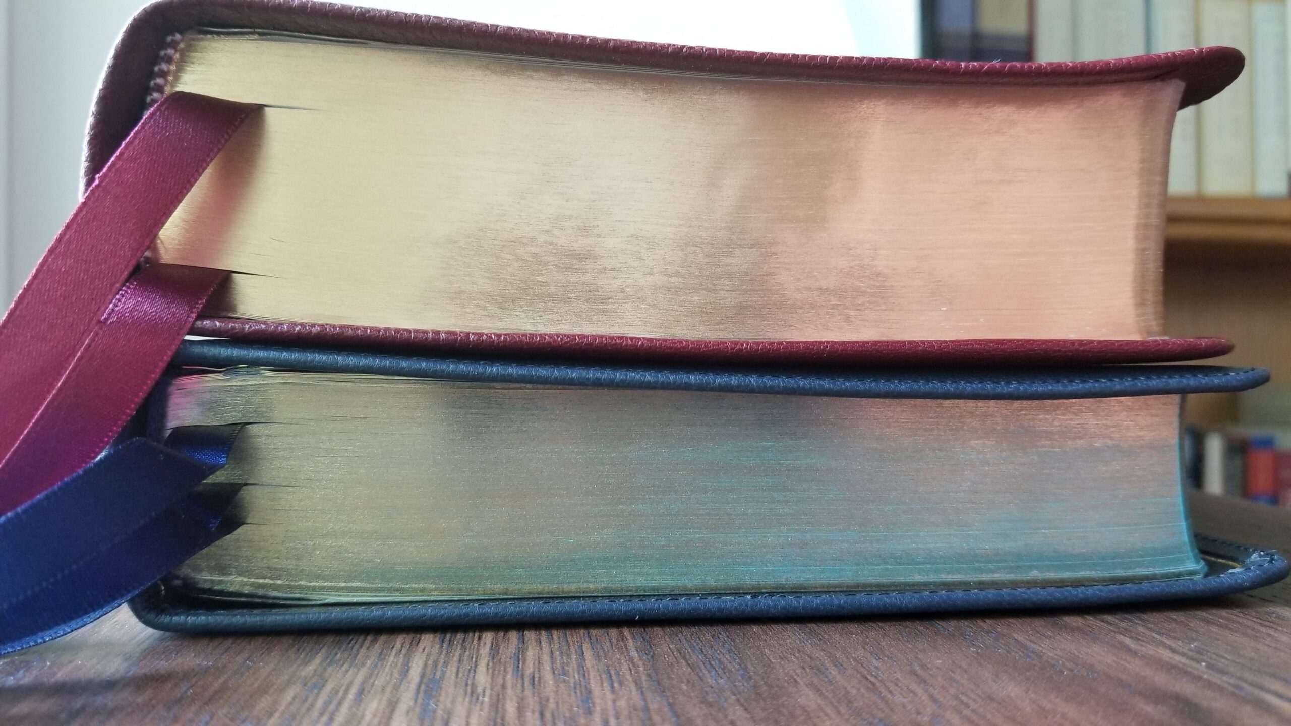
The image above also shows another quirk of the Schuyler edition: the spine is thicker than the opposite edge. If you plan on stacking this Bible with other editions, it may be best to place it on top of the stack to prevent the stack from tilting. Other bibles on my shelf have a similar construction, but this Schuyler edition has a more pronounced difference in thickness than most others I own.
Overall, for external fit and finish and overall feel, I prefer the Cambridge edition to the new Schuyler Quentel. The mirror-polished gilding on the Cambridge is extremely well-done, and the binding feels a bit tighter without the slightest hint of imperfections. The Schuyler edition shows some minor page wrinkles near the gutter, and the feel of opening and closing the Bible is not as “solid” as the Cambridge. Overall this is a minor difference, and I think it will vary a lot based on personal taste.
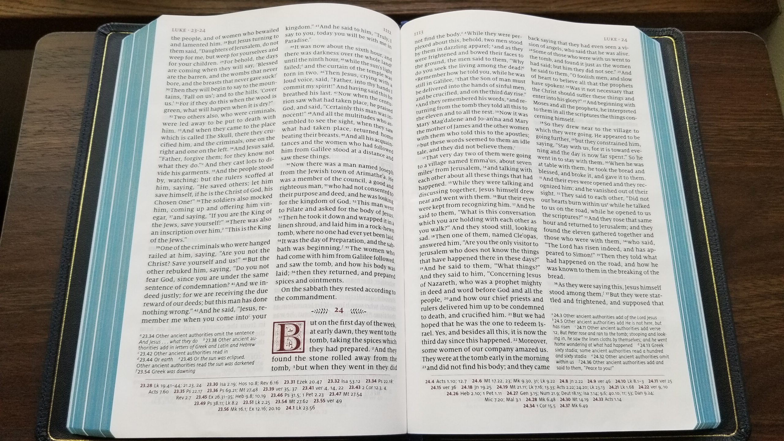
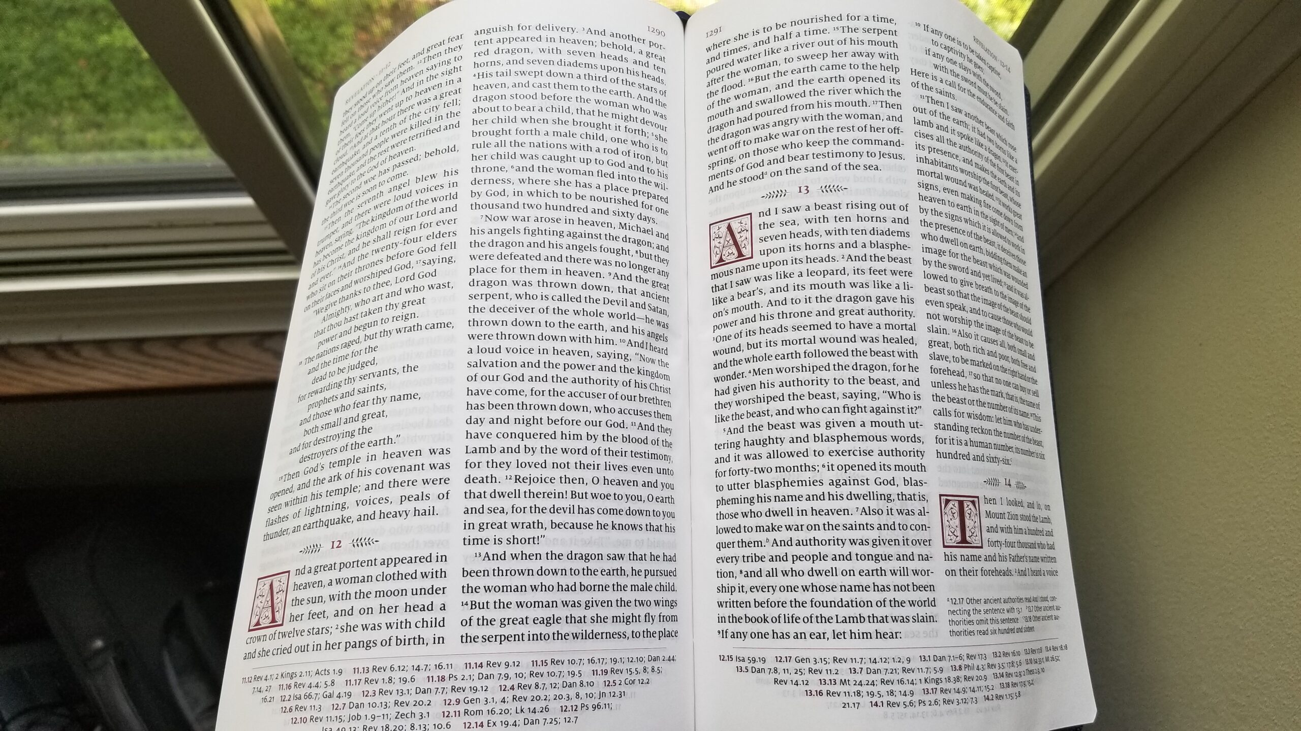
Where the Schuyler edition shines is the typesetting, paper quality, and overall layout. This bible is an exceptional reader’s edition. The text is incredibly clear and easy to read. The line spacing is very well designed. The entire page is balanced and easy on the eyes. I also enjoy that the verse numbers are minimized and the chapter numbers are not overbearing. If you need to look up a verse the numbers are there, but if you want to read extended sections of the Bible, the numbers do not get in the way.
Schuyler reports that the font size is 10 pt. In practice, this font is just as easy to read (if not easier) than the 12 pt font in the Oxford Large Print NABRE, which is significantly less bold. Here is a side-by-side comparsion:
The text is line-matched, meaning that the lines of text on each side of a page are aligned to minimize ghosting of text during reading. I’ve noticed that subsequent pages are not always perfectly aligned with the current page, resulting in minor ghosting. This is noticeable on some pages more than others. Overall, it doesn’t impact reading at all, but there are much cheaper Bibles that are more consistent in line-matching between pages.
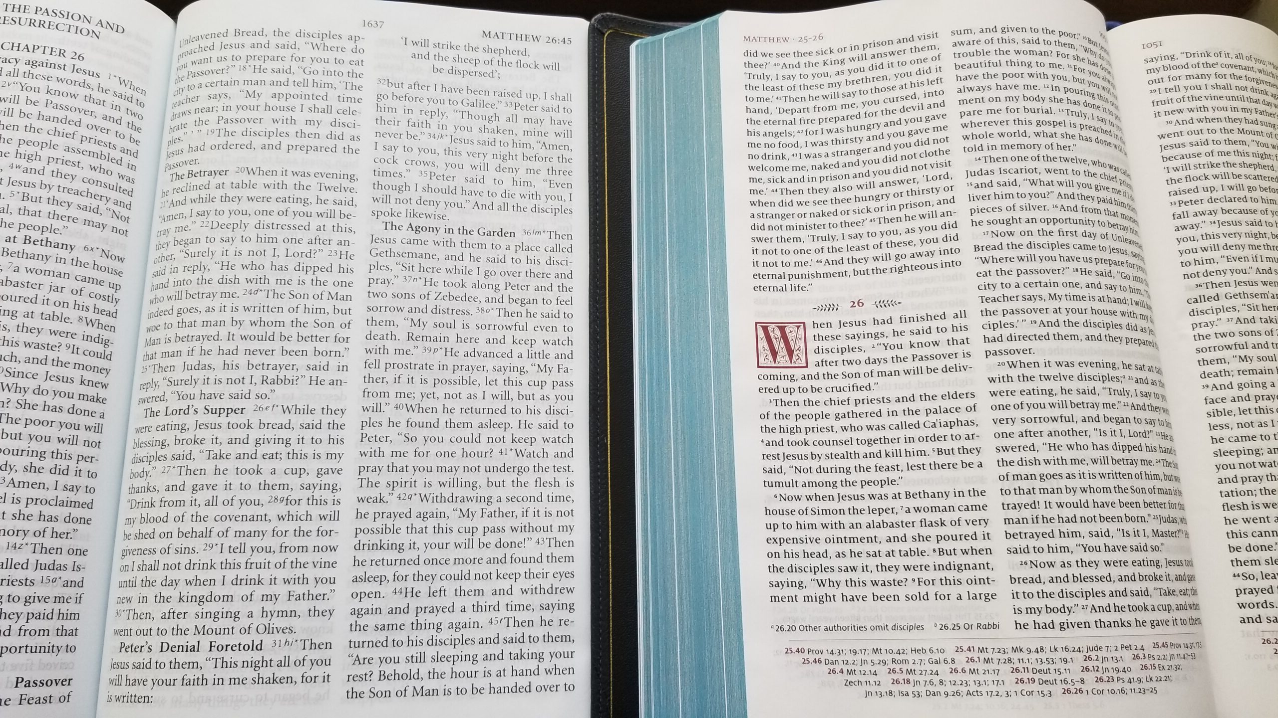
The text is also significantly larger than the Cambridge Reference NRSV, and the page layout feels less “busy”, with the cross-references at the bottom of the page instead of the middle column:
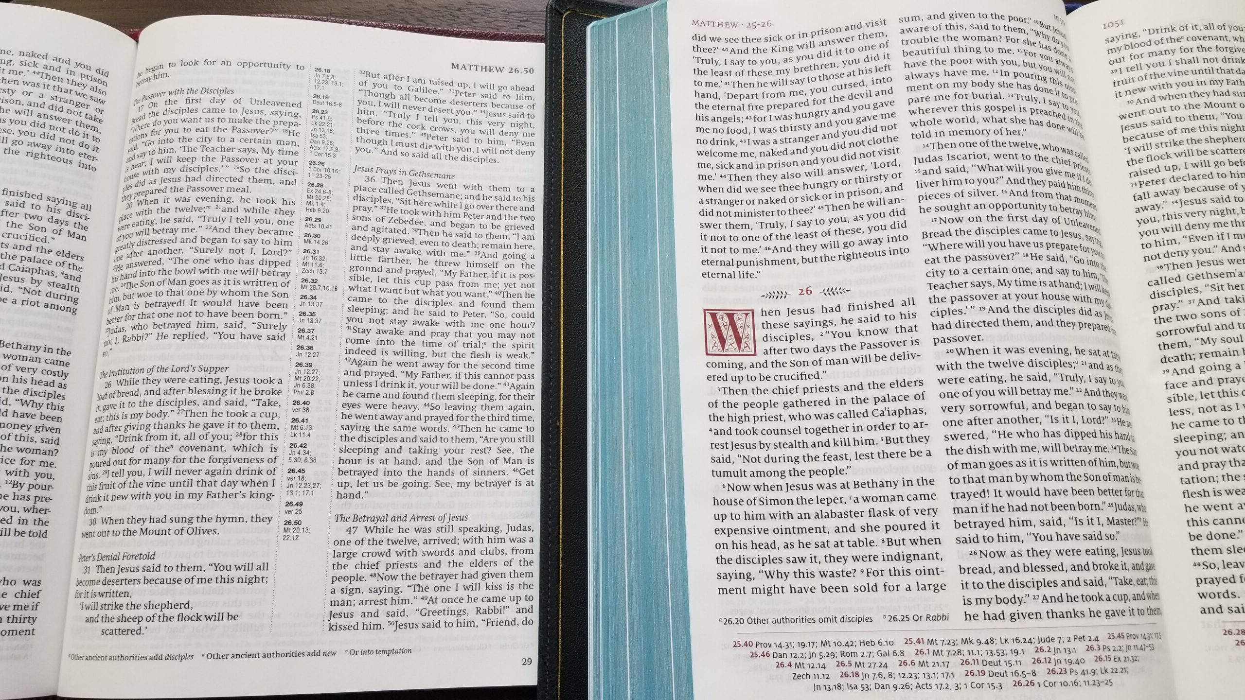
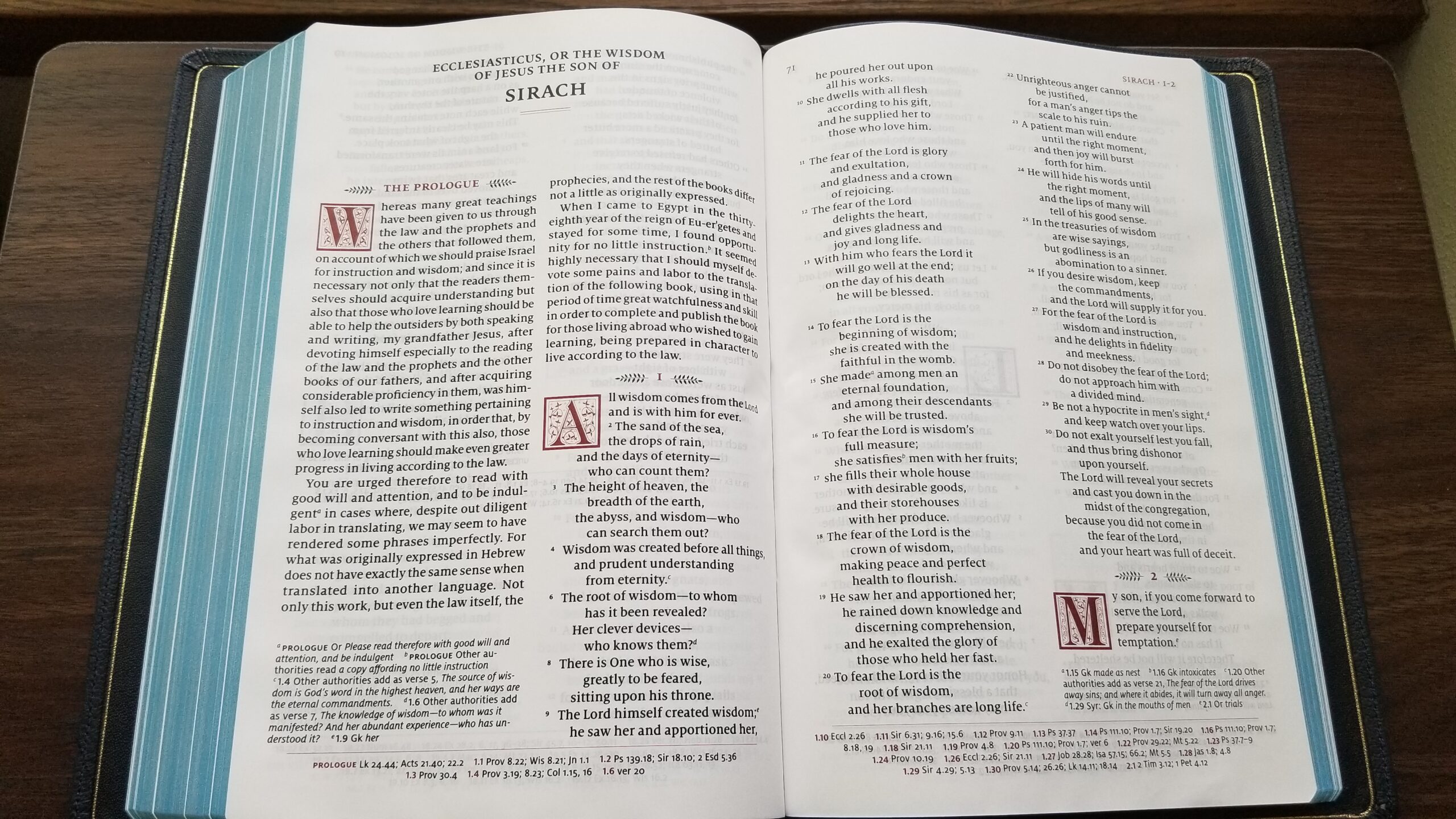
The Apocrypha/deuterocanonical books are printed at the back of the Bible (after the book of Revelation). There is no difference in font size or typesetting for the books in the Apocrypha. There is a full complement of cross-references and textual notes for the Apocrypha, similar to the rest of the Bible. Here is a sample from the first two pages of Sirach (otherwise known as Ecclesiasticus or Ben Sira):
As a final note, this Bible is very comfortable to hold, but its size often requires using two hands while reading the outer columns of text. The Cambridge Reference NRSV is similar due to its wide pages. Somehow, I find the Schuyler RSV easier (or more enjoyable) to hold while reading than the Cambridge. Even though the Schuyler is longer and just as wide, it doesn’t feel overly large to me. On the other hand, the Cambridge feels “too wide” when I’m reading. The following photo shows how the pages curve downward when I hold the Schuyler RSV in one hand:
Overall, this Bible lives up to Schuyler’s reputation for top-notch premium bibles. The goatskin cover is beautiful and flexible with a fine grain. The sewn binding and three high-quality ribbon markers are standard features for premium bibles. The best part of this Bible, where it distinguishes itself from most others on the market, is the page layout. It is excellent. The only other Bible in the same league for page layout and print quality is the Great Adventure Catholic Bible from Ascension Press. But for a pure reader’s bible with minimal distractions, this edition from Schuyler excels.
Thank you Marc for this review. I was gifted by a dear friend a new copy of the marbled mahogany RSV (w/ apocrypha) from Schulyers. I have to admit that I was hesitant to get a premium bible. I have been very happy over the last number of years with my the various “ugly-bibles” that I have been using. But I must say, after sitting with this bible for the past day, it has been a bit of a revelation to me. Reading the sacred word in this Schuyler’s RSV feels like a new experience. I second your comment that the page layout is excellent. It truly is. I have never had such enjoyment reading from a double column bible before. And the fact that it has the references, glossary, and maps makes this a bible that can be used in any setting. So, while I have no plans on getting any future premium bibles, I know for sure that this Schuyler RSV is going to be something I use daily.
I don’t mean to open a can of worms on this nice and desired review but you stated:
“Also, as expected, this edition uses the 1971 text of the Revised Standard Version which incorporates many of the changes from the 1966 Catholic Edition of the RSV.“
So, before I spend 200+ on a Bible, could someone give a quick rundown on how different this edition is from the 1967 RSV -CE? And I suppose the RSV2CE?
Just curious if it’s “Catholic” enough for me to use for a lifetime at that cost.
I am neophyte to all the nuances but I know I am NOT in love with the NAB or the NRSV
In terms of Church approval, here’s the rundown:
The original RSV (protestant OT and NT) was published in 1952.
In 1965, the Oxford Annotated Bible with Apocrypha was published with the original RSV text. Cardinal Richard Cushing gave the imprimatur to that edition.
The Catholic Edition (which included several changes to the NT and received an imprimatur) was published in 1966.
The RSV NT was revised in 1971, and many of the Catholic Edition changes were incorporated in the 1971 text.
The RSV Common Bible was published in 1973 with the 1971 revised New Testament. Cardinal Franz Koenig (archbishop of Vienna) gave it an “endorsement for general use.”
In short, both the original RSV and the RSV-CE have been granted an imprimatur. The 1971 NT includes many of the changes from the RSV-CE, and it was endorsed by Cardinal Koenig. It isn’t clear whether it was granted an imprimatur specifically. This site provides a written history of the RSV with the detail about Cardinal Koenig’s endorsement: http://www.katapi.org.uk/RSV/RSVCommonBPreface.htm
Thank you for the thoughtful reply
The 1983 Code of Canon Law entrusts to the Apostolic See and the episcopal conferences the authority to approve translations of the Sacred Scriptures in the Latin Catholic Church (c. 825, §1). Prior to 1983, Scriptural translations could be approved by the Apostolic See or by a local ordinary within a diocese. [usccb.org]
I assume that the RSVCE as given imprimaturs by Cardinals Cushing and Koenig is approved for reading and study by Catholics. As for the RSVCE2 itself, it lacks an imprimatur.
The original Catholic edition of the RSV translation was prepared by the Catholic Biblical Association of Great Britain in A.D. 1965
This edition was revised according to Liturgiam Authenticam
2001
Ignatius Press San Francisco
Published with ecclesiastical approval.
Original RSV Bible text:
Nihil obstat: Thomas Hanlon, S.T.L., L.S.S., Ph.L.
Imprimatur: + Peter W. Bertholome, D.D.
Bishop of St. Cloud Minnesota
May 11, 1966
Second Catholic Edition approved under the same imprimatur by the Secretariat for Doctrine and Pastoral Practices, national Conference of Catholic Bishops
February 29, 2000
Introduction, commentariesm and notes:
Nihil obstat: Rev. Msgr. J. Warren Holleran, S.T.D.
Imprimatur: + Most Rev. George Niederauer
Archbishop of San Francisco
January 13, 2010
Very interesting.
This convinced me to track down an old copy of the 1965 OAB with Cushing’s imprimatur.
Do you know, though: do any subsequent editions of the OAB (not the RSV itself, but specifically the Oxford Annotated editions of it) also carry the imprimatur?
I loved the New Oxford Annotated RSV I used in college those last four years before the NRSV was published. But I wasn’t Catholic then, so the mention of an imprimatur simply eluded me. I don’t think it had one though.
So if I’m interested specifically in the Oxford Annotated that carries an imprimatur, I think the 1965 Cushing edition is my only option. Can anyone confirm?
Tim in Miami (Great name by the way),
Here is a link that examines some of the differences:
http://web.archive.org/web/20071218022237/umsis.miami.edu/~medmunds/RSVCEdiff.htm
Thank you!
I love that the cross-references aren’t superscripted into the text. I wish all reference bibles followed this practice.
This is a beautiful edition. I’ve never owned a Schuyler, and I’m very impressed with the craftsmanship and the quality of the materials— and the design, too.
I’m finding the differences between this RSV and the RSV 2nd Catholic edition to be minimal for the most part. I’m doing Fr. Mike Schmitz’s/Ascension’s Bible-in-a-year and switched from my RSV2CE to the new Schuyler. “Tomb” in the RSV2CE is “sepulchre” in the Schuyler. “Behold” is “lo.” And, of course, the pronouns used in this older version of RSV to address God are “thee,” and “thou.”
One thing I really like is that the spine simply has RSV on it, without the standard “with Apocrypha” found on all ecumenical bibles I’ve owned.
Excellent info. Thank you. I find I am a real Goldilocks when it comes to translations and editions (I suspect I’m not alone here)
Especially since the Catholic Church doesn’t use “apocrypha” in any official way. The disputed books are simply long-held canonical books of the OT. It’s the Protestant reformers who determined their canonicity to be apocryphal.
I got mine very quickly, very glad I went with the faster FedEx shipping. I absolutely love it. It wasn’t cheap, but my wife pre-ordered it for me as a graduation present back in July.
I would like to quote from a community post on Youtube of R. Grant Jones: ‘The Schuyler RSV Quentel’s references in the Deuterocanonical/Apocryphal books should be treated with caution, especially in chapters where the RSV and NRSV number verses differently.’
It is a bit concerning that a premium product from very reputable publisher should have this mistake. Having the Apocrypha is nearly the raison d’etre of his particular volume, so there should be no mistake here. Hopefully this can be corrected, as it looks a very quality piece of work, but it belied by that problem. It is a very expensive Bible with a problem related its major selling point.
That IS rather concerning. Calling the books “Apocrypha” would also be irritating for me ten years ago, but I am getting old enough to let a few things go.
The title page refers to it as Deuterocanonical/Apocrypha, not just Apocrypha.
Small step…
Yes, partial apologies, for it’s the word used by the publisher, but this would come close to spoiling it for me. It isn’t fatal, for a person would land a verse ahead, in navigating to the referenced text, like Sirach 35:2 instead of Sirach 35:1, which is one of the examples given. Yet the point of this publication is the Deutrocanonical books, so the editors should’ve been hawk like, not ‘grand, it’ll do.’ It’ll do, but at that price point, there should be something close to perfection, if that doesn’t make me sound too fussy.
I have been pretty obsessed with this edition since I saw it advertised on several Bible websites, blogs, and Youtube channels that I enjoy.
$200+ is a tough ask, alas, but possibly St. Nicholas will do me a solid this year and slide one under the tree for me. The combination of premium feel in the hands and readability (in terms of layout and margins etc) that I read and heard about really drives up my interest.
I hope that those of you who have ordered one enjoy God’s Word, and report back on how it is working out.
Not a fan of that wrinkled gutter in the last pic. I wonder if the paper is easily bent and creased?
This is absolutely the most beautiful RSV edition I have ever held. The Quentel reads so well and the premium quality from Schuyler is just top of the line. I am so happy they decided to include the deuterocanonical books with this edition and hope they end up doing the same for their King James Canterbury.
I know this is off topic but Baronius just released a “flexible leather cover” version of the Knox Bible. Mine will be here Tuesday and I’ll let you know how it is if anyone is interested.
Oooooh that sounds very interesting! I’m very curious to know how it is.
I received mine today. It is identical inside to the hardcover edition but it has a thin leather cover. The grain is nothing to write home about and is on the stiff side of “flexible”. It is by far more pleasant to handle than the thick board cover of the hardback edition though. I was disappointed that for the same price point as the hardback it did not include the “On Englishing the Bible” paperback.
Looking forward to digging into it
Off topic, but there’s a new edition of the Knox Bible now 🙂
https://www.baroniuspress.com/book.php?wid=56&bid=104#tab=tab-1
A new really interesting free video course of Biblical Hebrew.
https://freegreek.hismagnificence.com/
https://www.youtube.com/c/AlphawithAngela/featured
https://www.facebook.com/alphawithangela
take a look if you have time. It’s a great method for learning Biblical Greek.
I received my copy from Evangelical Bible in September after ordering it in July. I chose black with full yapp. It’s a truly sensuous experience to use this Bible; I’ve had goatskin rebinds done before and enjoyed them but this is something else. I’m still getting accustomed to (what is to me) a different font. However, I noticed immediately that I can read this without my ‘cheaters’, which I must use for my Douay-Rheims from Crossway. I converted from Presbyterian to Catholic a decade ago and still miss my superb Thompson Chain Reference in KJV and NASB. We have no equivalent in Catholic Bibles. And I HATE the clumsy and inaccurate NAB/NABRE. Hard to believe the Bishops weren’t stoned when they came up with that mess. I grew up in the Presbyterian Church with the RSV so it’s been a lifelong friend. I love the ESV that came out 20 years ago, but it’s so close to this that I don’t miss it. I wish Schuyler could come up with the Knox translation, but that’ll never happen–if you remember, Bishop Sheen was a big fan of it. This Bible will be a keeper like my 1977 Chain Reference.
It the blue of the cover darker than you picture shows?
It seems dark on their website.
https://evangelicalbible.com/wp-content/uploads/2020/11/IMG_8501.jpg
I took the photos in this post with sunlight shining through a window. Overall, I’d say it looks darker in-person than my photos, but probably a bit lighter than the photo you linked from Evangelical Bible.