In the first part of this guest post about The Psalter of King David: The 1662 Coverdale Psalter Arranged for Orthodox Worship, I talked about what motivated this project, gave a brief overview of the Coverdale psalter, and explained the Coverdale’s approval status. Here, I’ll share with you some of the design processes and considerations that went into this e-book, including some major challenges that traditional book formatting doesn’t really have—and also some significant benefits! And finally, I’ll explain why I think the Coverdale psalter still relevant today, not just for its beauty, but for ecumenical reasons.
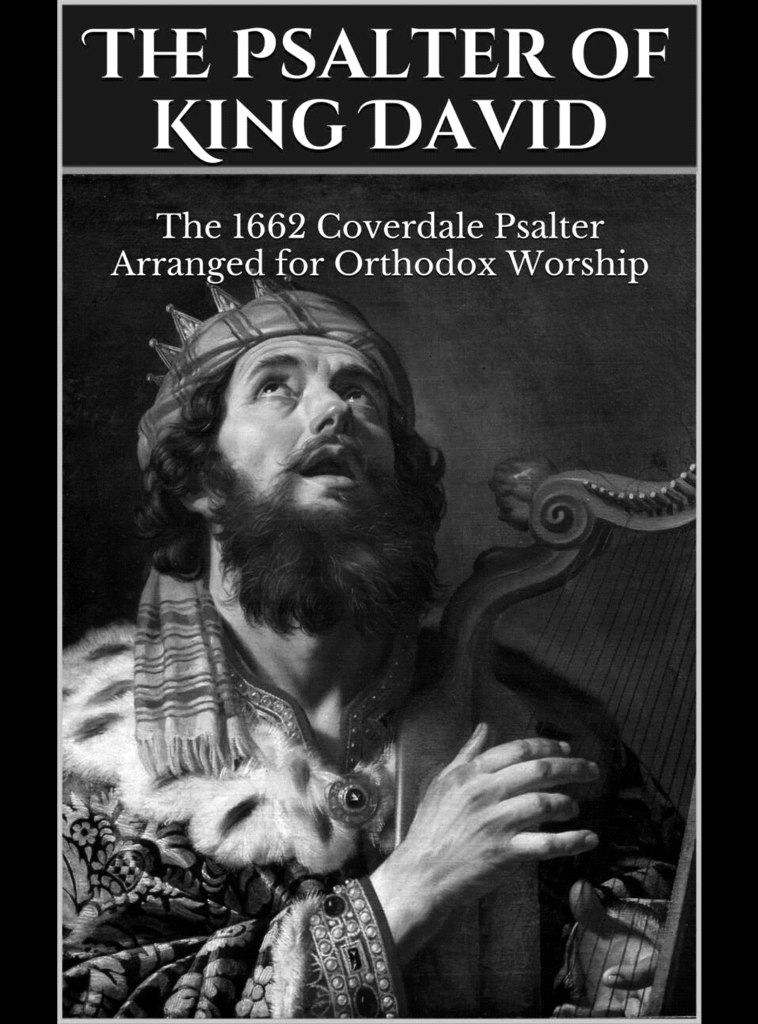
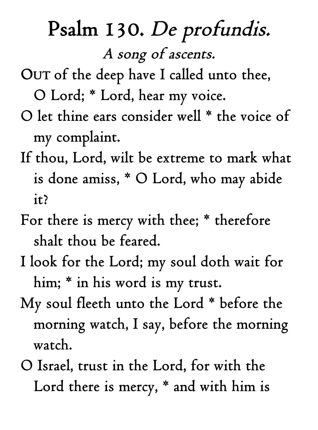
Before diving into the underlying code, let’s talk about the text of the psalter itself. I made exactly one—and only one—textual change to the 1662 psalter: I restored the Tetragrammaton to Psalm 68, where it was (in my opinion) quite poorly transliterated as “JAH”. I did this because (again, in my opinion) it’s the singular instance where the Coverdale translation fails to read well. JAH is really an ugly, jarring word in English; I’m not sure why Jehovah wasn’t used here instead. In addition to this change, I added subtitles to the psalms, which are a relatively recent translation by an Orthodox priest who prefers to remain unnamed. And, of course, I added punctuation where the English psalters only have colons (to divide the verses for chanting) and replaced the thirty-day divisions with kathismata and stases. I intentionally kept the Masoretic numbering of the Psalms, since that’s what the Coverdale psalter has used since its inception nearly five centuries ago.
There are a number of well-regarded software programs available for creating e-books, but most come with either a steep price or a steep learning curve (or both). So, I elected to create my psalter from scratch using HTML and CSS, thinking that’d help me progress more quickly and maybe allow me to use some more modern web features. (Alas, that was not to be! The nearly-universal ePub format has not kept up with advancements in HTML and CSS standards, and Amazon’s bespoke KF8 and MOBI formats are even worse in this respect.) There were two goals I kept in mind: Improved navigation and beautiful typography—inasmuch as possible, anyway.
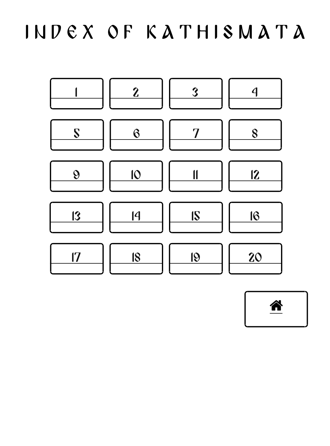
To improve navigation, I immediately threw out the idea of a traditional table of contents. They’re great for printed books, and perhaps not always bad for well-designed websites or apps, but for an e-book they’re really a suboptimal solution to the problem of getting from one point to another with as few (mis)steps as possible. Surely buttons were the answer! A few large buttons to link together a logical series of sections seemed reasonable, so that’s what I went with. Go to the first page and you’ll see buttons directing you to the Preface and other pages, including appendices in case you want to pray a specific psalm or kathisma rather than following the arrangements for Matins and Vespers. Everything is linked in such a way as to allow the user to pray an entire service with minimal distractions (which happen quite often while navigating e-books).
Beautiful typography, on the other hand, is honestly much more challenging than implementing buttons. I created around a dozen revisions fine-tuning exactly where to place non-breaking spaces, where to force page breaks and where to avoid them (because “avoid” is evidently the best you can do with e-book formats, although I’d be very excited to learn a reliable method to absolutely prevent breaks), and even innocuous details like at what height to set the small caps. I finally arrived at a finished product I was completely happy with…only to discover that various display settings can undo all the details I struggled to iron out!
And that’s how I came to realize some of the severe downsides to e-books: The reflowable format is both a blessing and a curse. Because these books typically don’t have a fixed format (they can, but I chose not to use one to allow the reader more flexibility), you’re able to customize the display to your heart’s content. Don’t like the font? Change it! Don’t like any of the fonts? Install your own! (I do.) Would you like your text fully justified, or left-aligned? Widely- or narrowly-spaced lines, or something in between? Large margins? Or no margins? Portrait or landscape display? Page number, location number, time remaining, clock, or nothing but the text itself? It’s really wonderful how you can personalize your books. But with all this freedom comes a host of weaknesses.
Take, for example, my small caps: They ought to be set to 1 ex in height, as is meet and right so to do. The height of an ex is different for every font, so this should result in my small caps always being the correct height in relation to the regular text. Not so! For although an ex is a valid unit in HTML, apparently it’s not a valid unit in e-book HTML. So now my small caps are proportional in some fonts, but in others they’re just a hair too tall or a bit too short. Non-breaking spaces are supposed to be the same width as regular spaces, and they are—in most fonts. Line breaks are usually avoided where I don’t want them to happen, but if your Kindle decides that it really wants to squeeze an extra line onto the page, then it’s going to do so regardless of whether or not that results in a psalm title at the bottom of one page and the first verse at the top of the next.
It’s not all bad, of course—I love being able to use my favorite fonts and customize the margins and line spacing to my liking. And two of the greatest features are the integrated dictionaries and what Amazon calls X-Ray (this is something unique to Amazon, which makes the inherent weaknesses of their e-book formats nearly tolerable). In something like the Coverdale psalter, which uses an archaic term every so often, clarification via the dictionary is only a moment away. (Conies in Psalm 104? Rabbits.) X-Ray in particular is an extremely powerful tool, when it works—it’s basically a concordance of places and names, which is very helpful for scriptural and liturgical books. I’ve set up the X-Ray for my psalter to include all places and names that come up in the text, so if you see something unfamiliar you can read a brief Wikipedia excerpt about it. The Coverdale translation uses some older forms of words that we know by different names today—Libanus for Lebanon, for example—so this is really valuable, and something printed books by and large don’t offer. (Note: At the time of this writing, the X-Ray feature is currently disabled for reasons unknown. I’ve contacted Amazon to find out way, and they’re “working on fixing it”. Hopefully it gets fixed soon!)
Well, that about covers the e-book fairly thoroughly. If there’s anything you’d like me to talk more about, let me know and I’ll do my best to answer your questions quickly and thoroughly. To see more screenshots and photos, here is a link to an imgur album with a wider selection of images.
To conclude, let’s talk about why the Coverdale psalter is important even today, in a world swamped with new, usually trendy, occasionally even relevant English Bible translations (Catholic and otherwise). For me, it really boils down to two things. First is the tremendous influence of the Coverdale psalter (via the Book of Common Prayer) on the English language and culture—it’s such an important part of our shared Anglophone heritage, whether we’re Catholic, Orthodox, Anglican, of another faith or of no faith at all. It’s an acknowledged literary masterpiece even if you set aside the fact that it’s sacred scripture. And second is the fact that Coverdale’s psalter is in shared use by Anglicans, Catholics and Orthodox—a powerful statement to its genius, and a brilliant example of perhaps-unintentional ecumenism. Much as the RSV, NRSV and ESV are all lauded as ecumenical tours-de-force, so too does the Coverdale psalter deserve this recognition. Today, it’s officially used in public liturgies of the three largest Christian bodies. Though our churches remain separated, I hope we can continue to pray together for eventual reunion, using these words from Psalm 133: Behold, how good and joyful a thing it is, brethren, to dwell together in unity!
This looks very nice, and so I ordered the physical book (paperback) from the Amazon website.
It should arrive in a day or two.
One mild question: Why did you change “Holy Ghost” to “Holy Spirit” in the following specific
Morning Prayer shown below?
“Holy Ghost” is in both the BCP (1662) by Cambridge University Press and the Anglican Parishes 1928 BCP (in their combination KJV with Apocrypha with 1928 BCP)
Morning Prayer:
Glory be to the the Father, and to the Son, * and to the
Holy Ghost:
As it was in the beginning, is now, and ever shall be, *
world without end. Amen.
Jeff, I’m not sure I understand what you mean when you refer to “the following specific Morning Prayer”–I imagine you’re asking about the form of the Glory Be used in the prayers after each stasis shown in one of the above screenshots? The traditional English translation isn’t a close translation of the original Greek, and Eastern churches have generally chosen to adopt their own English translations rather than the traditional version (which is goes back to the original 1549 Book of Common Prayer, and perhaps is even older). While I definitely prefer the elegant Cranmerian translation, I chose to use an Orthodox version (specifically, that used by the Russian Orthodox Church Outside Russia, since it doesn’t avoid archaic pronouns) instead since this book is “arranged for Orthodox worship”. Admittedly, perhaps in choosing to do so I’ve just perpetuated the ridiculousness of every church having their own bespoke translations of common prayers.
I don’t think that is what he means. He just means why choose “Spirit” when other prayer books using the Coverdale Psalter happen to use “Ghost”.
There is no closer or less close to the Greek here. Spirit has its roots in the Latin (Spiritus) and Ghost in the German (Geist). Both mean what we commonly mean by “Spirit” these days–now that ghost has taken on a spooky connotation–and both have their respective roots in a word that means breath or wind, and both would correspond to the Greek word pneuma.
FWIW, I don’t really have a preference here, just commenting.
Well, like I explained above, I used the version I did because it’s in widespread use by English-speaking Orthodox (though perhaps I should have kept the traditional Anglican version–and perhaps they should have too!). I didn’t change “Ghost” to “Spirit” because I thought it was closer to the Greek, but because I substituted one translation of the prayer for another (which, taken in its entirety, is undeniably much closer to the original language) that happens to say “Spirit” instead of “Ghost”.
The Holy Spirit use in context of tradition language reminds me of the diocesan priest in charge of Dublin’s traditional Latin Mass. Fr will use the traditional language but always says Holy Spirit and dislikes any excess of archaism. My 1957 Maryknoll Missal is the same with Holy Spirit in context of otherwise traditional English language prayers.
I bought this. It seems a very polished product for so little.