About six weeks ago, I received a complimentary review copy of the Enhanced Edition of the Clementine Vulgate from Church Latin Publishing Corporation. It is a good quality facsimile of a Vulgate edition which was originally published in 1901 by the Society of St. John the Evangelist. This reprinted edition is the result of many years of work by publisher Derek Bonnell to scan and postprocess each page of the 1901 edition to ensure the best possible copy of the original content with minimal speckling and visual artifacts introduced by the scanning process.
Brief Synopsis
The end result is an eminently portable Bible (nearly a perfect size to hold and read) with good quality gold gilding, a sewn binding, and a bonded leather cover. The original artwork from the 1901 edition is printed with excellent clarity and very minimal visual imperfections. The main drawback is the small font size (approximately 7.5 pt font).
Physical Construction
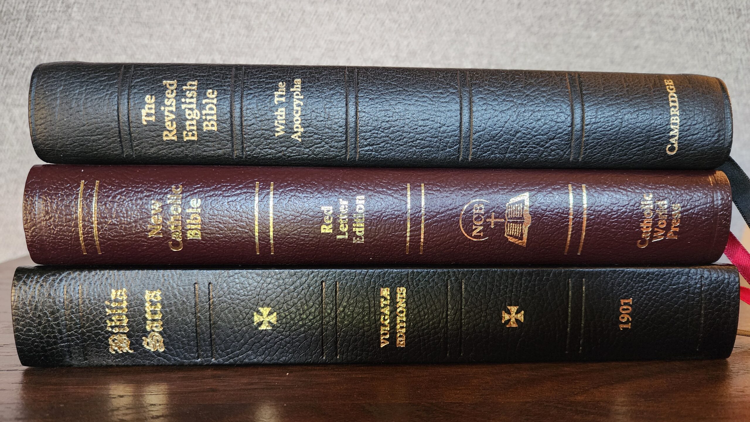
The Enhanced Edition measures 6 3/16 X 9 5/16 X 1 1/4 inches. I consider this to be nearly an ideal size for a Bible. It is easy to hold without feeling heavy or bulky. It is just a little larger than the Cambridge French Morocco Revised English Bible with Apocrypha which I have owned for several years and consider to be a “goldilocks” size — not too small, not too big. Compared to many other Catholic Bibles, the Enhanced Edition is also relatively thin. It could almost be considered a “thinline” edition. It is comparable in size to the New Catholic Bible (NCB) Deluxe Gift Edition from World Catholic Press which I reviewed in December.
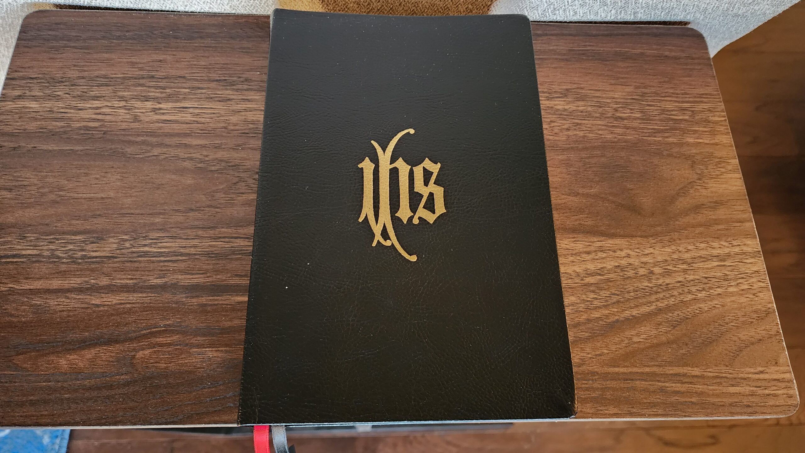
The bonded leather cover feels stiffer than either the Cambridge French Morocco REB or the World NCB Deluxe Gift Edition. It is squared-off at the spine (rather than curved like the other two Bibles), and it features a gold stamped “IHS” Christogram on both the front and back cover, as well as gold lettering on the spine. The cover hinges open effortlessly, and the sewn binding flexes upward to allow the book to lay flat.
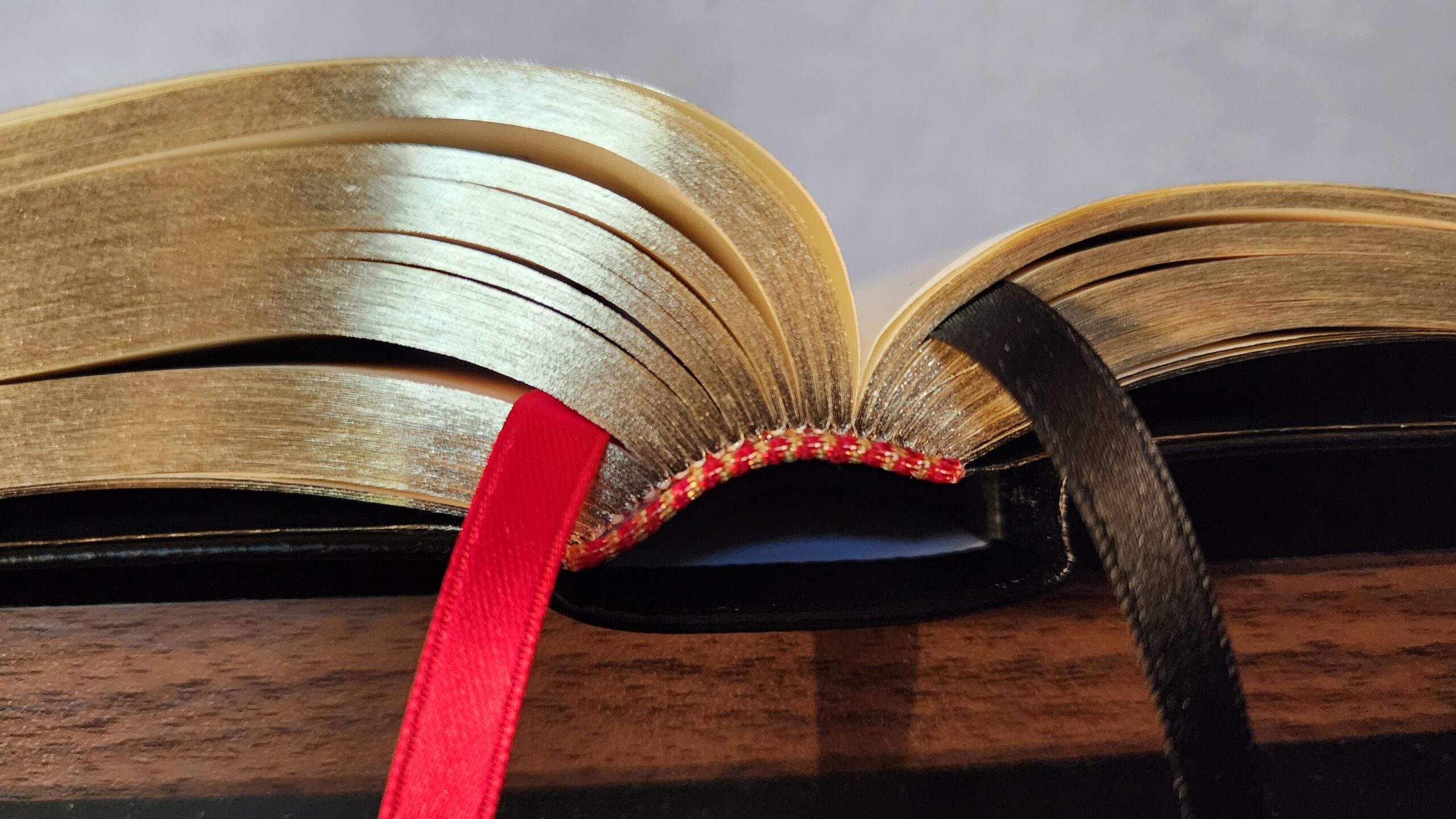
There are two 1/4-inch double-sided ribbon markers (one red and one black), and the gold gilding on the page edges is good quality. It is not as thick and mirror-like as the gilding on the Cambridge REB, but it looks nicer to my eye than the gilding on the World NCB.
Paper, Typesetting, Artwork, and Other Features
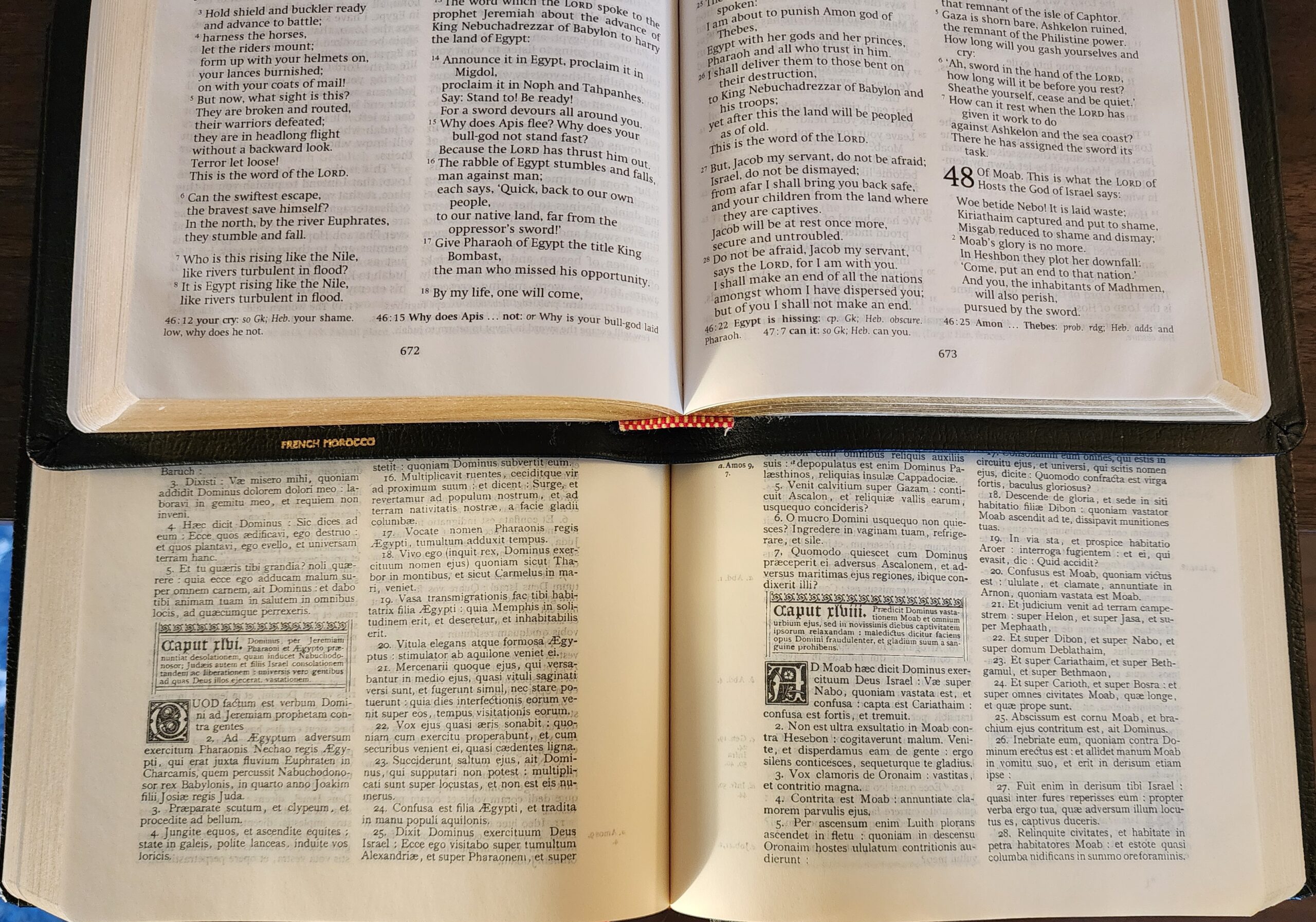
The paper is a cream-colored Bible paper which is advertised as 40 GSM. There is some ghosting of text from adjacent pages, but it doesn’t impede reading. The primary drawbacks to readability are the small font size and the print darkness. The darkness is acceptable in most cases, but there are small imperfections in the scanned pages where letters become faint or where individual letters like “o” or “a” are not fully closed. I found myself looking closer to try to determine what letter I was looking at more than once. If I knew Latin, this may not be a problem, because I would know the words by sight without needing to sound them out or type them into a translator.
More generally, the text could benefit from bolder printing to improve readability (although bolder text could make the ghosting worse).
Publisher Derek Bonnell explained that the font size was determined by the size of the original book. Since his goal was to produce a facsimile of the 1901 edition, he was constrained to the layout and font that were used by the original publisher.
The biblical text is printed in double-column, verse-by-verse format (with each verse beginning on a new line). Stylized drop caps are used at the beginning of each chapter, along with a brief theological synopsis of the chapter in Latin (printed in a smaller font than the biblical text).
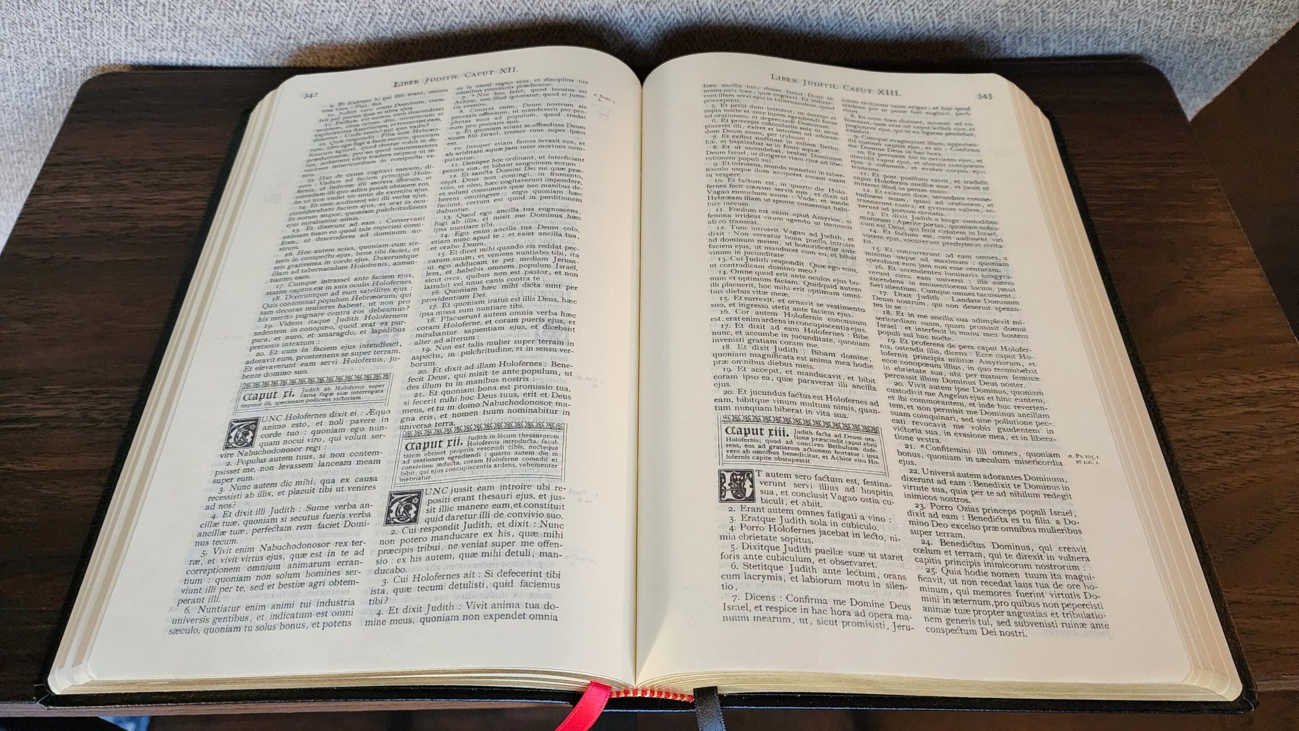
Comprehensive cross references are included in the margins throughout the Old and New Testaments. The abbreviated names of biblical books follow the Latin names of the books. Also, if a cross-reference points to another verse in the same book, the words “supr.” or “infra” are used to refer to verses “above” or “below” the current verse, respectively. I think the cross references are a standout feature of this Bible. So many modern Catholic Bibles dump the cross references into an impenetrable wall of text at the bottom of the page (or worse, at the end of each biblical book!), but in this Bible, the marginal references are so much more readable and usable. Modern publishers should take note!
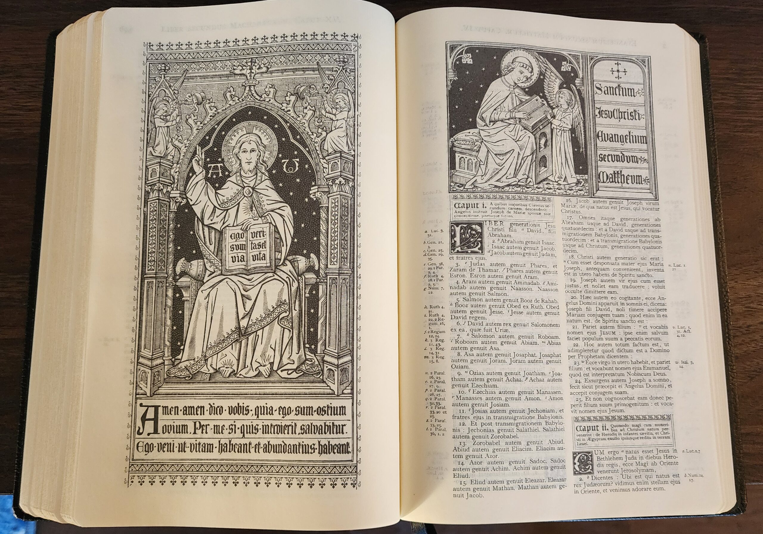
Small pieces of artwork are included at the beginning of some (but not all) biblical books, and beautiful full-page artwork appears in the front matter as well as at the beginnings of both the Old and New Testaments.
Two maps are included (one map of the Holy Land and another map of the wider Mediterranean world during the time of the New Testament.
Conclusion
Overall, this is a well-constructed, good quality facsimile of a beautiful Bible that was originally published in 1901. It is also an eminently portable and usable size, although it achieves that portability at the cost of a small font size. Its listed price of $125 is closer to the usual market price of French Morocco Cambridge editions than it is to the World Deluxe NCB. In terms of the overall quality of the printing, paper, and materials, I would place this Vulgate edition between the Cambridge French Morocco REB and the World NCB.
For a small print run by an independent publisher, I think it is a fair price even if I wish it were a bit less expensive. I’m impressed by the level of quality Derek was able to achieve through meticulously scanning the original edition, cleaning up the scanned images, and working with a printer to produce a beautiful Bible.
Church Latin Publishing also offers hardcover and paperback editions of the same text block for $64.99 and $44.99 respectively. Both of those editions are listed as having a glued binding.
Interesting, but one would have to be able to read Latin to find this useful. What I would like, however, is a new English translation of the Vulgate with English text on one page and the Latin on the other side, just like the NJPS translation of the TANAKH, or Jewish Old Testament which has English on one page and the Masoretic Hebrew text on the other.
The Navarre Bible Old Testament volumes and the combined New Testament expanded edition have the text of the Nova Vulgata underneath the RSV-CE text. That isn’t exactly what you described, but it might be the next best thing for now. And as a bonus, it has really good commentary from the Saints, Popes, and the Catechism.
It’s also only available in 73 separate paperback volumes or 8 hardcover volumes for over $700. Neither option is acceptable to me.
As Spock would say, “Your thoughts are my thoughts.” I concur, yet the publisher is Church Latin Publishing, Co., which specializes in “reprinting tradition Catholic works focusing on the Latin language”. Thus, a Latin bible is one of such works. My agreement with you is that most do not have a grasp of Latin, to benefit from a Bible in Latin. In receiving a message that there was a review of a Vulgate edition, I presumed (erroneously) that it would be a dual-language edition.
Aside from that “wall” for most, the use of images seems quite beautiful, but the 7.5 text font seems rather small. I presume this is so as this is a reprint edition (1901) and not a newly typeset edition.
If this were a dual-language edition, this might warrant some consideration. I’d be interested to hear from anyone who is considering such an edition, and the reason for their interest.
I’ve heard about this edition for a long time, but have yet to pull the trigger on it. To my knowledge, if anyone were to need a “standard reference” edition of the Clementine Vulgate, the current accepted version of that is the Colunga-Turrado Biblia Vulgata, which I don’t think I’ve ever seen in person and its confusing edition numbering has made it difficult for me to decide whether to import from Spain or just search for secondhand, since you can’t easily tell whether a version is a new edition or simply a new impression of an existing edition, or what even changed between the editions.
This is definitely not the Colunga-Turrado edition but a facsimile of an edition of a Clementine Vulgate published in Belgium in 1885. I have the immediate predecessor to this edition, with faux leather cover and red page edges. It’s a lovely thing to have alongside the Weber-Gryson Vulgate published by Deutsche Bibelgesellschaft and the edition of the Clementine Vulgate prepared by Michael Tweedale, published by Baronius Press alongside the Douai-Rheims English version.
Sorry, published 1901 as Marc’s review says, when it received its imprimatur.
I’m aware they’re not the same. I’m just saying that this Church Latin Publishing edition is more of a curiosity than anything. If you wanted to do serious critical study with the Clementine edition of the Vulgate, you’d get the Colunga-Turrado edition. This is an aesthetically nicer volume, though.
I wish you good fortune in finding a copy of the Colunga-Turrado Vulgate. I’ve seen copies for sale – some even described as new – on Abe Books from Spanish sellers. I guess you could request photos to determine their true condition.
Amazon is selling new copies of the Colunga-Turrado Vulgate
https://www.amazon.com/Biblia-Vulgata-Latin-Alberto-Colunga/dp/8479140216/ref=sr_1_1?crid=1KKNIFPT79N7R&dib=eyJ2IjoiMSJ9.oHMSexjQm3tgyfpZzxIf2g.Ya-8L1VqTs5_T1DAUMsI4NlD3pNXTlDE8CsARWN59Bk&dib_tag=se&keywords=9788479140212&qid=1778083244&sprefix=9788479140212%2Caps%2C164&sr=8-1
Re: the above discussion, according to H. A. G. Houghton in his The Latin New Testament: A Guide to Its Early History, Texts, and Manuscripts (Oxford UP, 2016), Colunga-Turrado is “the current standard reference edition” for the Sixto-Clementine Vulgate, a statement he reaffirms in The Oxford Handbook of the Latin Bible (Oxford UP, 2023), though there he also namedrops Hetzenauer as another “modern edition” for “academic purposes”. As for Colunga-Turrado edition number, I can confirm that it’s all over the place. An academic book from De Gruyter published as recently as 2023 cites the “4th edition” in its notes even though I’ve seen “10th edition” copies from 1999 on secondhand online markets, which leads me to assume there’s not much of note in these “newer” editions of it.