About a month ago, I purchased an imperfect navy blue copy of the R L Allan NRSV1 (with Apocrypha). Allan has been offering imperfect copies (which they refer to as “special purchase”) in all four colors from their 2024 printing. All four colors are still available as of this writing.
This is the first time I’ve owned an Allan Bible, and the price for an imperfect copy is good for a premium Bible (£140).
Imperfections
Since this Bible was advertised as imperfect, I will cover the print defects first. I’ve paged through the entire Bible twice, and I’ve found a total of 5 pages with printing defects: 4 pages with ink stains in the Acts of the Apostles and some slight ink smudging on one page in Revelation. The product description from the Allan website says: “Copies discounted for print problems owing to over inking in the printing process; up to 30 pages may be affected but text remains readable in all cases.” That statement is completely accurate for my copy, and I’m happy to have only 5 pages that were affected. Here are some photos of the ink stains:
Feature Overview
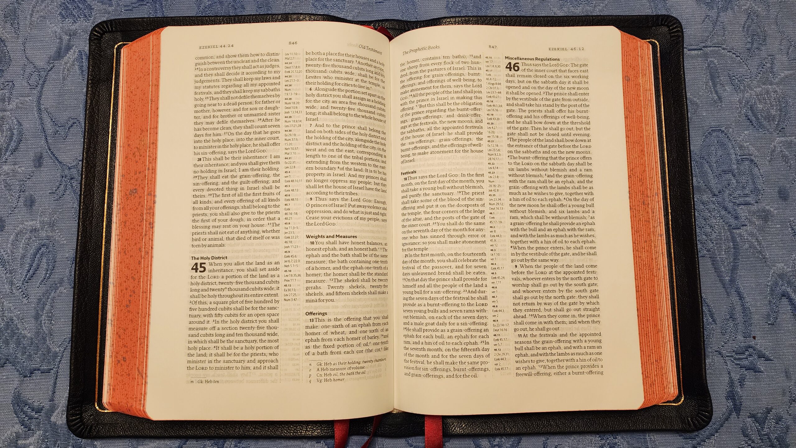
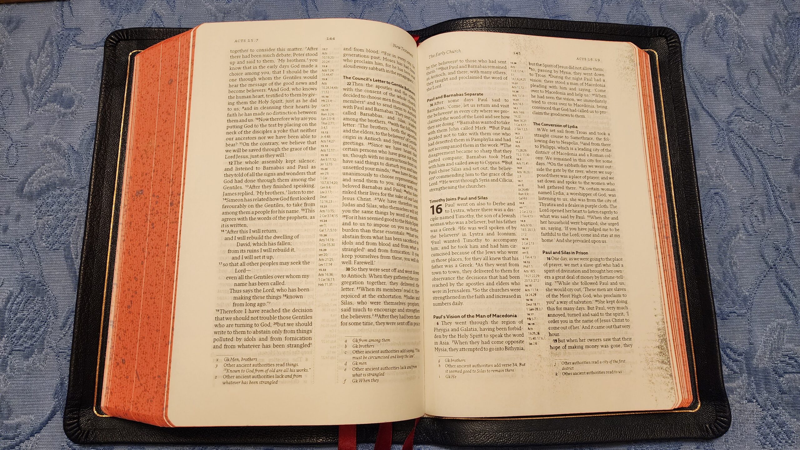
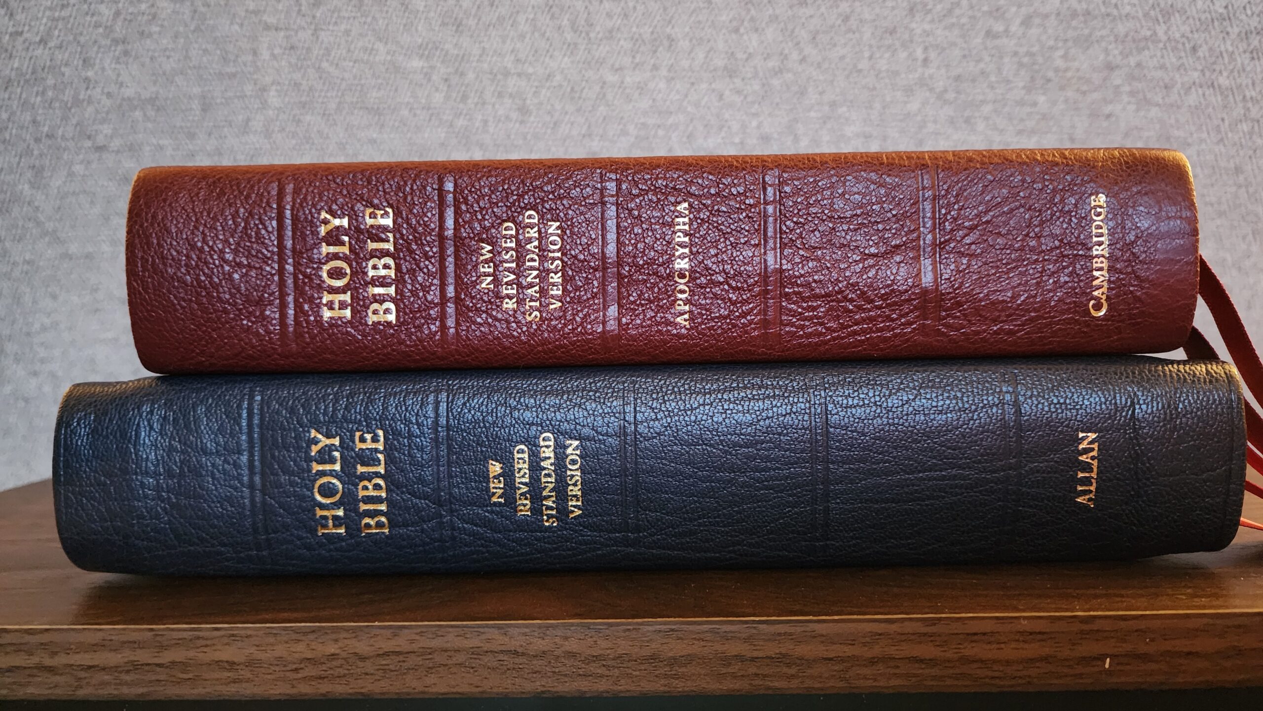
The Allan NRSV1 uses the Anglicized Text (UK spelling and usage) of the NRSV. The text block of this Bible measures 5 7/8 inches wide and 8 3/4 inches tall. The navy blue goatskin cover feels notably smooth—almost like it has a waxed surface. This waxy feeling (which I like) is unique among other goatskin bibles I own (like the Schuyler RSV with Apocrypha, the Cambridge NRSV Reference Bible with Apocrypha, or the Zondervan Premier NRSVue with Apocrypha). It’s not a night-and-day difference, and it’s not necessarily better than the other editions, but it’s distinctive.
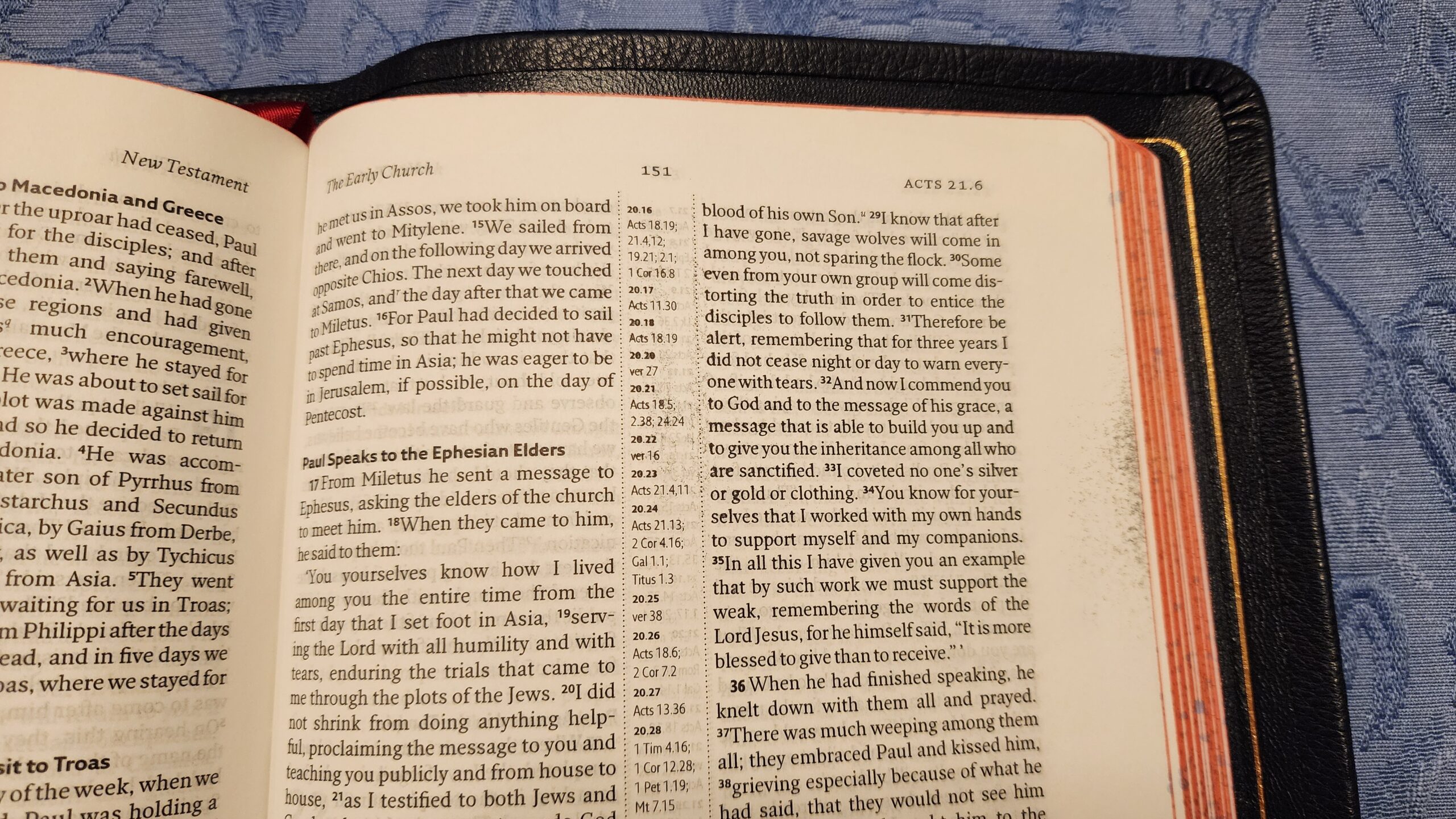
The goatskin cover is almost a full-yapp. When the edges of the cover are wrapped around the corners of the text block, there is about a 1/4 inch wide gap remaining between the two sides of the cover.
There is no stamping or lettering of any kind on the front of the Bible, and the gold lettering on the spine merely reads “HOLY BIBLE New Revised Standard Version Allan.” There is a gold gilded line around the perimeter of the inside of the cover (visible in the images of imperfections above).
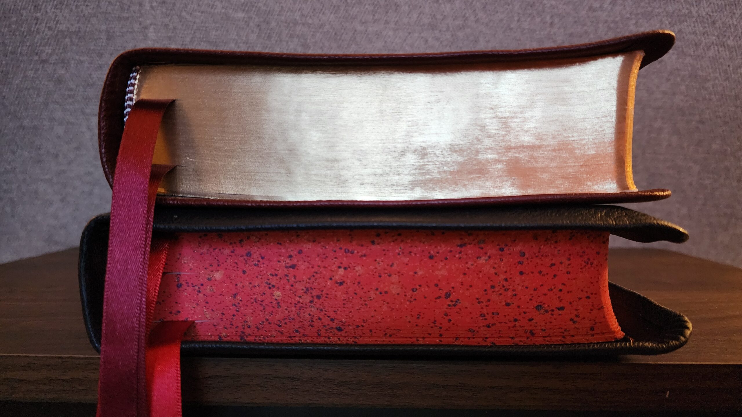
The binding is sewn, and there are three crimson ribbon markers. There are 16 Oxford maps in the back, along with 32 pages of ruled paper for notes.
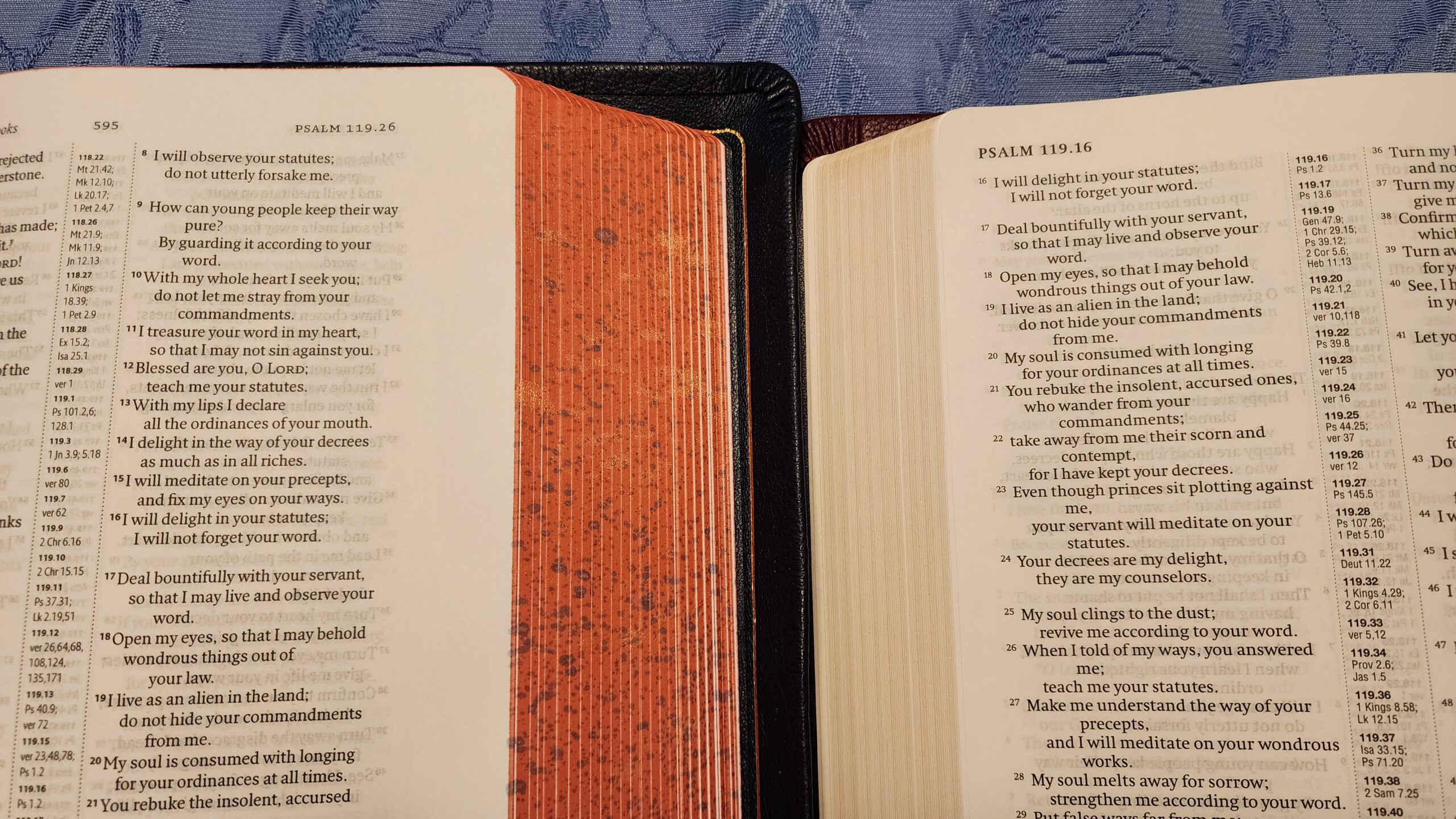
The page edges are painted with a red and blue speckled pattern (including some slightly reflective paint that catches the light occasionally). This is the only aspect of this Bible that stands out and attracts notice, but the yapp tends to shield the page edges from full view while the bible is lying closed.
Typesetting, Font, and Page Layout
The biblical text is printed in two columns with 8.75 pt. font on 40 GSM paper. Cross references are printed in the center between the two text columns. The paper is quite opaque with very minimal ghosting in most lighting. It doesn’t have the silky feel of the paper in Schuyler’s ESV with Apocrypha, but for practical readability and opacity, it is just as good.

When the bible is closed, the book block has a very solid, uncompromising feel. It doesn’t like to bend easily. This is partly because the pages have temporarily warped due to the bone-dry weather we’ve been having recently in the Midwest USA.
The font is clear and generally good for reading, but the 8.75 pt. size is a bit small for my liking. When I place the Allan Bible next to the Cambridge NRSV Reference Bible with Apocrypha, I find the 9 pt. font in the Cambridge noticeably easier to read. The Cambridge also uses a larger font for the cross-references, and they are similarly easier to read.
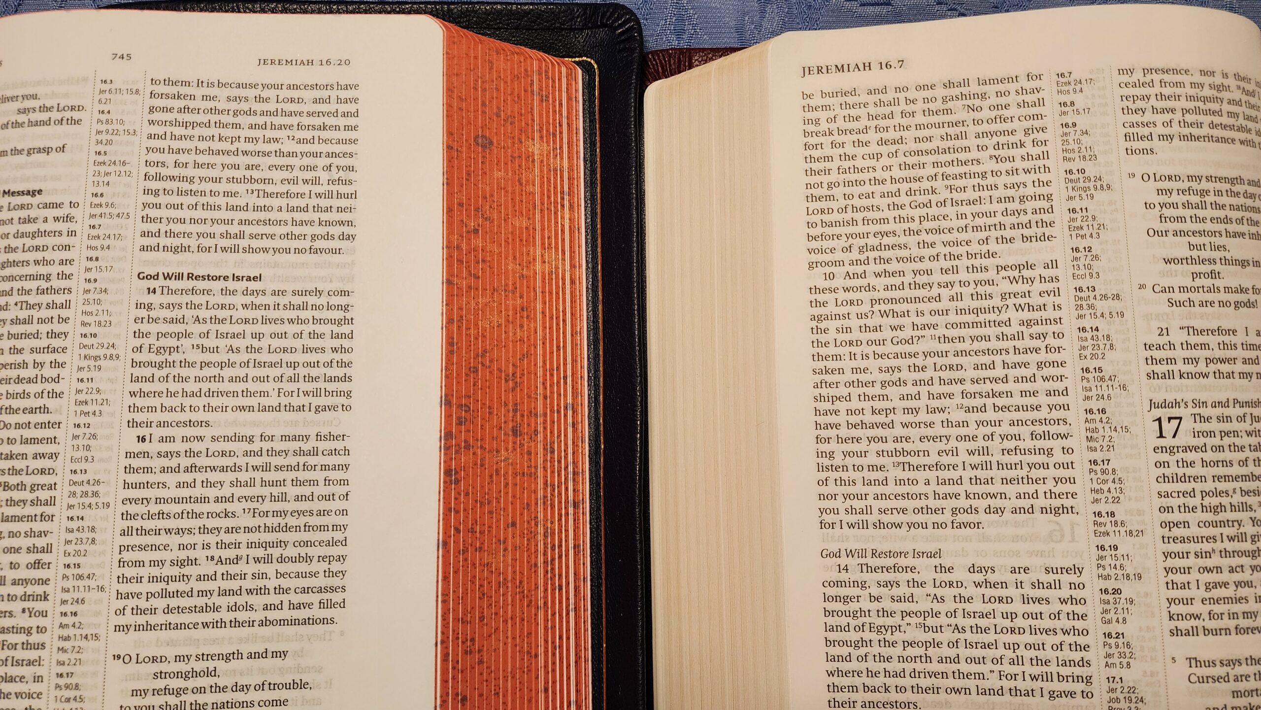
The Cambridge edition has traded a larger font for much smaller margins. It is also about 1/2 inch shorter in height compared to the Allan (the Cambridge measures just under 8 1/4 inches high). It would be nearly impossible to write any marginal notes in the Cambridge edition, but the Allan has margins wide enough for short notes in small handwriting.
The Allan also uses bold text for all section headings and any verse numbers at the beginning of paragraphs. This makes it very easy to look up a passage, but it’s distracting when reading long passages. By contrast, the Cambridge uses italic text for section headings and large numbers (not in bold) for verse numbers at the beginning of paragraphs. Since I prefer reader’s bibles with minimal distractions, I prefer the Cambridge in this respect.
Conclusion
Overall, I’m happy to own a copy of an Allan Bible at a discount with minimal defects. It is a relatively understated edition (aside from the speckled page edges), and it has a decent page design for practical usage. The font size is smaller than I would like, but as a result, the margins are relatively generous for anyone who likes to make marginal notes. The paper is not silky-smooth, but it has excellent opacity and minimal ghosting.
For anyone who can tolerate the small font, this could be a good choice for a premium Bible that is also a “daily driver.” The combination of a decent yapp (which helps to protect the pages) and painted speckling instead of gold gilding (which can get scratched) makes me feel less nervous about bringing it with me in the car or taking it to church.
Marc,
I can’t tell you how much I appreciate your review and the details you included. I would be very interested if the type were bigger. I guess the market for premium bibles must be much smaller in volume so the size, layout, and print size options can’t be as varied as the more mass market publishing houses. I’m very happy with my NRSV-CE from Catholic Bible Publishing (Nelson) which is a large print edition at 10.5 type size. If the Allan offering were 9.5 point type I’d be ordering right now.
The paper sounds interesting. 40 gsm is nice and heavy for bible paper. You mention it’s not as smooth as some, which I do not think I’d mind at all. Does this less smooth paper tend to stick together less than bibles with smooth paper ? The Ignatius Press bibles I have with not particularly smooth paper make page turning much easier. Since I write with pencil my preferred papers have some tooth.
This brings another thought to mind. I watch many of R Grant Jones’ youtube bible review videos, which are extremely detailed and very helpful. He does consider page numbers unless in a bible, and prefers they be placed near the binding to be out of the way. I’ve been meaning to comment that I look at the page numbers every page !! It’s the fastest way to tell if you’ve turned one, two, or more pages of thin bible paper.
Thanks Mark! To answer your questions on the paper: So far, I would actually say the pages in the Allan tend to stick together a bit more than in the Schuyler Quentel ESV with Apocrypha. Maybe that will change with more use, but I’ve definitely had some trouble with turning multiple pages. I agree with you on page numbers! I use them a lot for making sure I didn’t turn too many pages!
I added a new comparison photo to the body of the review above with extreme close-ups of the Allan and Schuyler paper texture. It’s interesting to see what the texture looks like and compare it to how it feels. From what I can see in the photos, it looks like the Allan has a more fibrous texture, while the Schuyler is a bit “fuzzier”. The difference in feel when running my finger across each one is very noticeable. The Schuyler feels very silky. It is *surprisingly* soft to the touch. The Allan feels significantly rougher (although not nearly as rough as a paperback book, for example). I felt the Allan and the new Ignatius Catholic Study Bible side by side, and I’d say the paper texture feels similar. The ICSB’s paper has a very slightly waxy feel, while the Allan feels like pure dry paper, if that makes sense.
Marc,
Thank you for the additional effort and clarification. I’m glad I asked. It sounds like the Allan paper is compounded with fewer additives to give it a more ‘raw’ or ‘classic, vintage’ feel. For the user it’s the results that count and you did a great job describing the differences.
Probably a dumb question, but I am assuming the paper is not as yellow as it looks in the pics? Since the Cambridge has the same appearance. Just the lighting?
Yep, the paper looks white in person. I took most of the photos in this post under indoor lights after the sun went down, so I think the yellowish color is from the lighting.
If I could choose one premium publisher for Catholics to create a copy of, it’d be Allan.
What do you like about them? I’m relatively unfamiliar with them overall. It seems like they make fewer efforts at publicity compared to other premium publishers like Schuyler and Cambridge
R. L. Allan is considered the peak of British craftsmanship in terms of hand-binded leather Bibles (the hand-binded part being the biggest thing that separates them from other premium publishers). Additionally, it seems that there’s an entire subindustry in the Bible rebinding world dedicated to “Allan clones” just because of the Allan reputation and style.
Speaking of Bibles in the RSV family tree, it appears the ESV is being updated again. I wonder if these changes will make their way into the CE edition eventually. One of the big changes appears to be to change Genesis 3:16 back to “for” from the 2016 version’s “contrary to”, with an additional interesting change being to improve on the ESV rendition or John 1:18, which I always found to be somewhat obscure and stilted as it doesn’t acknowledge that the text is referring to God the Son.
More info here, including the complete list of changes:
https://www.crossway.org/articles/esv-bible-translation-update/
And that Genesis 3:16 change is them simply reverting to the earlier ESV reading. I’m sorry, but this instability in what has tried to present itself as the new “normative” English Bible just continues to turn me off from the ESV, and the ESV-CE as an innocent casualty. At least the NJB waited nearly 20 years to produce an update of the JB, and then nearly 35 years before producing an update to that one… and they all got separate names! The ESV has now had 5 editions in less than 25 years since its publication in 2001 (2002, 2007, 2011, 2016, and 2025), all published as “the ESV.”
Compare this to the RSV-2CE, with which, after some relative instability in its first few years (if I recall correctly), the only notable change in the last 20 years has been one verse in Luke, quietly changed without fanfare.
Setting aside the general Bible-reading public for a moment, I wonder how many scholars must get annoyed when they publish papers and books, citing verses and passages from the ESV, and notice that now some of those citations no longer match the ESV.
That is not unique about the ESV; most Bible translations make minor adjustments every few years. The NIV, the NASB, and CSB all make regular minor adjustments to the text. Just look at the copyright dates on your most recent printing. Frankly, it needs to be done more often; way too many Bibles are plagued with typos that can go decades without being corrected. Why should we have to wait 25 for a major revision to get an obvious typo fixed, assuming the revision committee gets around to fixing it?
I just heard about the latest ESV changes. The constant and sometimes questionable tweaks and revisions, especially now after Crossway previously said no more updates, is a big reason I’ve never been able to warm up to this translation. At least they fixed Genesis 3:16, but it appears 1 Timothy 3:15 retains its translational bias of calling the church “*a* pillar and buttress of the truth.” Honestly, I’ve never found that the ESV does anything that the RSV2CE already didn’t do, and usually better.
What change is that? Do you mind posting a link?
They posted on Facebook that the 2016 edition was the final edition, and the post generated tens of housands of complaints. They reversed the decision 24 hours later, saying the policy of making periodic changes would continue.
It’s off topic, but have any of you purchased or used the RSV Personal Size Bible with Cross References, Black Leathersoft, (Sovereign Collection) from Thomas Nelson?
Thanks!
No, I haven’t. It looks like a beautiful edition, and I like the choice to format poetry books in single column and narrative books in double column. It looks like it is not available with the deuterocanonical books, though.
I wonder what people think of the 1 vs 2 column layout choices in premium Bibles. I suppose 2 columns is favored to keep the page count down, but the line wrapping of poetic forms (psalms and canticles) look ugly to my eyes. I’m thinking of the pics of the Psalm pages above, where some lines are indented 3 levels deep just to accommodate a single word like “me”. That’s normal for most Bibles, sure, but if I were to spend a pile of money on a premium one, it seems somewhat dissatisfying.
I’m not sure there are many good options for Catholics who want the single column layout. Maybe import the CTS sorta-Jerusalem Bible from the UK, or one of those note-taking Bibles?
I wish Schuyler or Cambridge had a single column ESV with the Deuterocanonicals. I also hope someone releases the new NABRE in a single column format.