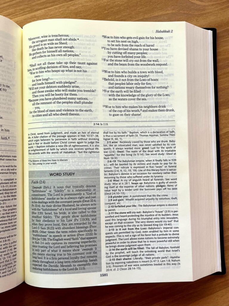
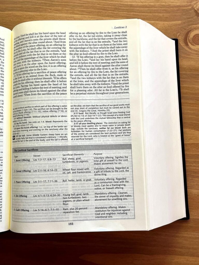
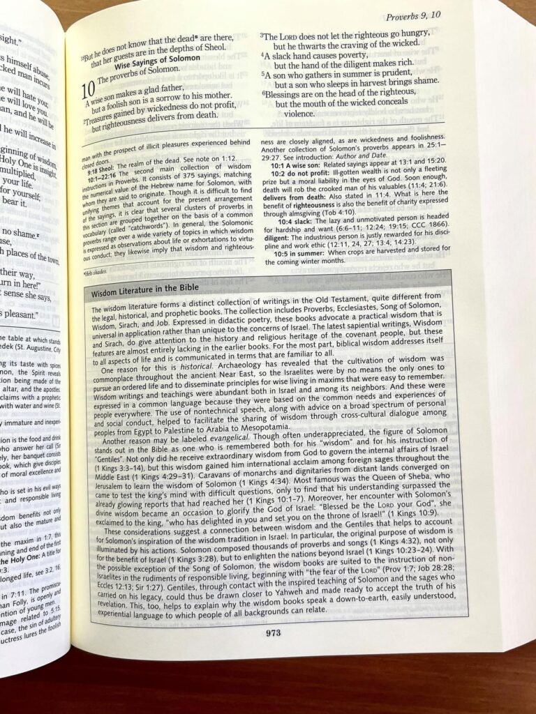
Ignatius Press recently posted a few interior pictures of the upcoming Ignatius Catholic Study Bible on their Facebook page showing the page layout and samples of the notes and informational boxes that will be printed.
The first photo shows a page from the book of the prophet Habakkuk. The footnotes are referenced with a superscript letter in the biblical text, and each footnote begins with the chapter and verse printed in bold. I’m glad to see this. It makes it easy to find the verse that each note is referring to, rather than scanning the page for a tiny letter or symbol. There is also a word study information box printed inside the footnote section of the page. According to the Ignatius Press website, there are more than 140 of these word study boxes throughout the bible.
The next photo comes from Leviticus and shows an information table below the footnote section detailing the requirements and purpose of five types of sacrifices that are described in Leviticus.
The final image shows a page from Proverbs and shows an information box on “Wisdom Literature in the Bible.”
All of these photos show noticeable ghosting of text from the back of the page and subsequent pages. It looks like the biblical text is line-matched in all three images, but this is less helpful in areas where the footnotes cover more or less of the page on subsequent pages. In that case, the smaller font size of the notes leads to parts of the page where lines are not matched.
It will be interesting to see how the ghosting looks in person. In my experience, photos do not always do justice to the reading experience, especially in varying types of light.


I like that it’s on Bible paper and not the near card-stock they used in the stand-alone NT volume! I’ll take ghosting over that any day. 🙂
I also like that the information box appear inline. That’s the sort of content the Catholic Study Bible from Oxford tends to handle in a separate section of cross-referenced essays elsewhere in the book. That makes for much more page-flipping as you hunt down the reference from the page you’re reading. I like Ignatius’ inline approach much better.
Every time I open my Ignatius Study New Testament, I recall happy memories of cutting construction paper in elementary school.
The photos make the paper look yellow. If this is the same paper as the Didache is should be bright white. Perhaps the light source is yellow.
Anyone know where this bible is printed ??
It appears to be Ignatius’s standard Bible paper, same color and everything.
This looks good, and I look forward to getting my copy. Is this the same paper that’s used in their text-only Ignatius Bible? That Bible’s paper is very readable without too much ghosting. This study Bible will have more blank spaces due to the essays and such, so ghosting will be more noticeable, but it should still be a good read if it’s that same paper.
Amazon has changed their shipping date from November 15 to December 9. It’s humorous that even after a few decades of waiting, there’s more delays.
That’s just Amazon being Amazon. The ACW translation for St. Jerome’s Commentary on Daniel supposedly “came out” in late July, and yet Amazon is currently telling me not to expect my copy until mid-October. Thankfully, I’m not in any rush.
Random aside: One thing about the RSV-2CE that’s always annoyed me is that, because they just inherited the cross references from the original RSV, they never have references from the New Testament or the rest of the Old Testament to the deuterocanonical Old Testament. This Study Bible rectifies that a bit by sometimes putting them in the study notes, but I wish they could’ve added them directly to the cross references section. In this category, I think the original Jerusalem Bible is still undefeated.
I love the cream colored paper, that’s one thing I always appreciated about Ignatius’ Bible, but what is that yellowness in the gutter? Is that an actual highlighting added to the gutter?
For me I want a Bible that is lucid and robust, is the RSV2CE as a translation up for that? Otherwise the RNJB seems the most fitting given it’s wide adoption for liturgical use and is more up to date than both the NABRE and NRSVCE, let along the elder RSVCE(2CE)
Crack open a few different books around your house under different light sources. An apparent “beam” of color down the gutter is extremely common in books and just has to do with the way the light reflects off pages.
Do you know of a well-printed version of the RNJB? The copy I have suffers ghosting quite bad…
Anonymous,
The well-printed versions I have of the esteemed RNJB are: RNJB New Testament and Psalms With Study Notes by D-L-T (available on Amazon), as well as the RNJB: Study Edition by Image (available on Amazon—with a great discount at that)… Given that more countries have opted for the RNJB for their Lectionary, I would assume there may be different editions produced at some point in the future.
I personally think the notes and cross-references in the RNJB are extremely underwhelming, and they killed my interest in it early on. Just copy-pasting over those from the NJB would’ve been vastly preferable to what the RNJB has. I know there is a “reader’s edition” of the RNJB, but there’s barely any information about it so I don’t know how much material it keeps from the “study edition.” So I’m going to keep using the NJB myself for whenever I want a taste of the JB family of translation. Maybe the greater liturgical adoption of the RNJB will bring about better editions, because the “RNJB: Study Edition” is a massive “pass” for me as it is.
I sure hope so, because I own both the DLT Study Edition and the Readers edition, and I have to say, neither of them are what I would call “nice” books at least physically.
I like the Study edition is single column, and it’s length and height are actually a pretty good size. It’s just that width that makes the thing almost comically over-sized. And you know, I could almost be fine with that, if that extra bulk was so that detailed footnotes specific to the translation were included, but as has been noted elsewhere, these note instead seem to be warmed over copy paste jobs from the CTS New Catholic Bible, which is in a much more convenient physical format.
And what in the world is up with the Psalms?! Why did they just port over the Revised Grail Psalter WITH all the original notes? It’s way too much, and the change in format for the notes compared to the rest of the bible is VERY jarring. I can’t help but think that some of that unwieldy bulk could have been cut down if they’d just left the Revised Grail Psalm notes out.
Don’t even get me started on that blasted reader edition! I thought, “here’s a solution to the problem of the RNJB’s bulk problem, look how compact it is in comparison!” Until you open the blasted thing up and realize the page ghosting makes the thing practically unreadable! And what’s with the random books in single column vs double column? I mean, I think I read that it’s not actually random, the poetic books are supposed to be in single column and all the rest are double column, but how does that make any sense? The Poetic sections are supposed to be in verse, so I think that actually makes it easier to put them in double column, since there’s built in limitation on how many words can be in a line to begin with. I recall a version of the NRSV that did exactly this, it was single column EXCEPT for the poetic books that it printed in double column. I think that made way more sense.
Ultimately, I wonder if any of this is actually going to mean anything. As much as I do actually appreciate the RNJB as a translation, it definitely has all the marks of a publisher trying to push something out in order to save it’s monopoly on lectionaries. It just feels so much like a rush job. And honestly, from what I’ve read (I believe from comments elsewhere on this blog), the Bishops of England and Wales are tried to make their version of the ESV lectionary to be more “inclusive” after all that drama over it’s announcement. If they do a good enough job with those revisions, I wonder if some of the conferences who’ve announced they’re working on RNJB lectionaries might just shrug and quietly adopt the ESV?
I really with all the english speaking conferences could just agree on a single lectionary translation, or at least all the commonwealth countries anyway, I get that there are some substantial lingustic and cultural differences between say, British and American english, but besides that dividing line, what other meaningful differences are there in modern English? And do these other conferences even have the money to all be working on their own lectonaries? The US has been tinkering with the NAB lectonaries for, what, over 50 years at this point? And one of the reasons frequently given for the delay, among others, what lack of funds. And now England and Wales (and Scotland?) Along with the Indian Conference are going to have their own lectonary while Ireland, Australia, New Zealand (and Malaysia?) are going to have something else? And look how many years it’s taken England and Wales to get a lectionary out for a translation that already had an approved Catholic lectionary, based on the Indian Bishops work on the ESV. How much longer will it take for Australia et all to create another lectionary completely from scratch? My impression is that these potential RNJB conferences aren’t exactly known for their deep pockets, or they’re deep knowledge and experience with projects like this, which is why I find their attempt to go there own way on this so baffling. Do they really find the ESV so offensive that they’ll bankrupt their conferences and put themselves through all the drama of lectonary creation, when there’s a perfectly viable ready made lectonary right there on the table? (Heck, if the ESV is so unacceptable, and inclusive language is SO important, why not just adopt whatever the US bishops finally settle on with the NAB successor!)
Ugh….anyway….rant over…
Christian books dot com lists the Image hardback. Their ‘specifications’ section gives the binding as glued. The type size is 9.5 point for the biblical text, but the notes are listed at 6.5 point which is magnifying glass territory for my old eyes. I also am very satisfied with the NJB, now I just need to find my copy. 🙂
R. Grant Jones reviewed the Image hardback RNJB on YouTube, and he confirmed it was glued. Double-checking his video also reminded me why the RNJB’s footnotes felt so odd, besides being much less thorough than the notes in the JB and NJB: They weren’t even written for the RNJB, but for the CTS New Catholic Bible.
In different news, a new book is coming out by Orthodox Biblical Scholar Fr Stephen de Young entitled “Paul the Pharisee: Jewish Apostle to all the Nations”.
It will have a focus of St. Paul relationship to the Torah and of particular note to the blog’s readers, it will contain a new translation of all of St. Paul’s epistles (including Hebrews).
Below is the link to the book’s introduction.
https://issuu.com/ancientfaith/docs/st_paul_the_pharisee_sample_pages/s/55723288
I am glad there is a new emphasis on Paul as a Pharisee, all too often, the word “Pharisee” is used among Christians as an insult. In a way, it is almost understandable as the gospels are filled with a lot of “Woe to you scribes and Pharisees.” Still, the emphasis on this ignores the fact that both Christianity and modern Judaism are highly influenced by Phariseic logic and reasoning. Some scholars have even argued that Jesus might have been a Pharisee himself, but that seems absurd until you realize that people usually have the most bitter disputes within their group, just like the infighting within families.
At any rate, a new appreciation for the positive aspects of the Pharisees and a recognition of their influence is important especially if it serves as a bulwark against antisemitism.