Many thanks to Matthew Kudija for his excellent review of the new ESV Quentel shortly after it released a month ago. I pre-ordered the full yapp crimson red calfskin edition (with apocrypha) and received it about a week after Matthew wrote his review.
Printing Irregularities
Before anything else, I’d like to cover the printing irregularities that multiple commenters and reviewers have reported. In the comments on Matthew’s original review, both Fr. JT and Matthew noted that the print was noticeably faint on several pages in Matthew and Mark. Fr. JT found pages in his copy where the text was so faint that he could hardly read it. He requested a replacement copy and found the same issues. The YouTube review channel A Nickels Worth Bible Reviews also posted a lengthy comment with photos showing faint text on multiple pages in Matthew and Mark.
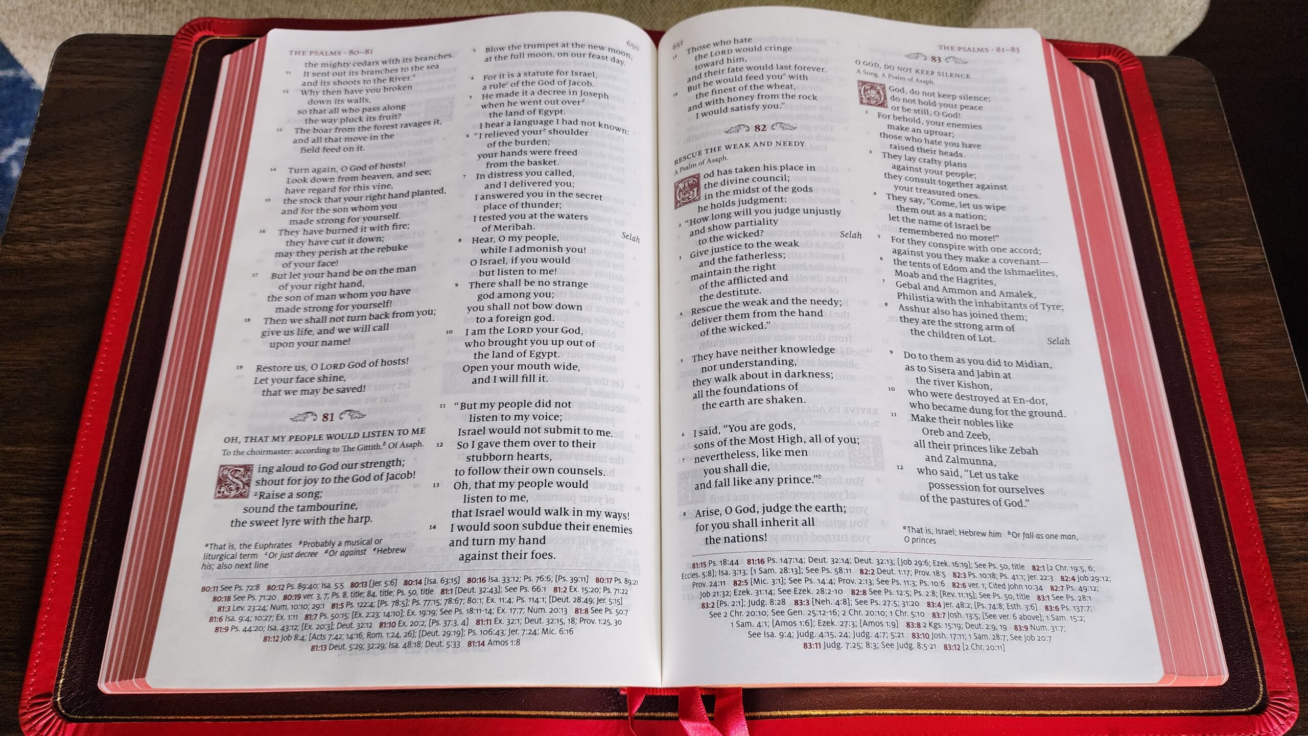
I can confirm that the printing in my copy is also faint on the right-hand side of several pages in Matthew and Mark. The problem is more noticeable to me in bright light. When I first looked for any issues in my copy, I looked at each page in Matthew and Mark in my dimly-lit living room in the evening, and I had trouble seeing the variation in print quality. In the sunlight, it is easily noticeable, and I’m including a couple of pictures below to illustrate what it looks like in my copy.
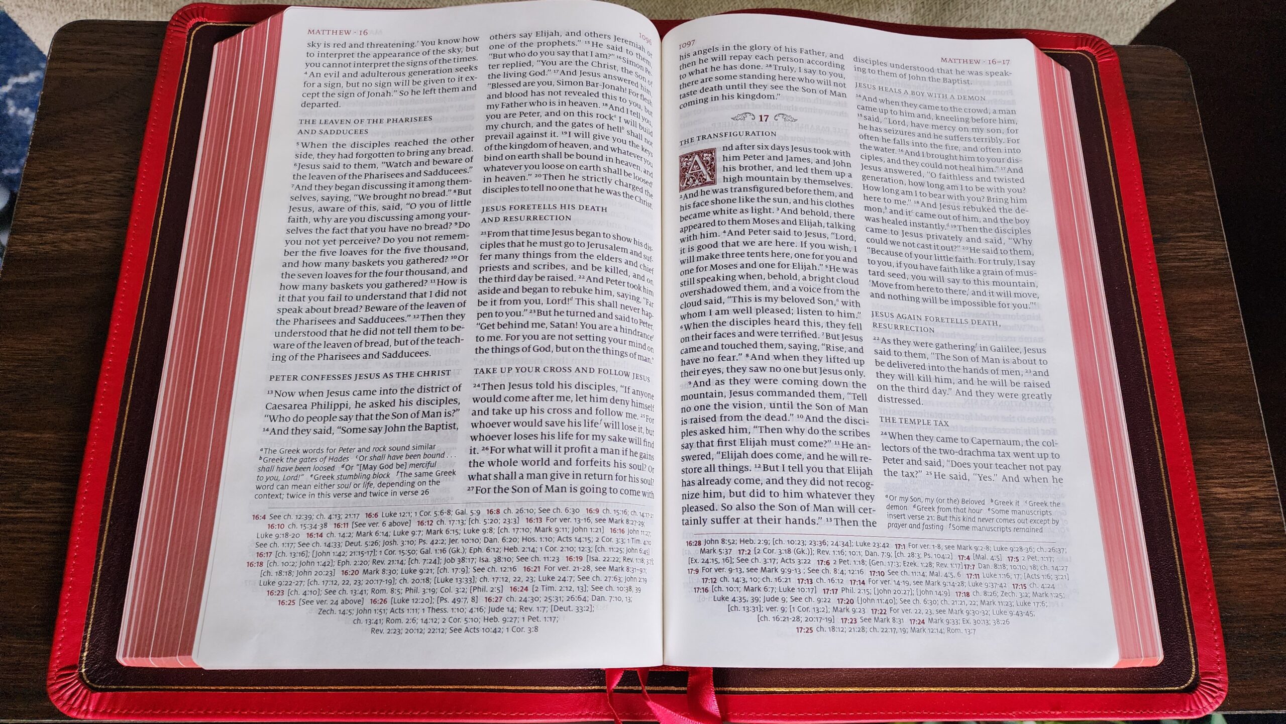
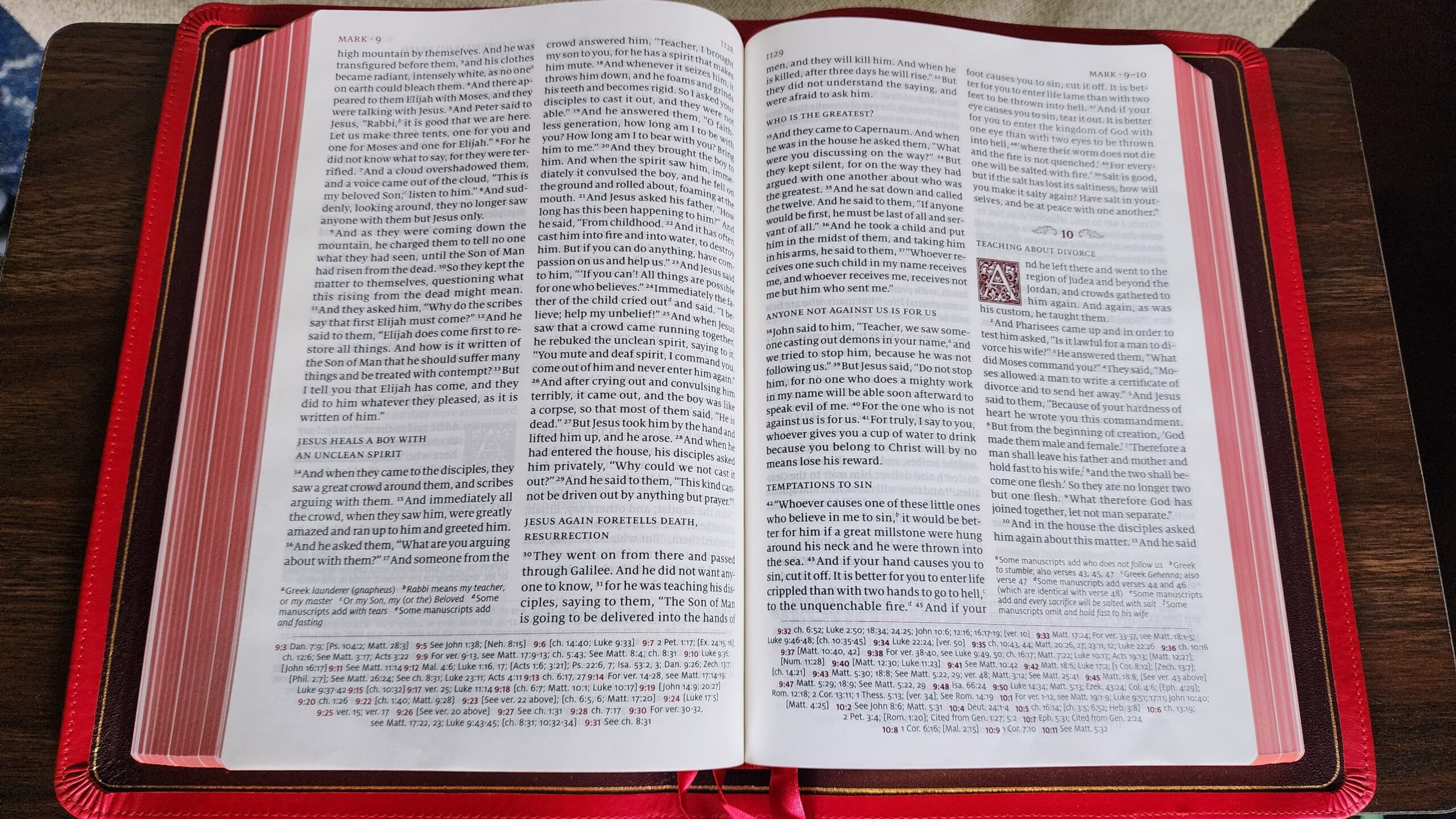
I have not found any pages where the text was impossible to read in my copy, but given the possibility of getting an especially faint copy and more generally the frustration of any uneven printing in a premium bible, I can completely understand this issue being a deal-breaker for many people in deciding whether to purchase a $250 bible. I will be keeping my copy because the text is still readable, but I wanted to cover this issue first since it is the primary drawback which seems to be a common problem right now.
Physical Construction
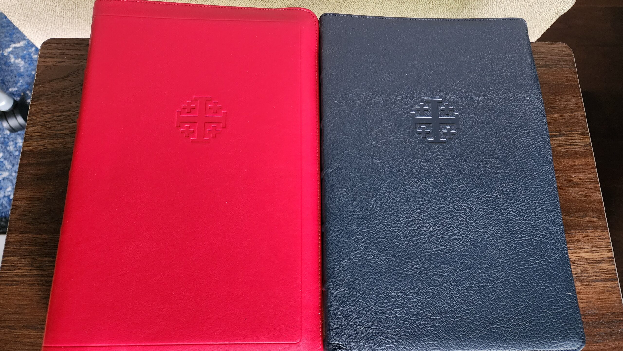
With that being said, the overall physical quality of this edition is top-notch in every other respect and does not disappoint. I stepped out of my comfort zone by ordering the crimson color. I’ve never owned a red bible that is as bright and vibrant as this. It has quickly grown on me since I received it, and I’ve come to appreciate it a lot. The colors throughout the whole bible fit together well — from the crimson cover to the red and gold art gilding to the burgundy drop-caps at the beginning of each chapter in the biblical text. I’ve read through much of the book of Sirach in this bible, and I’ve found myself marveling at how beautiful the colors are and how well everything goes together.
The cover is made in the “full yapp” style, meaning that the edges of the leather extend well beyond the edges of the text block and can be wrapped around the edges of the text until they meet together. The bible is wrapped in its presentation box with paper bands that help to “train” the yapp to curl over the edges of the text block. I have never liked the appearance of full yapp bibles, so that was another stretch outside my comfort zone.
I have mixed feelings about it. On the positive side, the full yapp feels like it adds a bit of protection for the text block, and when I’m reading the bible, the large leather cover frames the pages in a way that looks visually pleasing. I still don’t care for the oversized look of the yapp when the bible is sitting closed on a shelf or table, though.
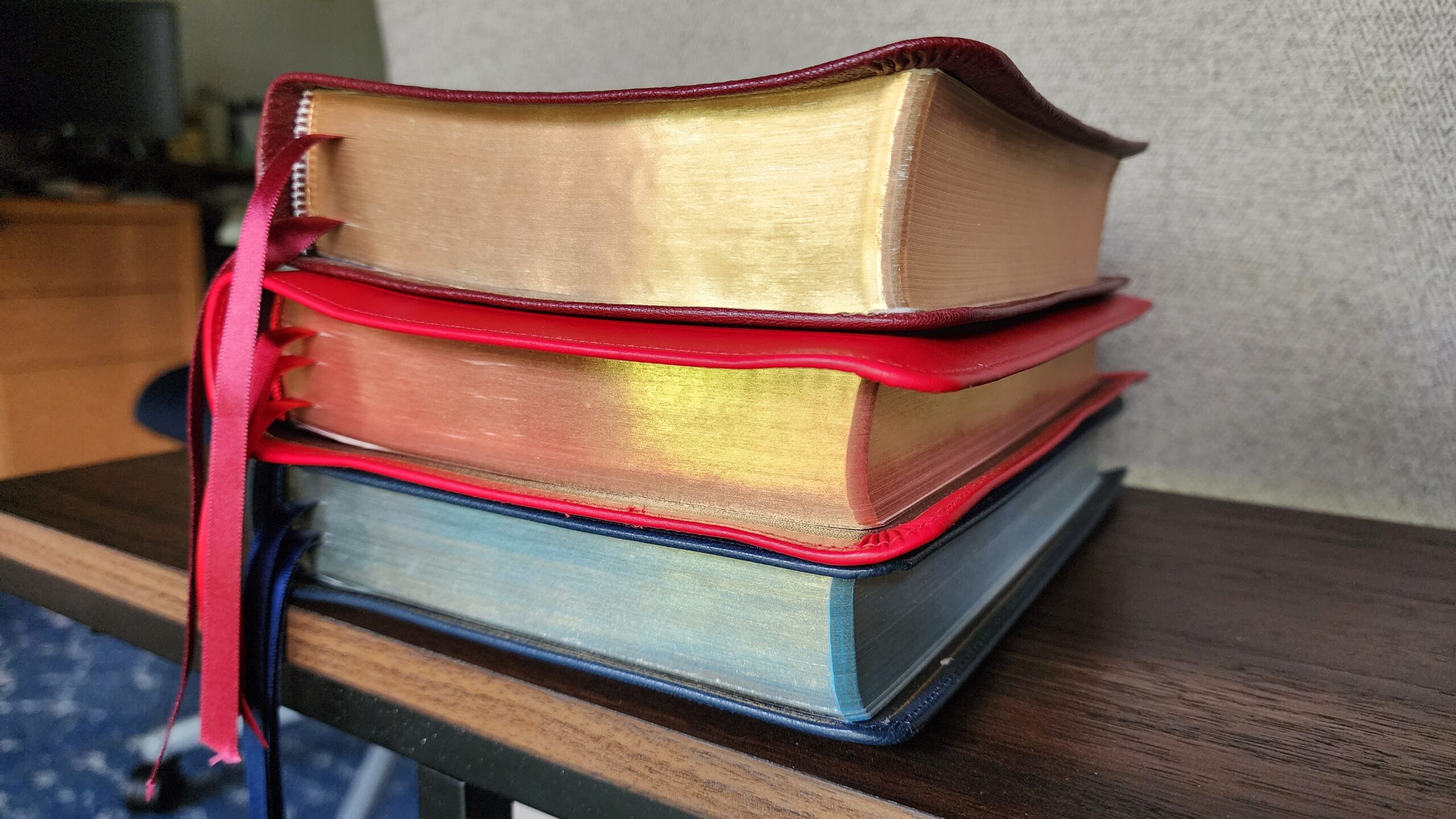
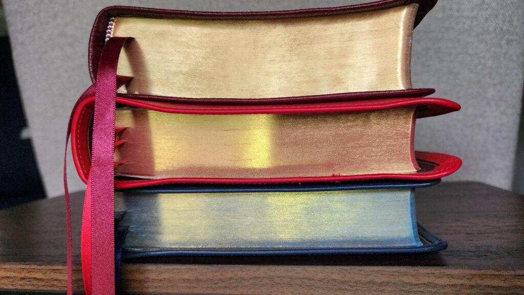
Finally, this is the first calfskin bible I’ve ever owned. The grain of the calfskin is much smoother and finer than the goatskin and stamped-grain bibles in my collection. The leather feels a bit thinner than the goatskin RSV Quentel from Schuyler which was released a few years ago. I don’t have a caliper to measure the thickness, so I’m just going by how it feels in my hands. In any event, it certainly has a premium feel and smooth texture. Here is a side-by-side photo with the RSV Quentel:
Similar to the RSV Quentel, the ESV Quentel has a sewn binding which is edge-lined. This means that a flap of leather from the liner of the cover is glued to the end pages of the text block. Most high-quality premium bibles have an edge-lined construction.
The flap of leather that is glued to the end pages adds thickness to Schuyler bibles near the spine. I noticed this in the RSV Quentel, and the same thing is true for the ESV Quentel. When I lay the bible flat on a table, the spine is noticeably thicker than the fore-edge (the opposite side of the book from the spine). I own other edge-lined bibles like the Cambridge NRSV Reference Bible with Apocrypha and the Zondervan Premier Collection NRSVue with Apocrypha, and neither of them have such a pronounced difference in thickness between the spine and the fore-edge. This makes it difficult to stack multiple bibles horizontally on a shelf without the stack tilting.
Page Layout and Typesetting
The page layout in the ESV Quentel is quite similar to the RSV Quentel. The font size is 10-point, and there is generous spacing between lines, making this a very comfortable bible to read. The paper quality is basically identical in feel and opacity between both editions. Cross-references are grouped at the bottom of the page in a somewhat dense arrangement. It can take a few seconds to scan this wall of text to find cross references for a specific verse, but I think this is an acceptable compromise. The densely-packed cross-references leave space on the page for the large font and good line spacing. I would classify the Quentel as a reader’s bible that contains cross-references. The focus of the page design is the easily readable text. As someone who prefers reader’s editions, I strongly prefer this.
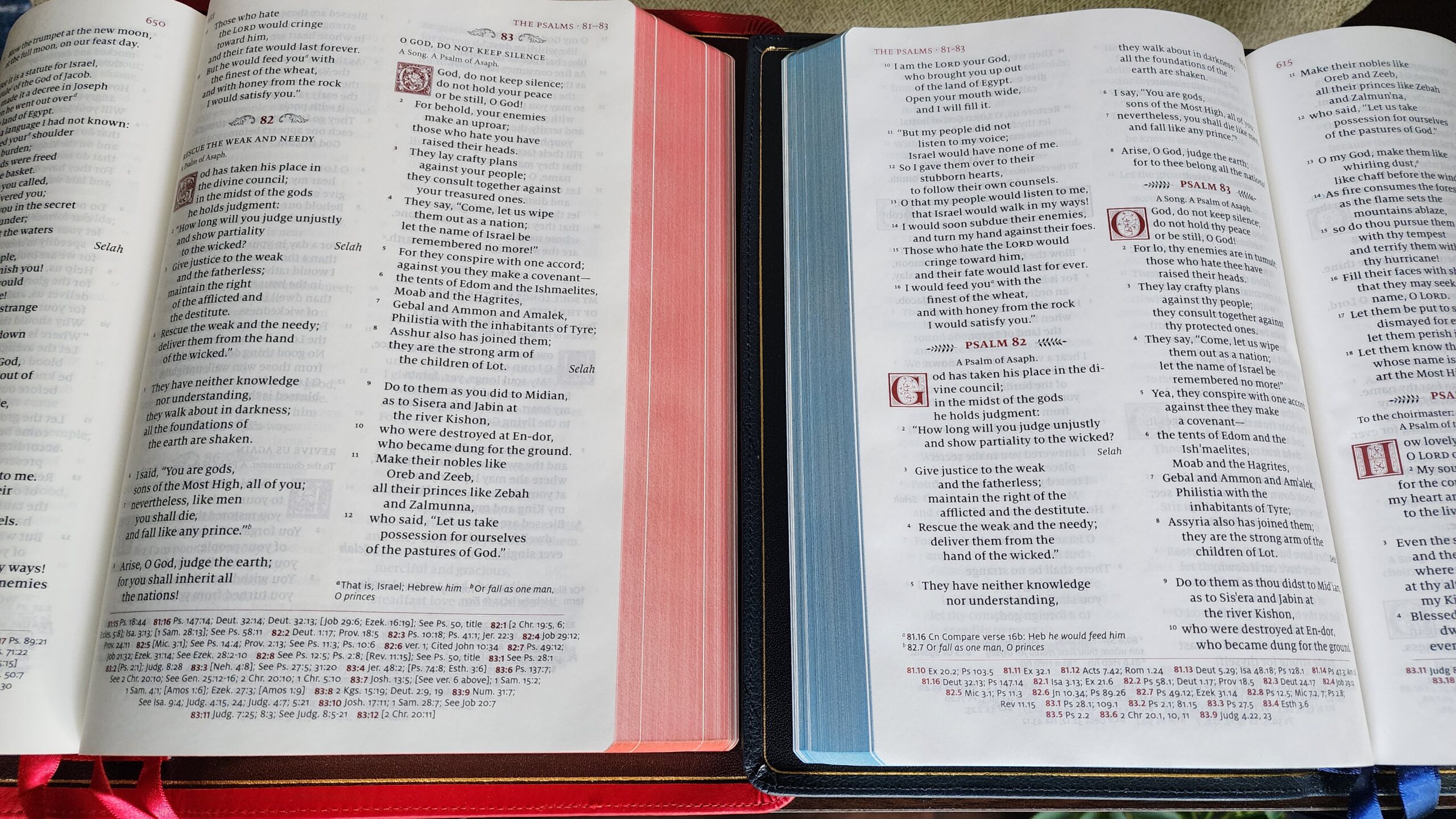
The primary difference between the page layout of the ESV Quentel compared to the RSV Quentel is the addition of paragraph headings in the ESV edition. The RSV Quentel contains no paragraph headings at all, and I personally prefer that. In general, I prefer fewer distractions from the flow of reading in a reader’s edition like the Quentel. However, the paragraph headings in the ESV Quentel are relatively unobtrusive. They are printed in small caps, and they are slightly less bold than the biblical text. It is possible to ignore them while reading. I certainly prefer this to other bibles which print the paragraph headings in a larger font size or a different color than the biblical text. Many bible readers prefer to have some paragraph headings to aid in finding passages, so I can understand why they were included here.
Conclusion
On the whole, I am quite happy with this Schuyler ESV Quentel. The red color has quickly grown on me, and I love how the colors of the entire edition work well together. The page layout and typesetting, similar to the RSV Quentel, are exceptionally good. The primary drawback is the uneven and faint printing which has been reported by multiple people who preordered the first edition. I am personally going to keep my copy, as the uneven printing is relatively minor in my edition, but it is entirely reasonable to wait for a later printing or skip this edition altogether if you would be bothered by the imperfection at this price point.
Thanks Marc for your review, great to see your impressions. That crimson looks very bright compared to the photos on Schuyler’s website!
Since you mention the Full Yapp and I do happen to have calipers, I took some measurements on my Siena version of this (which I imagine would be the same on this version). The Yapp isn’t quite full, there is a 0.18-0.25″ gap. This makes sense given that the Deuterocanon is about 0.19″, so it would be touching if it were not there and probably is on the versions with Apcrypha.
Here is the thickness of the portion of the text block (interesting to see the relative percentage of total):
Front Matter: 0.043 in (3% of total)
Old Testament : 0.683 in (55% of total)
New Testamanet: 0.205 in (16% of total)
Apocrypha: 0.193 in (15% of total)
Concordance: 0.039 in (3% of total)
Note Paper: 0.02 in (2% of total)
Maps: 0.03 in (2% of total)
End Sheets: 0.037 in (3% of total)
Total: 1.25 in (100% of total)
I am trying to buy the RSV OR ESV with the apopcrypha in either red or blue goatskin or calfskin. I have looked all over the Internet and cannot find a single one! Does anyone know where I can purchase the Bible that I have been looking for for over two years thank you.
JJ,
Looks like evangelicalbible.com has sold out of RSVs w/Apocrypha, and most ESVs w/A. The only ESV w/ A I found on their site was the BLACK goatskin edition. https://evangelicalbible.com/product/schuyler-quentel-esv-with-apocrypha-black-goatskin-bible/
It looks like Evangelical Bible might only have the black goat skin with normal yapp left.
the ESV text will change. ESV2025 update: https://www.youtube.com/watch?v=odVycRquzQE
There are a new batch up for pre-order at evangelicalbible.com