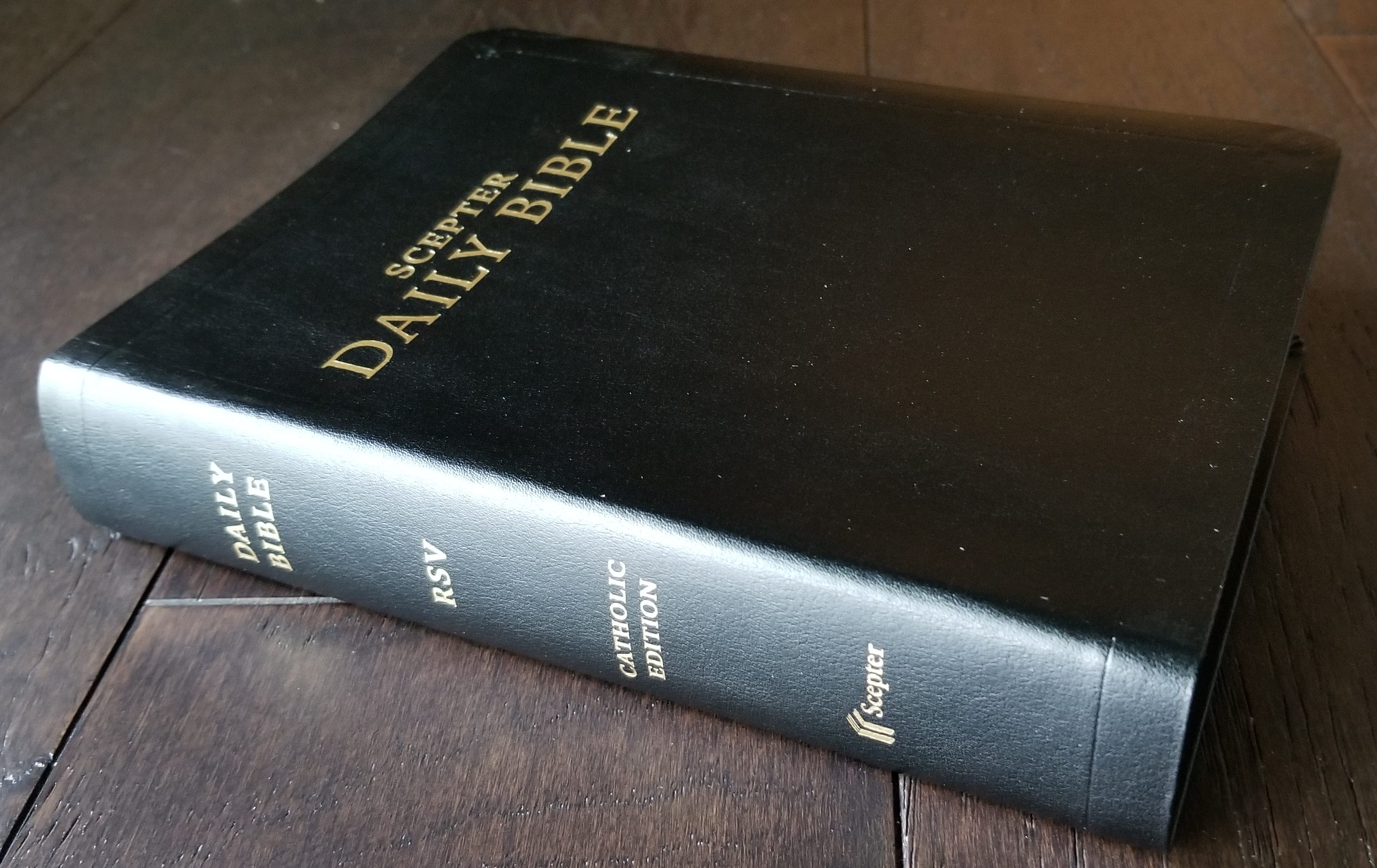
A few weeks ago, I found an imitation leather copy of the Scepter Daily Bible RSV-CE in a Catholic book store and posted my first impressions of it. I have now received a review copy of the bonded leather edition from Scepter Press, and I have some photos to share. The bible is now in stock at both Scepter Press and Leaflet Missal.
Firstly, if you are interested in purchasing this Bible, I highly recommend paying the extra $5 for the bonded leather edition. The cover is much nicer than the imitation leather, and it features gold gilding on the page edges which is quite decent for a bible at this price point. In my first impressions post, I mentioned that the imitation leather felt rubbery in my hands. The bonded leather is much closer to what a leather cover truly feels like. It is certainly thinner and more plastic-like compared to a premium leather cover, but it has a soft, flexible feel to it. It’s the kind of book that I would enjoy picking up and reading — just because of its texture.
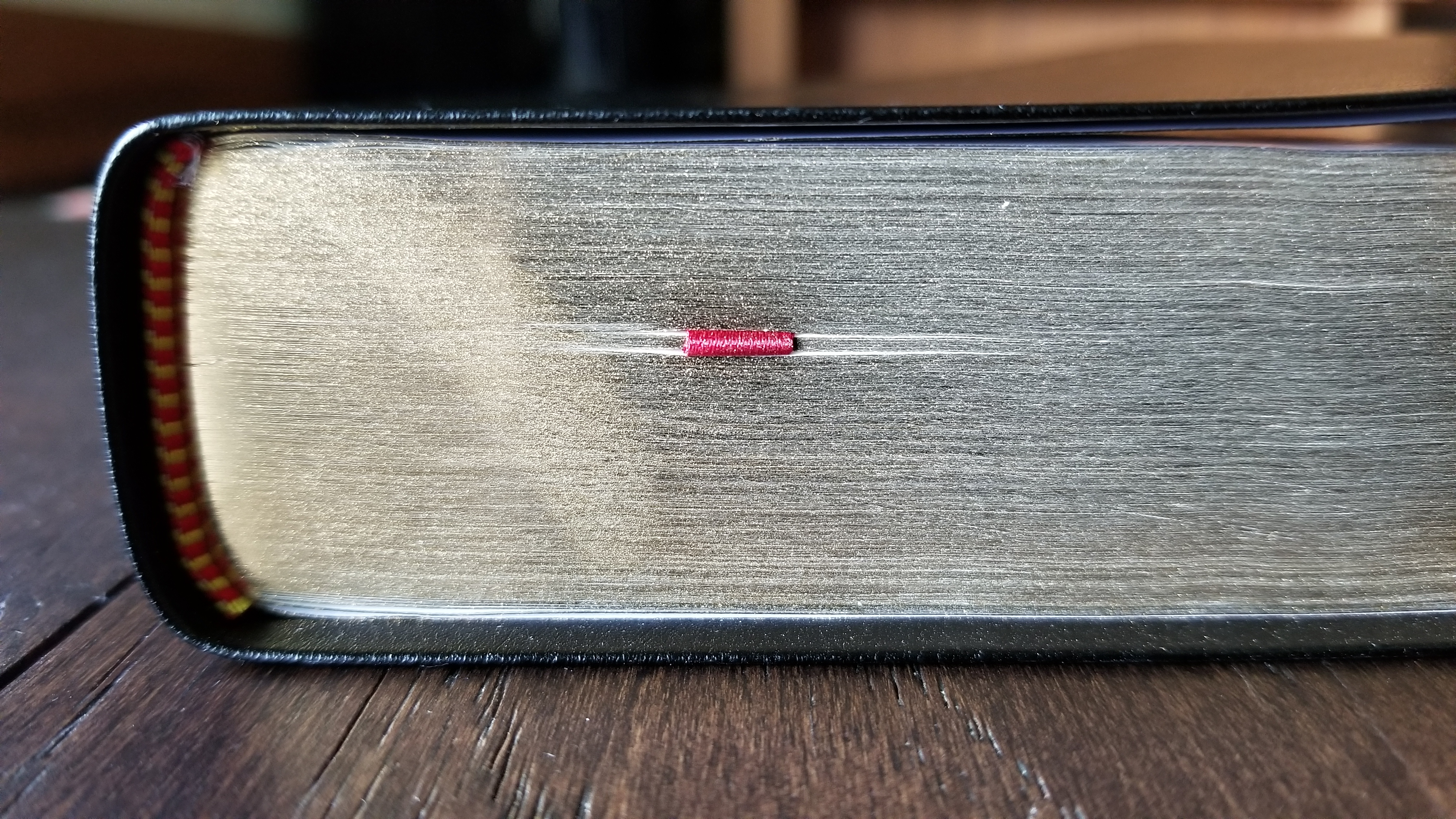
The binding is sewn, and it features one single-sided, 1/4 inch, red ribbon marker.
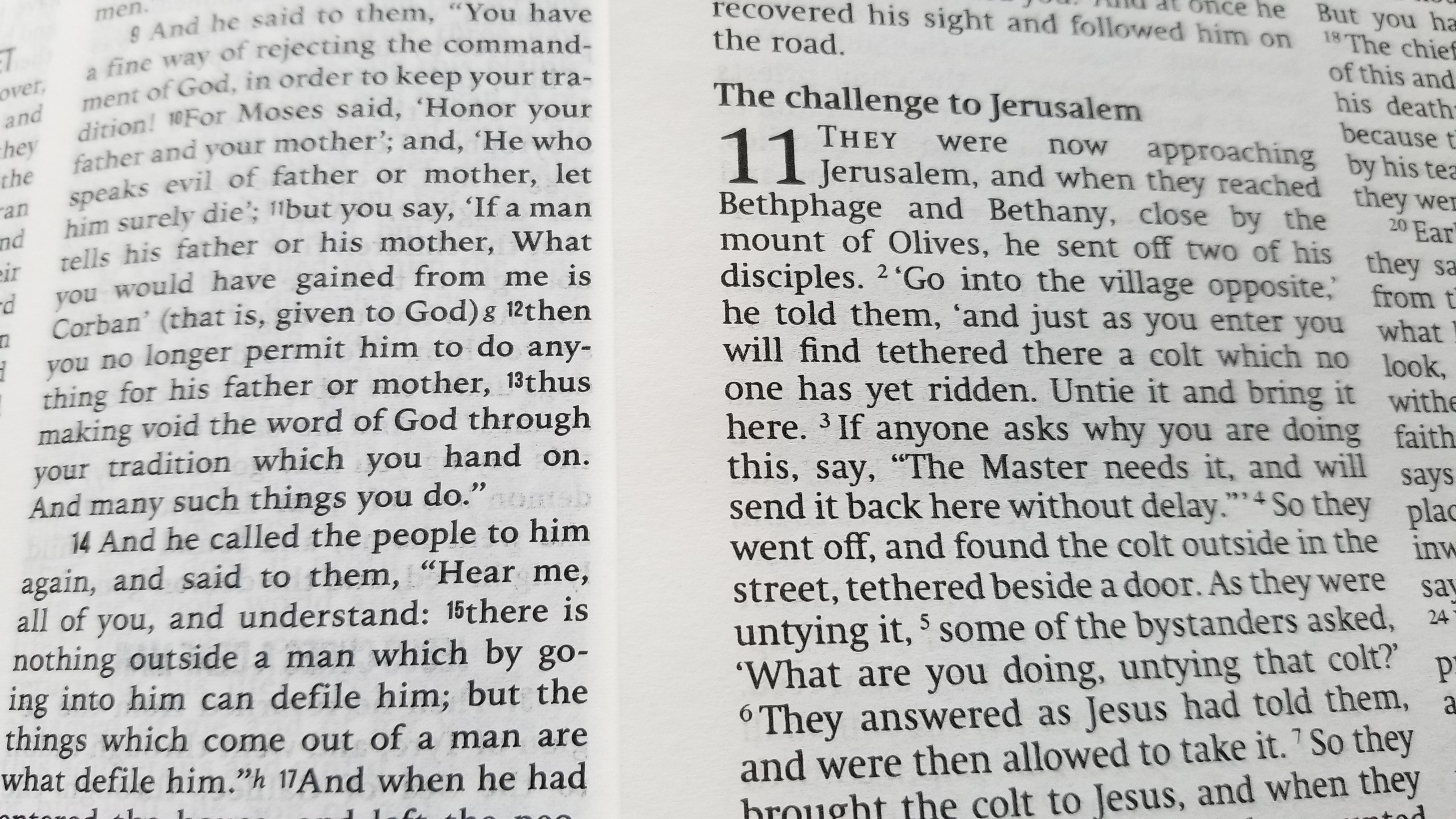
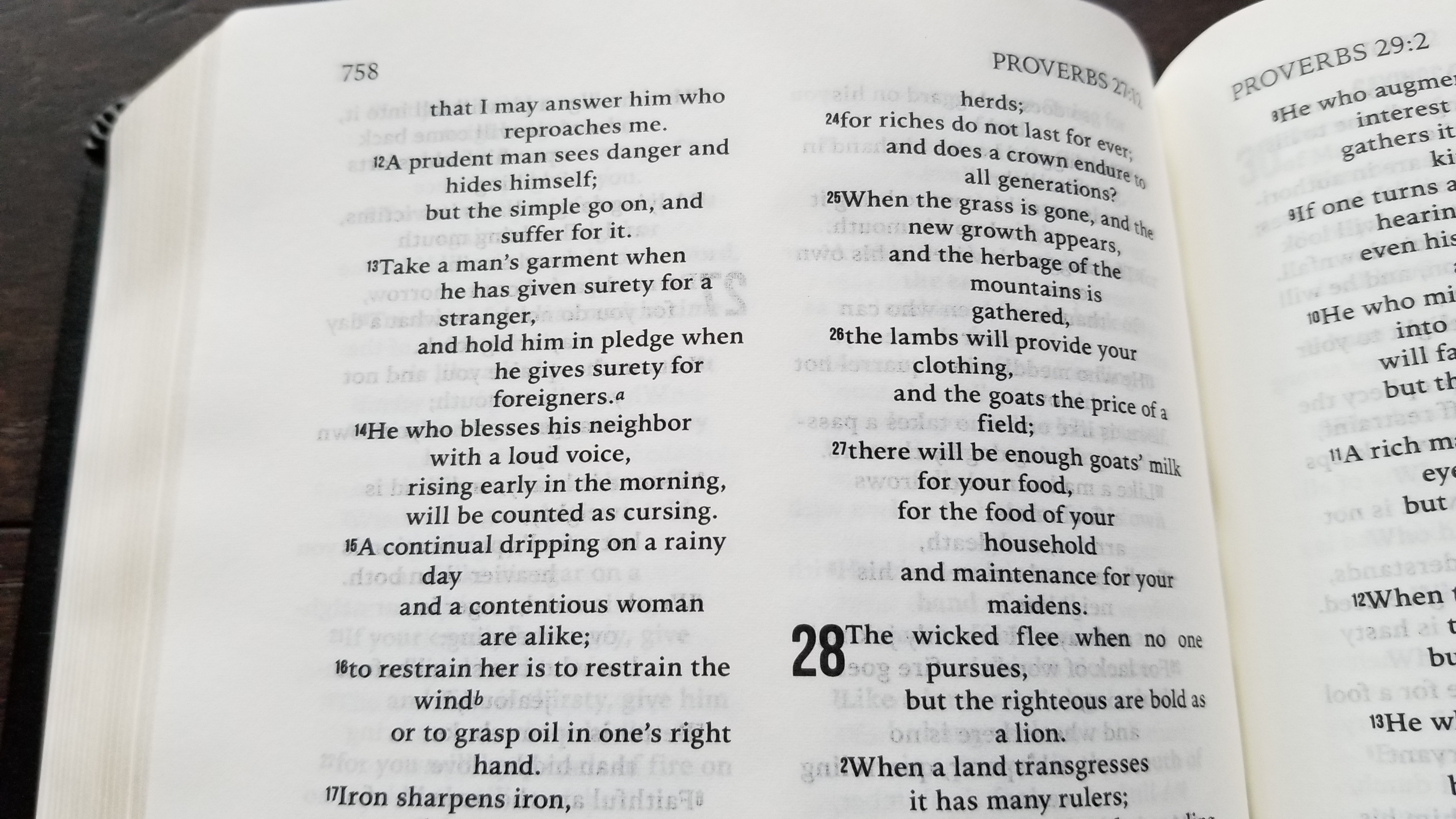
It’s worth emphasizing that the font size is quite small. Here is a photo with the Scepter Daily Bible RSV-CE on the left and the Cambridge hardcover REB on the right. The Cambridge has size 8 font, and the Scepter bible’s font is notably smaller (probably a size 6 or 7). If you find small print difficult or frustrating to read, this bible would be a source of grief for you.
On the positive side, though, the small font allows this bible to have a very nice size for carrying and reading. It is made to be easily portable and not bulky. It has a similar height and width to the Saint Paul Daily Missal which I reviewed a few months ago (although the Scepter bible is not nearly as thick).
The pages are thin enough to make ghosting noticeable. Many of the pages are line matched, which helps to make the ghosting less obtrusive, but there are a lot of pages where there is no line matching. I haven’t found the ghosting to be extremely distracting, so it would not be a deal-breaker for me. If you prefer minimal ghosting, though, this bible is probably not for you.
Overall, I would say this bible is a good choice for its intended purpose: a bible that can be easily carried anywhere you go for daily use. It’s a very nice size to hold, transport, and read. If the small print and moderate ghosting are not major obstacles, I think this will be a useful bible for a lot of people. The bonded leather edition is especially nice and worth the small $5 upgrade.
Is the font in the Scepter edition larger than the font that is used in the Oxford RSV travel Bible?
https://www.amazon.com/Catholic-Bible-Revised-Standard-Version/dp/019528853X/ref=sr_1_2?keywords=Oxford+RSV-CE+zipper&qid=1639742447&sr=8-2
I owned that one, but the font was a little too tiny for me. However, I’m looking for a Bible that I can use in adoration and the Scepter edition would be perfect for that, if the font is slightly bigger than the Oxford version.
Thanks!
I don’t have a copy of the Oxford to compare, unfortunately. I hope someone else can chime in to help out.
Thanks for the response!! Do you know what font size is used in the Scepter version? The Oxford RSV-CE uses 6 point font. Thanks!
I haven’t seen the exact size specified. In the photos in the post above, I have a side-by-side comparison with a size 8 font, and it’s definitely smaller. I would guess it’s a 6 or 7.
I happened to find a compact RSV-CE published by Scepter but which is virtually identical to the compact Oxford one (just without the zipper). It’s beautifully made, but the font is rather small and dense. As far as I know, the only “standard” sized RSV-CE currently in print is from St. Benedict Press, and it’s rather ugly and unpleasant to read in my opinion. The Daily Bible here presented would seem to somewhat fill that hole, but I’m concerned that the font is virtually the same size as the compact Oxford. Hard to find comparisons online, so I’m in the same boat as you. I have a great fondness for the RSV as it carries on much of the beauty of the Tyndale tradition and hadn’t yet succumb to “inclusive language” pace the NRSV. Perhaps the ESV-CE is the way to go…